Stream containers
A Container is embedded in one or more of your apps, rendering a single stream of cards. Containers provide a way for the Atomic SDKs to fetch a particular stream of cards for display. To create a container:
Create a Stream container
- From the Configuration section in the workbench sidebar menu, choose 'Stream containers' in the 'SDK' section. Alternatively, open the command palette and type Stream containers. Then click 'New container'.
- Create a name for your container e.g. Homepage Container.
- Select the card limit for the container. This defaults to 50.
- Select the Stream to present in the container.
- Select the theme to style the container.
- (optional) Select the dark mode theme to style the container.
- Take note of the container ID, you'll need this during SDK installation.
- Finally, click on the menu icon at the end of the row displaying your container, and select 'Manage client keys' then select the Client key you configured earlier.
We recommend using a descriptive name that reflects where the container will be placed. This will make it easier to identify when creating new cards or searching for cards using the Customer Center.
Assigning streams to containers
You can choose to have multiple containers in your apps, to show relevant action cards depending on the context. We recommend a unique stream container configuration for each container. This allows you to apply container-specific configurations to each, without affecting the others, and minimizing the likelihood of requiring changes in future to your client-side code.
You can do this by navigating to Configuration > Stream containers.
Click the New container button. Give the container a name, set a limit of the cards that can be shown inside the container, add a stream
and assign a theme. If you wish, you can also enable dark mode and assign a dark theme. You can read more about themes in the Theme editor tutorial.
Each container can only have 1 stream, but the same stream can be assigned to multiple containers.
Monitoring SDK usage
Each stream container records which SDK builds are actively connecting to it (within the last 7 days), so you can see, at a glance, which containers are in use, which client versions they're being used from, and their display variant (i.e. single, horizontal etc).
The data is refreshed once an hour, so a newly observed version can take up to an hour to appear in the table.
The information appears as extra columns on the Stream containers list in the Workbench Configuration section.
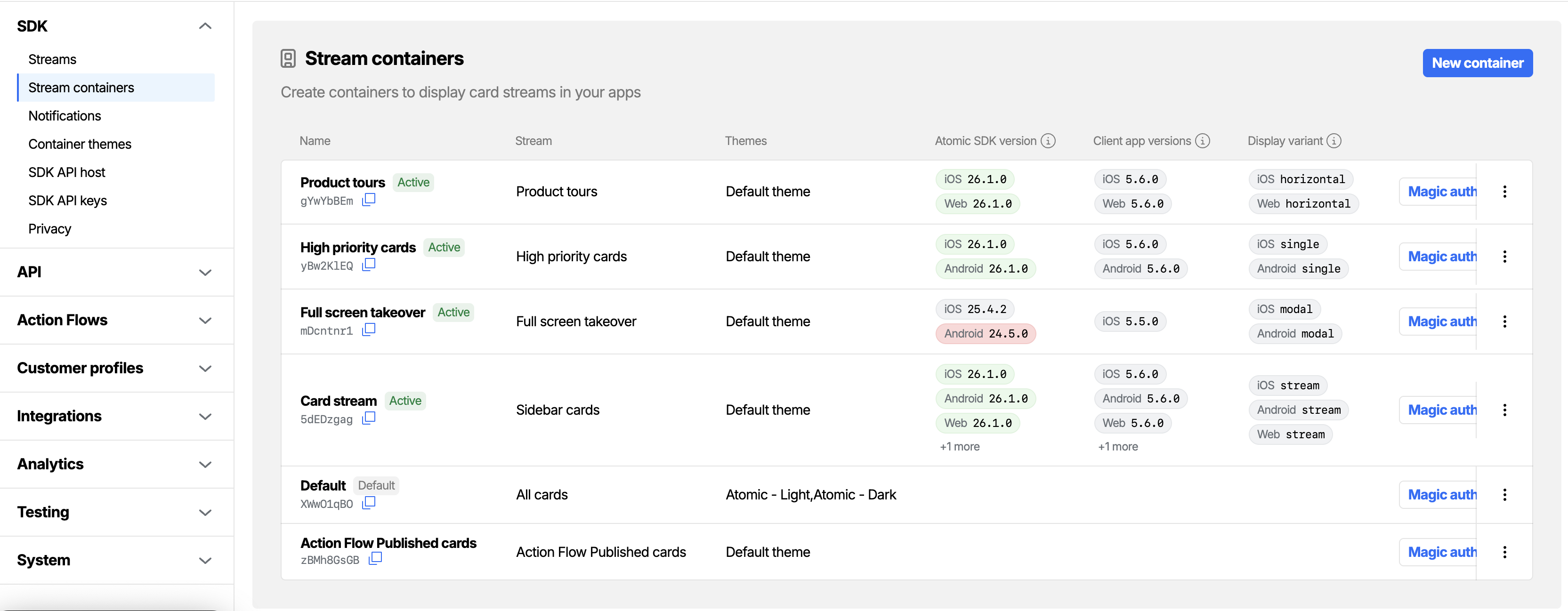
Status pills
Each container shows one or more status pills next to its name:
- Active (green): SDK traffic has been observed for this container in the last 7 days.
- Disabled (light): the container is currently turned off. See What happens when a container is disabled.
- Default (light): the container is set as the environment's default container. See What "default" means.
Atomic SDK version
The Atomic SDK version column lists each unique combination of SDK version and platform that has connected to the container, with the most recently seen entry first.
The pill colour reflects how the version sits against the set of Atomic SDK releases:
- Green - the latest Atomic SDK version. No action needed.
- Orange - this version will fall out of support in the next Atomic SDK release. We recommend upgrading soon.
- Red - this version is no longer supported. We recommend upgrading.
- Default (grey) - any other observed version.
Client app versions
The Client app versions column lists the version of your host application (the app that embeds the SDK) paired with the platform. This is helpful when you want to tie traffic back to specific releases of your own app rather than to SDK builds. The host app supplies this value by calling setClientAppVersion on initialization — see iOS, Android, Web, React Native or Flutter.
Display variant
The Display variant column shows the variant the SDK was rendering this container as - single, stream, horizontal, modal or launcher - paired with the platform. See Stream container UX considerations for what each variant looks like and which platforms support it.
The default stream container
Each environment has exactly one default stream container, marked with the Default pill in the stream containers list. When a new environment is created, the workbench automatically creates a container called Default and marks it as the default; you don't need to create one yourself.
What "default" means
Marking a container as default is used for convenient pre-selection in the workbench. A few workbench screens (for example, the magic link generator and the in-workbench customer center view) pre-select the default container if no other container has been chosen. You can always override the selection.
What "default" does not mean
- It does not change where action flows send cards. Every card-producing step in an action flow has its own explicit stream container selection, and that selection is what determines which container receives the card. A non-default container is treated identically to the default at delivery time.
- It does not act as a fallback for the SDKs. The Atomic mobile and web SDKs always require an explicit stream container ID to be supplied at initialisation; if you do not supply one, the SDK will not load cards. The default is not consulted.
- It does not affect notifications, push delivery, embargo, expiry, or any other card behaviour.
In short: the default container is the container the workbench picks for you when a container ID is optional and not supplied. Anywhere a container ID is required (the SDKs, action flow card steps), the default is irrelevant.
Changing the default
To change which container is the default, open the overflow menu (the three-dot icon at the end of a row) on any non-default container and choose Make default. The previous default container is automatically demoted in the same operation; there is always exactly one default per environment.
The default container is protected:
- It cannot be disabled.
- It cannot be deleted (this is enforced both in the workbench and at the database level).
If you want to disable or delete a container that is currently the default, first promote a different container to default using Make default.
Enabling and disabling a stream container
A stream container is enabled by default when it is created, and remains enabled unless you explicitly disable it. Enabled containers serve cards to your apps and receive notifications as normal.
You can disable a stream container that you no longer want to deliver cards to, without losing its configuration or having to delete it. This is useful when:
- You are decommissioning a screen in your app but want to keep the configuration in case you re-introduce it.
- You are migrating traffic from one container to another and want to stop the old one cleanly.
- You want to delete a container (deletion requires the container to be disabled first - see below).
To disable a container, open the overflow menu on the container row and choose Disable. To turn it back on, open the same menu and choose Enable.
What happens when a container is disabled
While a stream container is disabled:
- New cards are not delivered to the container. Action flows that target this container will run, but the resulting notifications are silently dropped for users registered to the disabled container. No error is raised on the action flow.
- The Atomic SDKs cannot fetch cards from the container. From the SDK's point of view, a disabled container behaves the same as a container that does not exist - requests for it fail authentication.
- Push notifications are suppressed. Even if a card is queued for delivery, push notifications scoped to a disabled container are not sent.
- Existing cards on user devices may still appear briefly. Cards that an SDK has already fetched and cached locally may continue to be displayed until the next refresh, at which point the SDK will stop receiving cards for that container.
- The container is hidden from configuration dropdowns. When you are picking a container in the workbench (for example, when configuring an action flow step), disabled containers do not appear in the list, so you cannot accidentally route new cards to a disabled container.
Re-enabling a container
Re-enabling is the symmetric action: choose Enable from the overflow menu and the container immediately starts serving cards and receiving notifications again. No further configuration is required, and any client keys that were previously associated with the container remain associated.
Deleting a stream container
Stream containers can only be deleted once they have been disabled. The Delete option only appears in the overflow menu after the container has been disabled (and only for non-default containers).
Deletion is permanent and removes the container's configuration entirely. If you are unsure, prefer leaving the container in the disabled state rather than deleting it.
Stream container UX considerations
The Atomic SDKs are designed with flexibility in mind, allowing you to integrate a stream of cards, or a single card, in a variety of ways. The available options are:
- Stream container: Displays a list of cards, designed to be presented as a self-contained screen in your app at a specified size. As an example, this could be used to display a notification center to your customers.
- Horizontal container: (iOS SwiftUI and Android Compose only): Displays cards arranged left to right at the same height, with horizontal scrolling. Useful for embedding a strip of cards inside another screen alongside your own content.
- Modal container: Displays the first card over a full-screen overlay as soon as cards are present, blocking interaction with views behind it until all cards are removed. Useful for full-screen takeovers driven by card delivery.
- Launcher: (Web SDK only): Displays a stream container as a floating layer on top of your app. The stream container is opened and closed using a trigger that sits in the bottom right of your page. The size of the stream container is automatically updated to accommodate the content being presented.
- Single card view: Displays the first card in a list of cards, without any surrounding UI. Once this card is actioned, dismissed or snoozed, the next card in the list appears in its place. The single card view resizes automatically to accommodate the card it is displaying, while also adhering to the width you provide.

iOS
The Atomic iOS SDK allows you to present a stream container or single card view.

Multi-card stream container
You can present a stream container:
- modally (with a close button in the top left);
- within a navigation stack (with a back button in the top left);
- inside of a tab bar;
- embedded inside another screen. This would allow you to provide your own navigation bar or surrounding UI.
In each of these scenarios, you can opt to show a 'three-dot' icon in the top left of the navigation bar for the stream container. Tapping this button will trigger a custom action that you can define in code.
Single card container
In SwiftUI, you can present a single card view anywhere in your app using SingleCardContainer. It can be embedded alongside your other app content and automatically resizes to accommodate the card it is presenting.
Android
The Android SDK allows you to present a stream container or single card view.

Multi-card stream container
You can present a stream container:
- inside of another activity (screen), where the device's back button allows you to return to the previous screen;
- within a tab bar;
- embedded inside of another screen, provided that the screen supports fragments. This would allow you to provide your own surrounding UI.
In each of these scenarios, you can opt to show a 'three-dot' icon in the top right of the navigation bar for the stream container. Tapping this button will trigger a custom action that you can define in code.
Single card container
You can present a single card view anywhere in your app, provided that the screen supports fragments. They automatically resize to accommodate the card they are presenting, and your app is notified when the single card view changes size, so you can update the rest of your layout accordingly.
Web
The Web SDK allows you to present a stream container, stream container in launcher mode, or a single card view.

Stream container
You can present a stream container anywhere in your web app. Stream containers in the Web SDK are implemented as an iframe, meaning that they can be presented inline with your content, positioned absolutely on the page or shown and hidden by clicking on a trigger button that you define.
Stream container in launcher mode
The Web SDK supports an additional implementation option - the launcher. This is implemented as a stream container that automatically resizes itself to accommodate its content, without growing beyond the bounds of the browser window. A trigger button is provided which allows you to open and close the stream container. This trigger button is positioned in the bottom right of your page by default, although it can be re-positioned using CSS.
Single card view
Single card views are implemented as an iframe, and can be presented anywhere in your app. They automatically resize to accommodate the card they are presenting, and your app is notified when the single card view changes size, so you can update the rest of your layout accordingly.
Displaying card count
The Atomic SDKs allow you to retrieve the total number of cards in a stream container, which you can display in your app UI. For example, you may choose to show the card count as a badge.
APIs are available in each of our SDKs, to access a count of the total number of cards in a stream.

Try it out
You can try out different implementation methods for stream containers and single card views using our demo apps for iOS, Android and Web:
- iOS: Log in to the Atomic Demo app, tap the 'three-dot' icon in the top left of the screen, then tap 'Variant'. Choose from one of the following options:
Direct: Presents a stream container as the only screen in the app.Footer: Presents a stream container as a tab within the app.Modal: Presents a stream container when you tap on the bell icon in the top right of the app.Content: Presents a stream container in a navigation stack when you tap on the 'View all' button.Single Card: Displays a single card surrounded by arbitrary app UI.
- Android: Log in to the Atomic Demo app, tap the 'three-dot' icon in the top right of the screen, and toggle the 'Single Card' checkbox on or off:
On: Displays a single card view when you tap on the 'Cards' tab.Off: Displays a stream container when you tap on the 'Cards' tab.
- Web: Log in to the Atomic Demo app, click the gear icon in the top right, and click 'Variant':
Standalone: Displays a stream container inside an iframe.Launcher: Displays a stream container in launcher mode.Single card: Displays a single card view.
'Single card' containers
The Atomic SDKs allow you to render a single card in your host app. The single card view renders the first card in a chosen stream container, and resizes itself to match the size of the card it is displaying.
The card displayed in the single card view is the most recent card sent to the stream container. You may choose to have two stream containers in your app - one for your card list, and one for your single card view - with only specific cards sent to the single card view.
Within a single card view, toast messages, such as those seen when submitting, dismissing or snoozing a card in a stream container, do not appear. Pull to refresh functionality is also disabled, and the single card view’s container has a transparent background.
iOS
Use SingleCardContainer from the Atomic SwiftUI SDK, which is configured in the same way as a vertical stream container. Supply the following parameters:
- Stream container ID: The stream container you want to display. The single card container renders only the first card that appears in that stream container.
- Configuration (optional): Defines the appearance and behavior of the single card container.
The configuration options, supplied using the configuration object above, are the same as those for a stream container. However, some properties are not applied to the single card container. For detailed information, refer to the definition file of ContainerConfiguration.
Swift
import AtomicSwiftUISDK

...

var body: some View {
    var config = ContainerConfiguration()
    config.enabledUIElements = [.cardListToast]
    config.cardListRefreshInterval = 10
    return NavigationStack {
        ScrollView {
            VStack {
                Text("Header view")
                SingleCardContainer(containerId: "<stream container id>", configuration: config)
                Text("Footer view")
            }
        }
    }
}
Android
Use the AACSingleCardView.create method to create a single card view in your app. A single card view is configured in the same way as a stream container, taking the following arguments:
- Your stream container ID as an
Integer. - An
AACSessionDelegate- this callback allows you to provide us with your user's JWT token as a string. - The fragment manager to use for navigation. If embedded in an
ActivityusegetFragmentManager(); if embedding in aFragmentusegetChildFragmentManager() - An optional callback -
onChangeCardSize- which allows you to be notified when the single card view changes size (requires SDK version 0.6.0 and above).
Java
// Example in a fragment
public class MyFragment extends Fragment {
  @Override
  public void onStart() {
    super.onStart();

    final AACSingleCardView singleCard =
        AACSingleCardView.create(
            1234,
            () -> "authToken",
            this.getChildFragmentManager());

    singleCard.start(R.id.someView);
  }
}
Kotlin
// Example in an Activity
class MainActivity : Activity {
  override fun onCreate(savedInstanceState: Bundle?) {
    super.onCreate(savedInstanceState)
    setContentView(R.layout.activity_main)

    val singleCard = AACSingleCardView.create(1234, object : AACSessionDelegate {
        override fun getToken(): String {
            return "authToken"
        }
    }, supportFragmentManager)

    singleCard.start(R.id.someView)
  }
}
Web
Call the AtomicSDK.singleCard method, passing an element to embed the single card view within, and a configuration object for the SDK:
AtomicSDK.singleCard(document.querySelector("#embed"), {
  authToken: "<authToken>",
  onSizeChanged: (width, height) => {
    console.log(`The single card view now has a height of ${height}.`);
  },
});
All subviews - including card subviews, the snooze selection screen and full image/video views - display in a modal iframe, independent of the single card view.
You can target a populated single card view using the CSS class has-card, and populated modal subviews using the CSS class has-subview.
You can optionally add a callback - onSizeChanged - to your configuration object, to be notified when the single card view changes size. This happens when a card is actioned, dismissed or snoozed, or when a new card appears.
Single card view is available in iOS SDK version 0.12.0 and above, Web SDK version 0.11.0 and above, and Android SDK version 0.5.0 and above.
For more information on using this feature in the SDKs, see the relevant documentation for iOS, Android or Web.
Use cases
Full-screen takeover
On iOS (SwiftUI), you can implement a full-screen takeover using the modal container, which is supported as a first-class feature in the SDK. Use the .modalContainer modifier to present the modal when cards are available, and let the SDK manage the overlay behavior. See the iOS guide for details on displaying a modal container.
On other platforms, a full-screen takeover can be implemented using a single card view.
When there is a card to show, the single card view can appear on top of all other content in your app, and when there is no longer a card to show, the single card view can be hidden. This is implemented using custom code that you write, using the single card view callback that indicates when the single card view changes size.
To achieve this, you will require some additional code in your app:
- In your app, create one of the following, which displays on top of every other screen in your app:
- A fragment/activity (Android);
- A view (React Native/Flutter);
- An HTML element (Web).
- Embed a single card view on this screen, as per the instructions above.
- Initially, the screen containing the single card view should be hidden.
- Monitor the size of your single card view, using the appropriate callback:
onChangeCardSizeon Android;onSizeChangedon Web;sizeDidChangeon React Native;onSizeChangedon Flutter.
- When the single card view's height changes to a non-zero height, present the full-screen takeover.
- When the single card view's height changes to zero, hide the full-screen takeover.