Container themes
Add customizable style across streams, cards, and card elements.
Add a Container theme
- From the Configuration section in the workbench sidebar menu, choose Container themes. Alternatively, open the command palette and type Container themes .
- Click the SDK tab
- Click Add theme button.
Understanding Container themes
This guide contains a detailed summary of which style attributes are customizable across streams, cards, and card elements and how to configure these via themes. Watch this video below for an overview.
Atomic.io Theme Editor training video. Running time 2:59.
- Design principles
- Error and loading states
- Themes
- Position
- Variants
- Markdown
- Colors
- Fonts
- Theme reference
Design principles
Styling the SDKs so they feel right at home in your host apps is crucial to a positive user experience – so we've made their appearance highly configurable.
When creating and sending a card to a container for the first time, you'll notice some sensible defaults are already set. When edited, this style propagates at once across Web, iOS, and Android simultaneously. However, some deviations in layout occur on each platform in order to adhere to their respective design conventions.
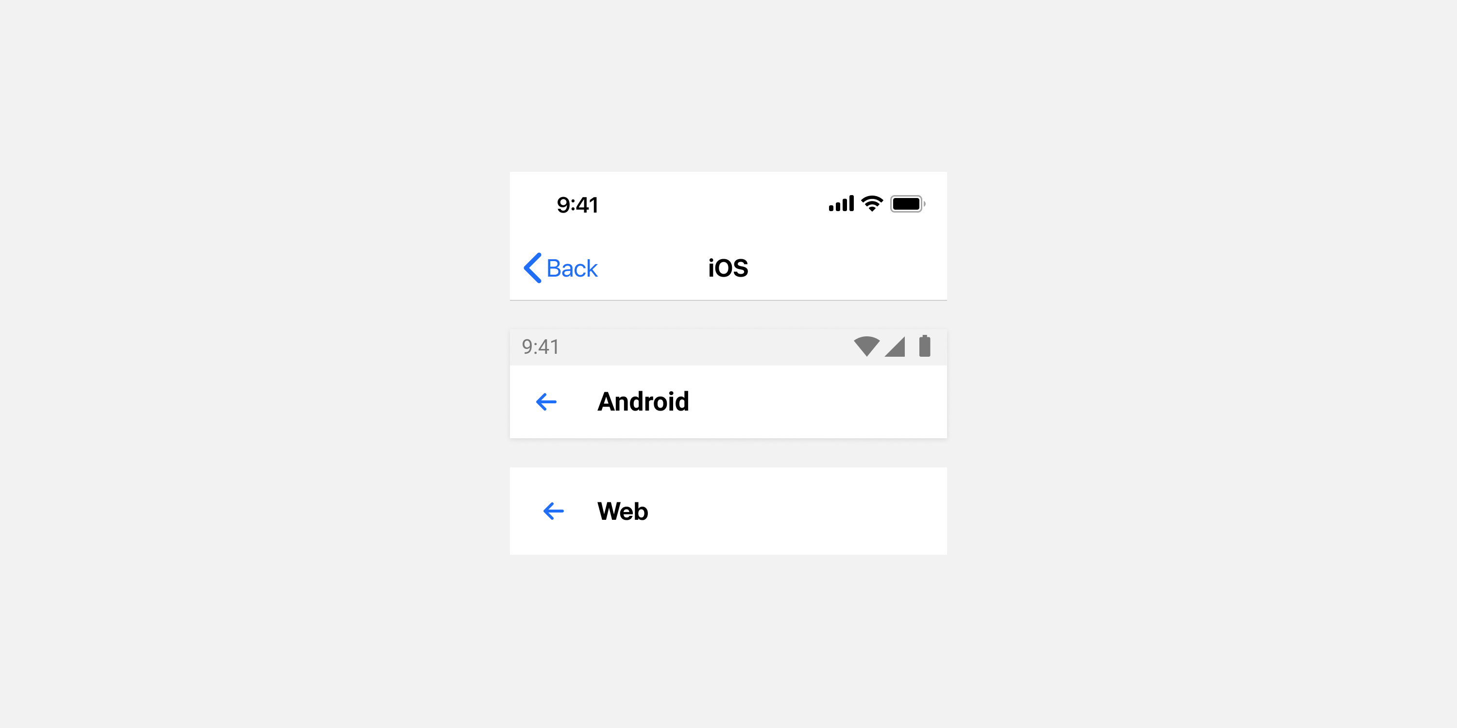
Aside from these platform deviations, at present, style is defined globally to establish consistency across platforms.
Error and loading states
Each SDK may be in one of the following three temporary states:
- No internet connection;
- An API issue;
- Loading.
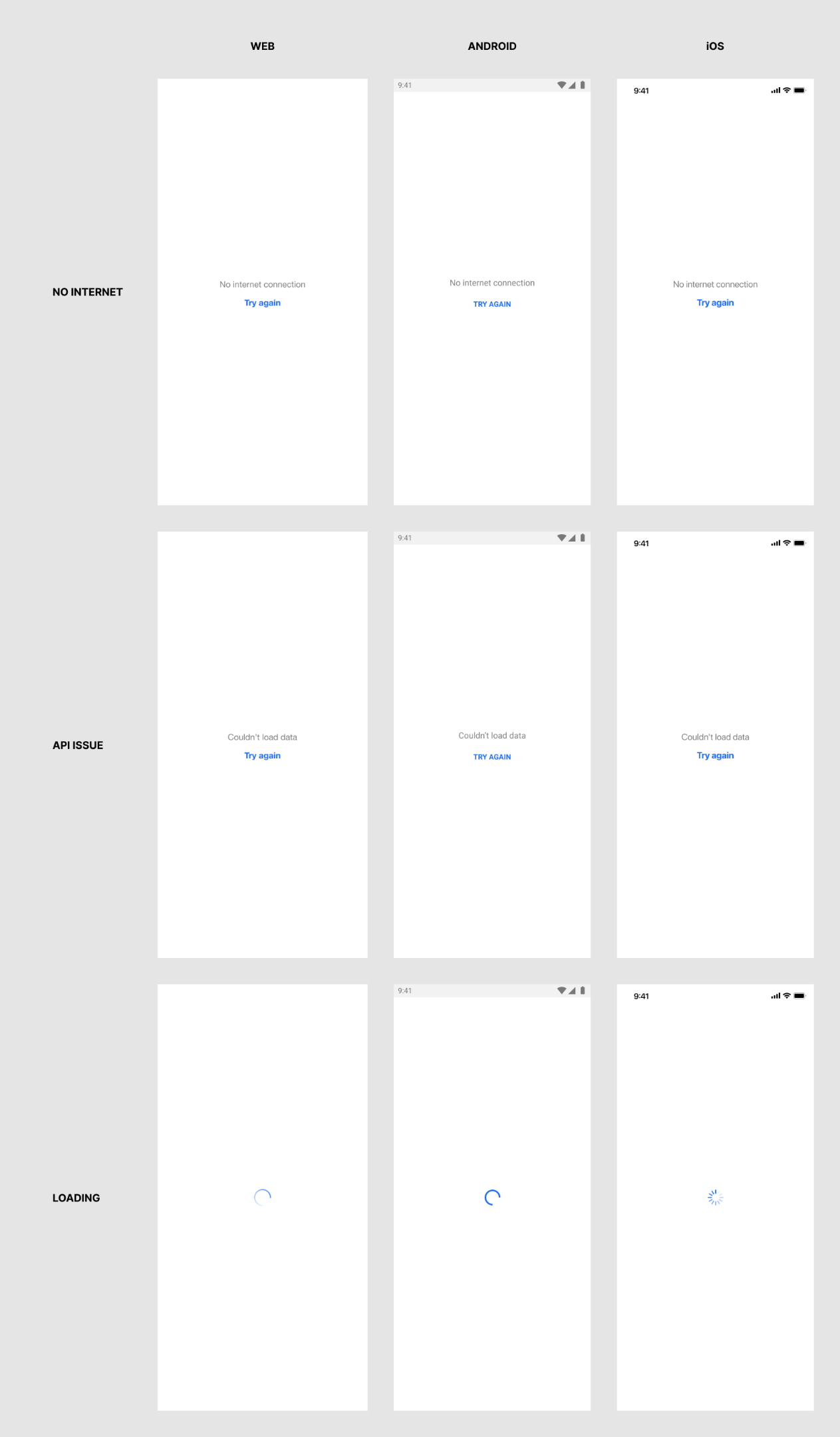
There are two ways these states may be styled, depending on whether a theme has been cached on-device yet. When a stream container is loaded for the first time on a device, the SDK-level configuration options are used. On subsequent loads, once a theme has been cached, this theme is used to style the error and loading states.
This information applies to all display modes for all platforms, except single card view. For single card view, no visual error or loading states are shown at all, but instead the container is set to a collapsed state whilst loading or in an error state, as the intention for the single card view is to be as unobtrusive as possible.
Customizable style attributes
Workbench theme
These theme elements are used once a cached theme has been downloaded on the user's device.
- Message and button text: See Error overlay in the theme reference.
- Loading indicator: See Loading spinner in the theme reference.
If you wish to match your theme to the default style set by via the SDK on first load, the values are as follows:
- iOS
- Message text: San Francisco, 17px, weight regular(400)
- Button text: San Francisco, 17px, weight bold(700)
- Android
- Message text: Roboto, 16px, weight regular(400)
- Button text: Roboto, 14px, weight bold(700)
- Web
- Message text: System default font stack, 16px, weight regular(400)
- Button text: System default font stack, 16px, weight bold(700)
SDK configuration
These theme attributes are set in code by your development team, and apply only on the first load of a theme for a stream container. Note that the SDK configuration has limited customizable style attributes for message text and button text, to reduce complexity while loading a theme for the first time.
- Message text: Color
- Button text: Color
- Loading indicator: Color
See configuration detail documentation for iOS, Android, or Web.
Themes
In the Atomic Workbench, style is set in the theme editor, where you can edit, add, or delete themes. Go to: Configuration > SDK > Container themes.
The theme editor generates a structured JSON object. When editing the theme, you can edit the raw JSON by selecting the overflow menu then 'Show JSON'.
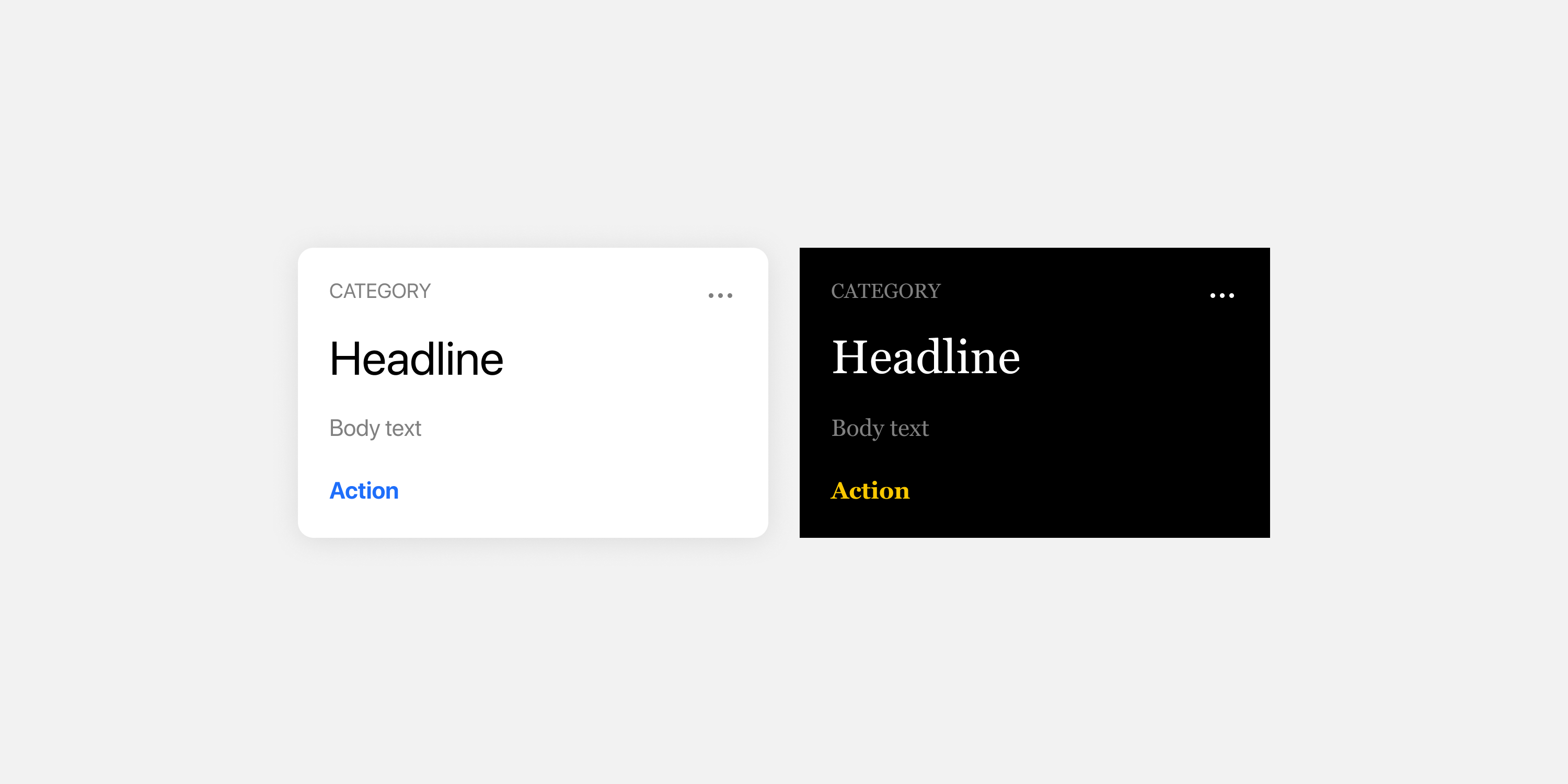
As a rule, most non-layout stylistic attributes are fully customizable. For example, you're able to define border radius, background color or font weight on a button to match your design language, but not layout properties like width or margin.
Fonts
Custom fonts can be added within the theme editor, and referenced in the theme. You can reference hosted OpenType (.otf) or TrueType (.ttf) fonts by url, or use fonts already embedded in your application, for iOS and Android.
If a font is not specified, Atomic uses the following fallbacks:
iOS
San Francisco
Android
Roboto
Web
The default of sans-serif is the last resort and will be different depending on operating system:
- Apple operating systems will use San Francisco
- Windows will use Segoe UI
- Chromebooks will use Roboto
- The fallback chain is: -apple-system, system-ui, BlinkMacSystemFont, "Segoe UI", Roboto, "Helvetica Neue", Arial, sans-serif;
If you specify a default font in the theme, Atomic will use that font in every place you have not defined a font.
Embedded fonts
When creating your stream container's theme in the Atomic Workbench, you optionally define custom fonts that can be used by the stream container for UI elements. When defined in the Workbench, these fonts must point to a remote URL, so that the SDK can download the font, register it against the system and use it.
It is likely that the custom fonts you wish to use are already part of your app, particularly if they are a critical component of your brand identity. If this is the case, you can have a stream container font - with a given font family name, weight and style - reference a font embedded in your app instead. This is also useful if the license for your font only permits you to embed the font and not download it from a remote URL.
Position
Elements can be displayed within cards and subviews in any order. However, as mentioned above, their layout attributes are defined by Atomic and cannot be customized. An exception to this is the control over arrangement and spacing of action buttons as outlined below. To rearrange elements, simply drag them into the desired order in the Workbench card builder. There are only a few elements that cannot be re-arranged, to keep the user experience consistent – these are listed below.
Element positions
| Element | Position |
|---|---|
| Category | Top left of card, or below a banner image if it is the first element in the card |
| Overflow menu | Top right of card |
| Images and videos in the banner format | Top of card |
| Card actions | Bottom of card, in any order |
| Subview buttons | Bottom of subview, in any order |
| All other content | Any order |
Action button layout
The theme editor allows control over the arrangement and spacing of action buttons within a card. You are able to customize whether these buttons follow a horizontal or vertical layout as well as the spacing between the action buttons. When action buttons are configured to have a vertical layout you can additionally control whether the buttons should fill the width of the card or if the width should be dictated by the button contents. In the case of buttons fitting the content width, you can control the horizontal alignment of the buttons.
Button layout is customizable at both the top-level card & subview levels, but within those levels the same settings apply to both primary & secondary action button variants.
Variants
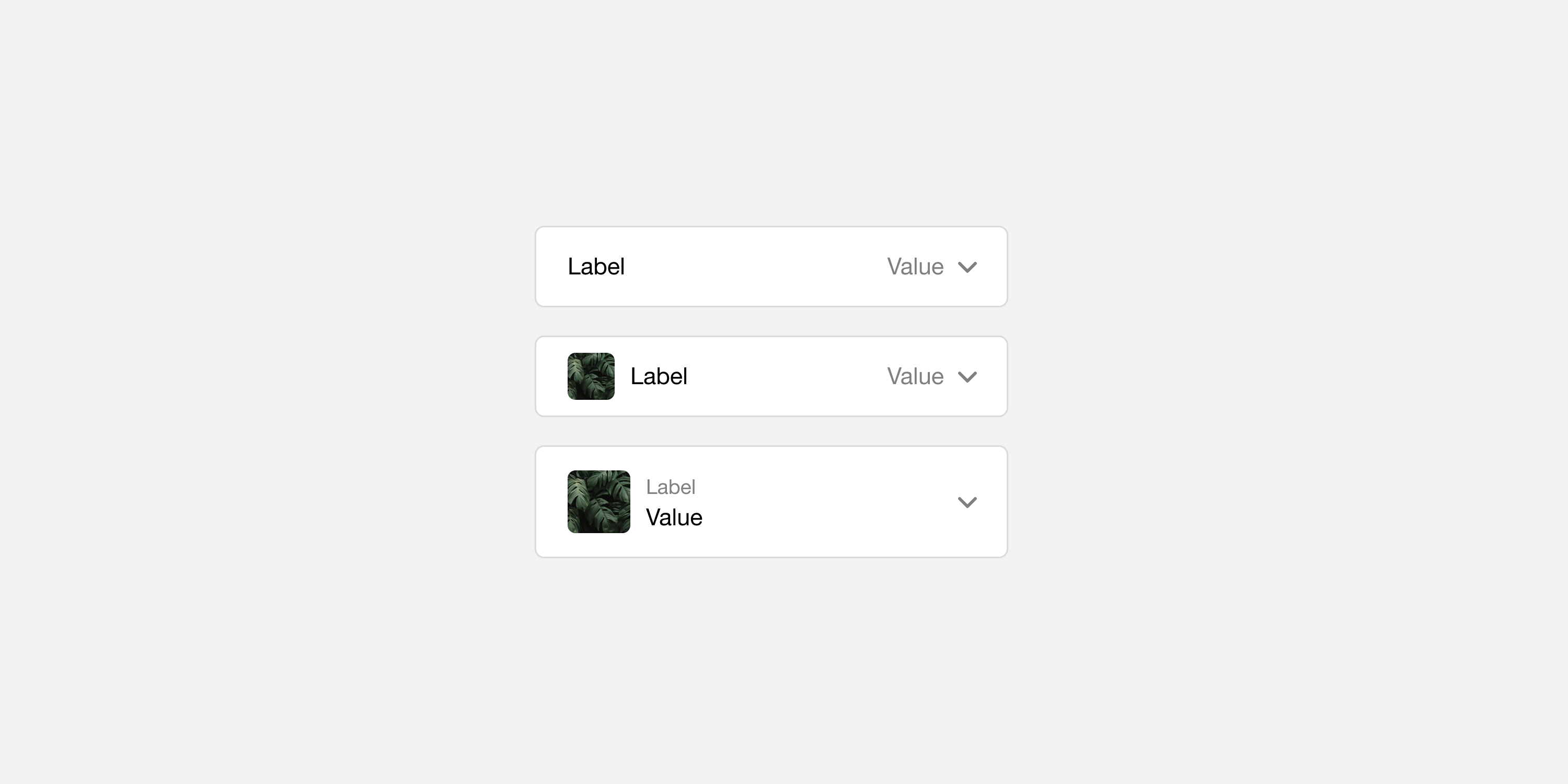
Understanding that the default design provided by a white-label product like Atomic may not align exactly with your design language, many elements offer several different design variants to provide you with additional flexibility. For example, images can be displayed as they are, or as a thumbnail with accompanying text. Similarly, inputs can be displayed in multiple formats such as on a single line, stacked with a floating label, or placed alongside an optional image.
Action button variants
The theme editor in the workbench allows you to create a distinct appearance for your application's action buttons. Two categories of variants can be defined: Primary and Secondary styles. These styles options are available at both the top-card level and on subviews.
Primary Style: This is the default style applied to action buttons. It includes all the customizable attributes such as background color, border style, typography, and title alignment.
Secondary Style: This style is applied to secondary action buttons, the same set of customizable attributes as the primary style has are available here.
These styles are independent of each other, offering a broad set of style attributes to create a visually engaging user interface.
Fallback rules to the secondary style
When defining styles, it's crucial to understand the fallback rules that ensure a cohesive appearance across your application. Below are the established fallback rules:
-
Initial State: Existing and newly created themes will not have any values set for ‘secondary’ buttons at either the top-level or subview.
-
Inheritance: When no values are defined for a secondary button, either at the top-level or subview, it will inherit the styling of the primary button at that same level.
-
Partial Definition: As soon as any one of the properties for a secondary button is defined, the button will no longer inherit the primary button styling.
-
Incomplete Configuration: If only some properties of the secondary button are defined, the undefined properties will revert to the SDK’s default styles (often rendered in black and white).
Summary: Secondary button styles default to primary button styles when undefined. However, if you begin to theme secondary buttons, ensure you define all relevant properties to prevent falling back to the SDK defaults.
Theme definition
You can define your theme in the Theme editor in the workbench UI; all of the settings you choose are then saved as a JSON object. Read the Themes section in this page if you want to know how to edit the raw JSON.
Font families
Custom font families are supported across all SDKs. You can declare as many fonts as you like in your theme definition, each with any number of weights. OpenType (OTF), TrueType (TTF) and Web Open Font (WOFF & WOFF2) fonts are supported.
A font is unique by a combination of its font name, style and weight. This means that if you want to use the same font, but with different weights, you need to import it for each combination.
Custom font families have the following properties:
- fontFamily: The name of the font family. A font is unique by a combination of its font name, style and weight.
- weight: Expressed as a numerical value, including 400 for
regularor 700 forbold. - style: Either
normaloritalic. - src: The HTTPS URL to download the font from.
The type of font (either OpenType or TrueType) is inferred from the file extension in the src attribute. Ensure your font URL has a file extension of either otf, ttf, woff or woff2 otherwise your font may not be registered correctly.
Colors
Color objects are defined as a hex color code, with an associated opacity:
- color: The hex color code for the color; e.g.
#00FF00. - opacity: The opacity of the color, between 0 and 1.
Typography
Typography styles are defined as an object with a font family name, size, transform, weight, style and line height.
When resolving fonts in the SDKs, the combination of font family, weight and style is used.
Add a separate font variable for every combination of name, weight and style that you use on components unless the font is already present on the target device. If there is no matching variable then the text will fall back to a system default font.
Typography properties are:
- fontFamily: The name of the custom font family to use. To use the system font for the platform, you can omit this property. The system font is San Francisco on iOS, Roboto on Android and a platform-specific font on Web.
- size: The size to use for the font, as a string with a
pxsuffix; e.g.15px. - transform: Transformation to apply to the text - either
noneoruppercase. - weight: Font weight to use - either
normalorbold. - style: Font style to use - either
normaloritalic. - lineHeight: The line height to apply to the font, as a decimal. Omitting this property is equivalent to using a value of
1.
Shape
Shape properties are used to express measurements used by the SDK, including border radius, shadow blur, offset, paddings and border widths. Their value is a pixel value as a string; e.g. 10px.
The following rules apply to shape properties across platforms:
- On iOS, the value is interpreted in points (pt);
- On Android, the value is interpreted in device pixels (dp);
- On Web, the value is interpreted in pixels.
Markdown
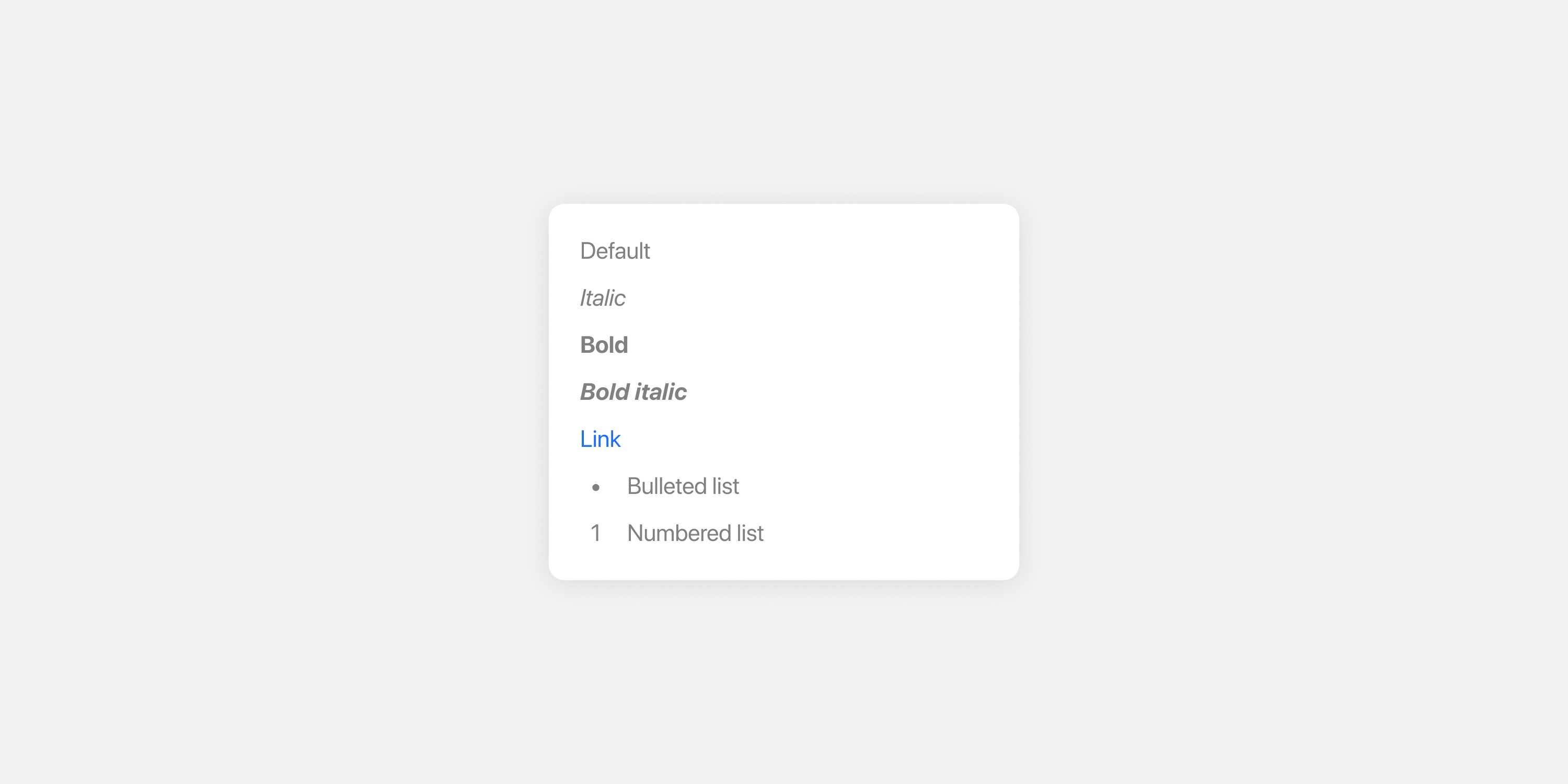
Text formatting is available using a subset of Markdown features on text elements.
Supported Markdown features
| Feature | Syntax |
|---|---|
| Italic | *Text* |
| Bold | **Text** |
| Bold italic | ***Text*** |
| Bulleted list | - Text |
| Numbered list | 1. Text |
| Link | [Label](URL) |
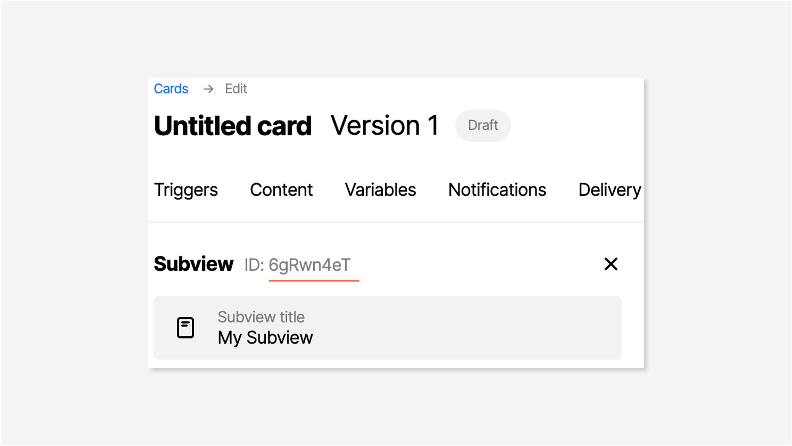
Link to subview
When using the Link syntax, you can point it to one of the subviews you created in the Workbench. The syntax is [Label](subview:Id)Id is the unique ID of a subview, which can be accessed on the subview page in the Workbench.
Vertical Alignment
Vertical alignment properties are used to place elements in a designated place. For example, when displaying cards in modal containers. Supported alignments are: top, center and bottom.
Theme editor
The theme editor is located at Configuration > SDK > Container themes.
In the theme editor, the preview switcher on the right enables you to look at your specific cards, to see what they will look like with that theme applied.
The editable elements of the theme are divided into 5 categories in the UI:
- Variables
- Containers
- Top-level card
- Subview
- System
Each of these is covered below in the Theme reference.
Theme reference
The list below contains a description of the properties of each theme and style element. Each of these are customizable in the Workbench. Their dot notation name references a path expression within the JSON object.
Variables
Different types of variables that can be used throughout the rest of the theme to allow quick updates across multiple elements at once.
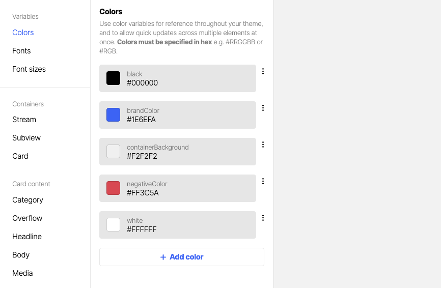
Colors
Color variables can be referenced throughout your theme wherever colors are specified. Colors must be specified in hex e.g. #RRGGBB or #RGB.
Fonts
Font variables can be referenced throughout your theme wherever font families are specified.
They are specified in otf or ttf, woff or woff2 format.
If you allocate a default font in the theme, Atomic will use that font in every place you have not defined a font.
Text styles
Text styles variables can be referenced throughout your theme wherever font sizes or line heights are specified. They must be specified in px.
Spacing
Spacing variables can be referenced throughout your theme wherever pixel based size/spacing is specified. They must be specified in px.
Containers
The Container of streams and subviews.
Stream
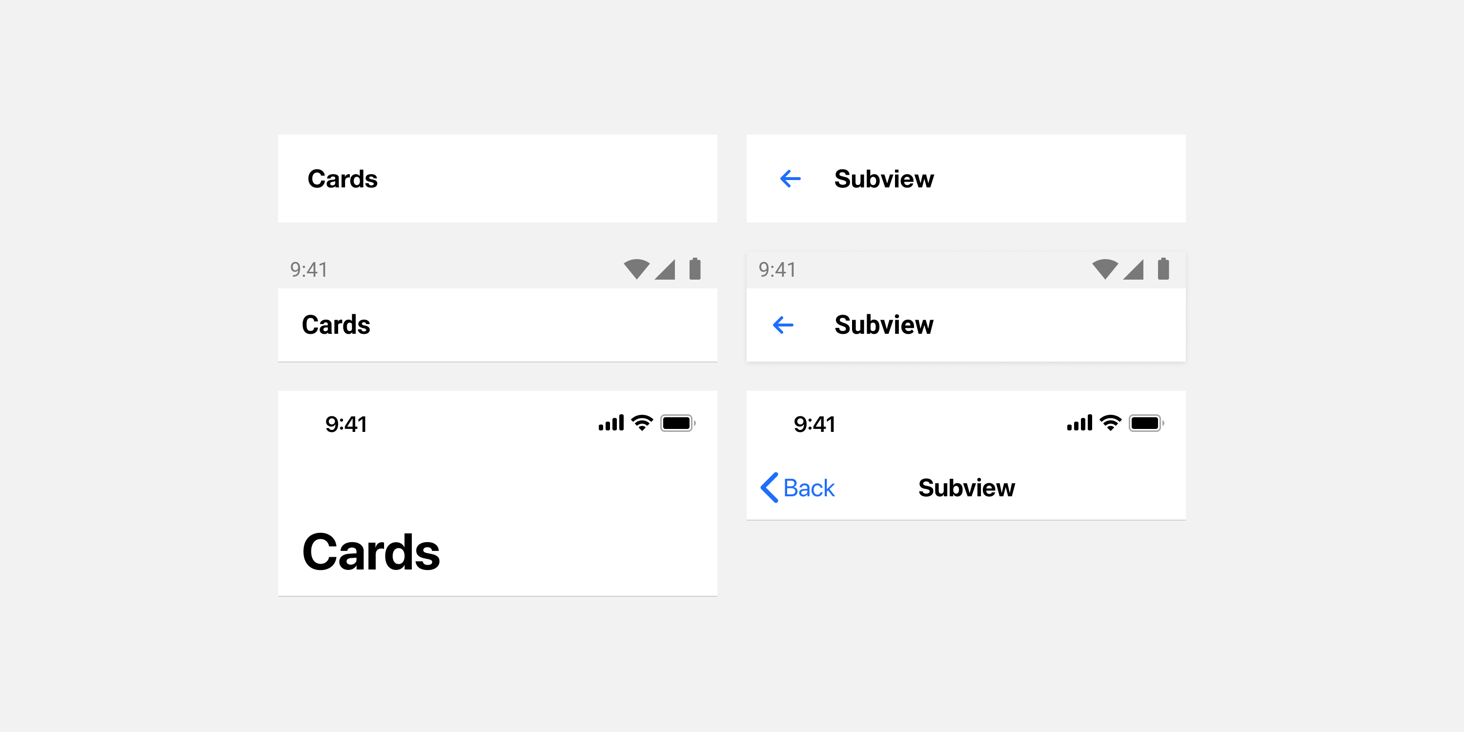
Header button
| Description | Name | Type |
|---|---|---|
| Color for navigation bar buttons | feed.colors.text.navigationAction | Color |
| Typography style for navigation bar buttons | feed.typography.navigationAction | Typography |
Header text, large
| Description | Name | Type |
|---|---|---|
| Color of large navigation bar title | feed.colors.text.listTitle | Color |
| Typography style for large navigation bar title | feed.typography.listTitle | Typography |
Header text
| Description | Name | Type |
|---|---|---|
| Color of the navigation bar title | feed.colors.text.navigationTitle | Color |
| Typography style for the navigation bar title | feed.typography.navigationTitle | Typography |
Header background
| Description | Name | Type |
|---|---|---|
| Background color for the navigation bar | feed.colors.background.navigation | Color |
Header shadow
| Description | Name | Type |
|---|---|---|
| Color of the navigation bar shadow | feed.colors.shadow.navigation | Color |
| Blur radius for the navigation bar shadow | feed.shape.blur.navigationShadow | Shape |
| Vertical offset for the navigation bar shadow | feed.shape.offset.navigationShadow | Shape |
Body background
| Description | Name | Type |
|---|---|---|
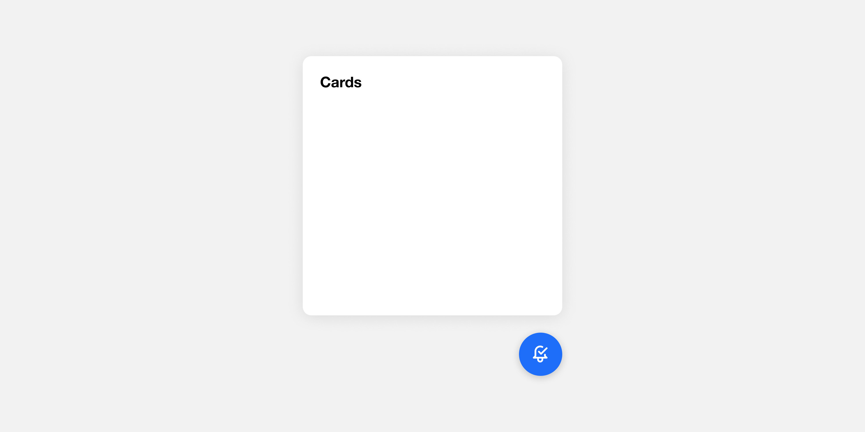
| Background color for the stream container or subview. This property is ignored for the stream container in single card view. | feed.colors.background.default | Color |
Padding
Requires SDK 25.3.0 or higher
Padding between the edge of the stream container and the content inside it.
| Description | Name | Type |
|---|---|---|
| Whether to use the same padding width on all sides | feed.shape.equalPaddings.stream | Switch |
| The width applied when using the same padding width on all sides | feed.shape.padding.streamWidth | Shape |
| The top padding, when using the same padding width option is disabled | feed.shape.padding.streamTop | Shape |
| The right padding, when using the same padding width option is disabled | feed.shape.padding.streamRight | Shape |
| The bottom padding, when using the same padding width option is disabled | feed.shape.padding.streamBottom | Shape |
| The left padding, when using the same padding width option is disabled | feed.shape.padding.streamLeft | Shape |
Space between cards
Requires SDK 25.3.0 or higher
| Description | Name | Type |
|---|---|---|
| The space between one card and the next in a multi-card container | feed.shape.spaceBetweenCards.global | Shape |
Subview
Header action
| Description | Name | Type |
|---|---|---|
| Color for navigation bar buttons | workflow.colors.text.navigationAction | Color |
| Typography style for navigation bar buttons | workflow.typography.navigationAction | Typography |
Header text
| Description | Name | Type |
|---|---|---|
| Color of the navigation bar title | workflow.colors.text.navigationTitle | Color |
| Typography style for the navigation bar title | workflow.typography.navigationTitle | Typography |
Header background
| Description | Name | Type |
|---|---|---|
| Background color for the subview navigation bar | workflow.colors.background.navigation | Color |
Header shadow
| Description | Name | Type |
|---|---|---|
| Color of the subview navigation bar shadow | workflow.colors.shadow.navigation | Color |
| Blur radius for the subview navigation bar shadow | workflow.shape.blur.navigationShadow | Shape |
| Vertical offset for the subview navigation bar shadow | workflow.shape.offset.navigationShadow | Shape |
Body background
| Description | Name | Type |
|---|---|---|
| Background color of a subview | workflow.colors.background.default | Color |
Padding
Requires SDK 25.3.0 or higher
Padding between the edge of the subview and the content inside it.
| Description | Name | Type |
|---|---|---|
| Whether to use the same padding width on all sides | workflow.shape.equalPaddings.stream. | Switch |
| The width applied when using the same padding width on all sides | workflow.shape.padding.streamWidth | Shape |
| The top padding, when using the same padding width option is disabled | workflow.shape.padding.streamTop. | Shape |
| The right padding, when using the same padding width option is disabled | workflow.shape.padding.streamRight. | Shape |
| The bottom padding, when using the same padding width option is disabled | workflow.shape.padding.streamBottom | Shape |
| The left padding, when using the same padding width option is disabled | workflow.shape.padding.streamLeft | Shape |
Top-level card
The default view of a card.
Card
Background
| Description | Name | Type |
|---|---|---|
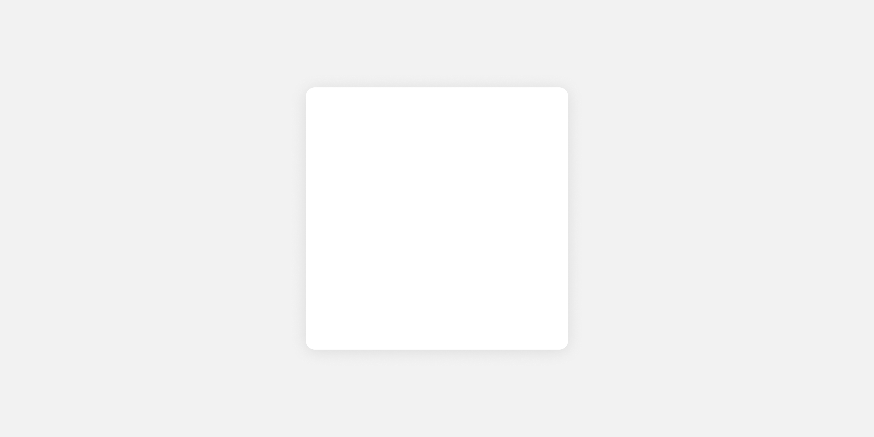
| Background color for a card | feed.colors.background.card | Color |
Border
| Description | Name | Type |
|---|---|---|
| Color of the border around a card | feed.colors.border.card | Color |
| Width of the border around a card | feed.shape.border.card | Shape |
| Border radius applied to a card | feed.shape.borderRadius.card | Shape |
Shadow
| Description | Name | Type |
|---|---|---|
| Color of the shadow behind a card | feed.colors.shadow.card | Color |
| Blur radius for the shadow behind a card | feed.shape.blur.cardShadow | Shape |
| Vertical offset of the shadow behind a card | feed.shape.offset.cardShadow | Shape |
Padding
Requires SDK 25.3.0 or higher
Padding between the edge of the card and the content inside it.
| Description | Name | Type |
|---|---|---|
| Whether to use the same padding width on all sides | feed.shape.equalPaddings.card | Switch |
| The width applied when using the same padding width on all sides | feed.shape.padding.cardWidth | Shape |
| The top padding, when using the same padding width option is disabled | feed.shape.padding.cardTop | Shape |
| The right padding, when using the same padding width option is disabled | feed.shape.padding.cardRight | Shape |
| The bottom padding, when using the same padding width option is disabled | feed.shape.padding.cardBottom | Shape |
| The left padding, when using the same padding width option is disabled | feed.shape.padding.cardLeft | Shape |
Space between elements
Requires SDK 25.3.0 or higher
Spacing between card elements.
Note: Buttons have a separate property for space between.
Note: If no action buttons are configured, no space will be shown after the content.
| Description | Name | Type |
|---|---|---|
| Spacing between card elements | feed.shape.padding.elementBottom | Shape |
Category
Typography
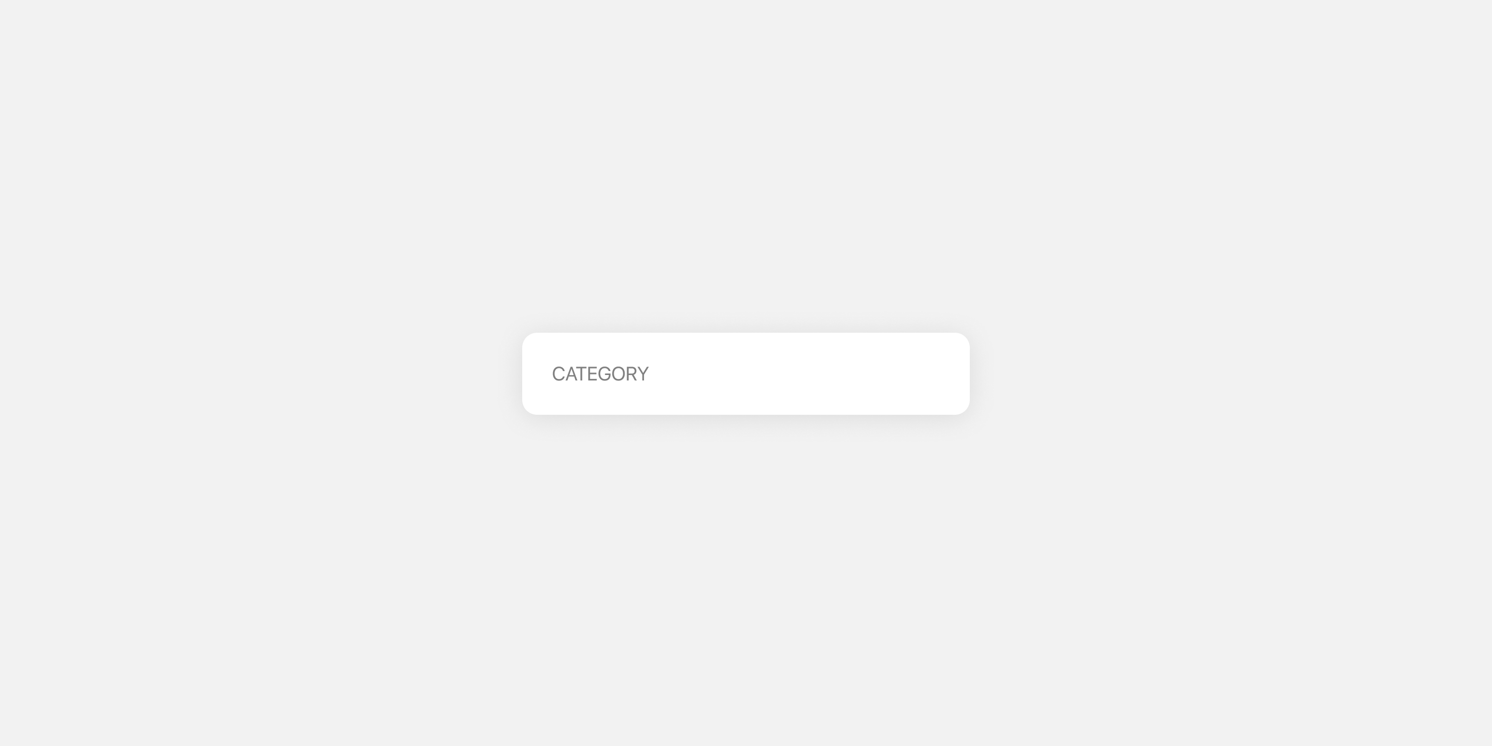
Styles applied to the category label, usually displayed in the top left of a card.
| Description | Name | Type |
|---|---|---|
| Text color for the card category | feed.colors.text.category | Color |
| Typography style for the card category | feed.typography.category | Typography |
Menu
Button icon
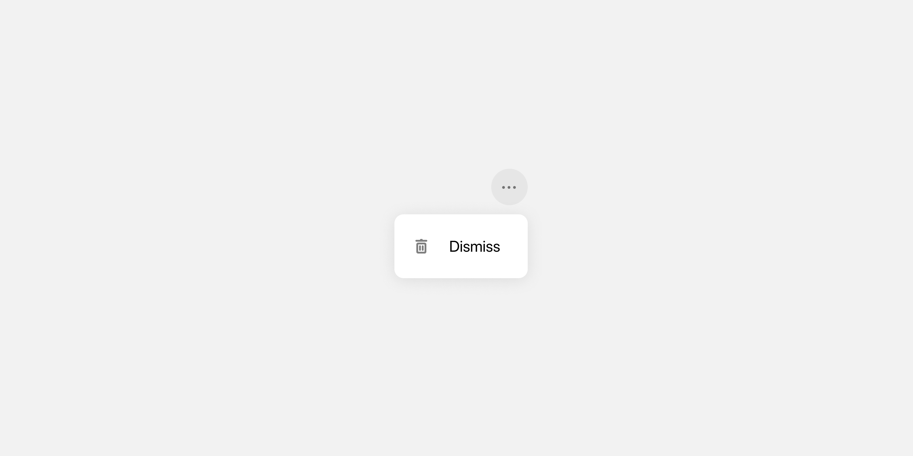
Icon color for the button displayed in the top right of a card, which opens the card menu.
| Description | Name | Type |
|---|---|---|
| Color of the overflow icon | feed.colors.icon.options | Color |
Button background
Background color for the button displayed in the top right of a card, which opens the card menu.
| Description | Name | Type |
|---|---|---|
| Background color of the overflow icon | feed.colors.background.options | Color |
Button states
Icon and background color applied to the card menu button when active.
| Description | Name | Type |
|---|---|---|
| Color of the overflow icon when in the active state | feed.colors.icon.optionsActive | Color |
| Background color of the overflow icon when it is in the active state | feed.colors.background.optionsActive | Color |
Item icon
Icon color for items displayed in the card menu.
| Description | Name | Type |
|---|---|---|
| Icon color for items in the overflow menu | feed.colors.icon.sheetItem | Color |
| Icon color for items in the overflow menu when active | feed.colors.icon.sheetItemActive & workflow.colors.icon.sheetItemActive | Color |
Item text
| Description | Name | Type |
|---|---|---|
| Text color of items in the overflow menu | workflow.colors.text.sheetItem & feed.colors.text.sheetItem | Color |
| Text color of items in the overflow menu when active | workflow.colors.text.sheetItemActive & feed.colors.text.sheetItemActive | Color |
| Typography style applied to overflow menu items | workflow.typography.sheetItem & feed.typography.sheetItem | Typography |
Item background, active
| Description | Name | Type |
|---|---|---|
| Background color applied to overflow menu items when they are in the active state | workflow.colors.background.sheetItemActive & feed.colors.background.sheet | Color |
Menu divider
| Description | Name | Type |
|---|---|---|
| Color of the divider displayed between item groups in the overflow menu | workflow.colors.border.sheetItemDivider & feed.colors.border.sheetItemDivider | Color |
Menu background
| Description | Name | Type |
|---|---|---|
| Background color displayed behind the overflow menu when it is on screen | feed.colors.overlay.sheet & workflow.colors.overlay.sheet | Color |
| Border radius for the overflow menu | feed.shape.borderRadius.sheet | Shape |
Menu mask
Color fill behind the menu when open, which obscures the background content and brings focus to the open menu. Applies to iOS (stream container and single card view) and Android (single card view).
| Description | Name | Type |
|---|---|---|
| Color fill behind the menu | feed.colors.overlay.sheet.color & workflow.colors.overlay.sheet.color | Color |
Headline

Typography
Styles applied to headline elements in cards.
| Description | Name | Type |
|---|---|---|
| Text color of the headline text | feed.colors.text.headline | Color |
| Typography style to apply to headlines | feed.typography.headline | Typography |
Body
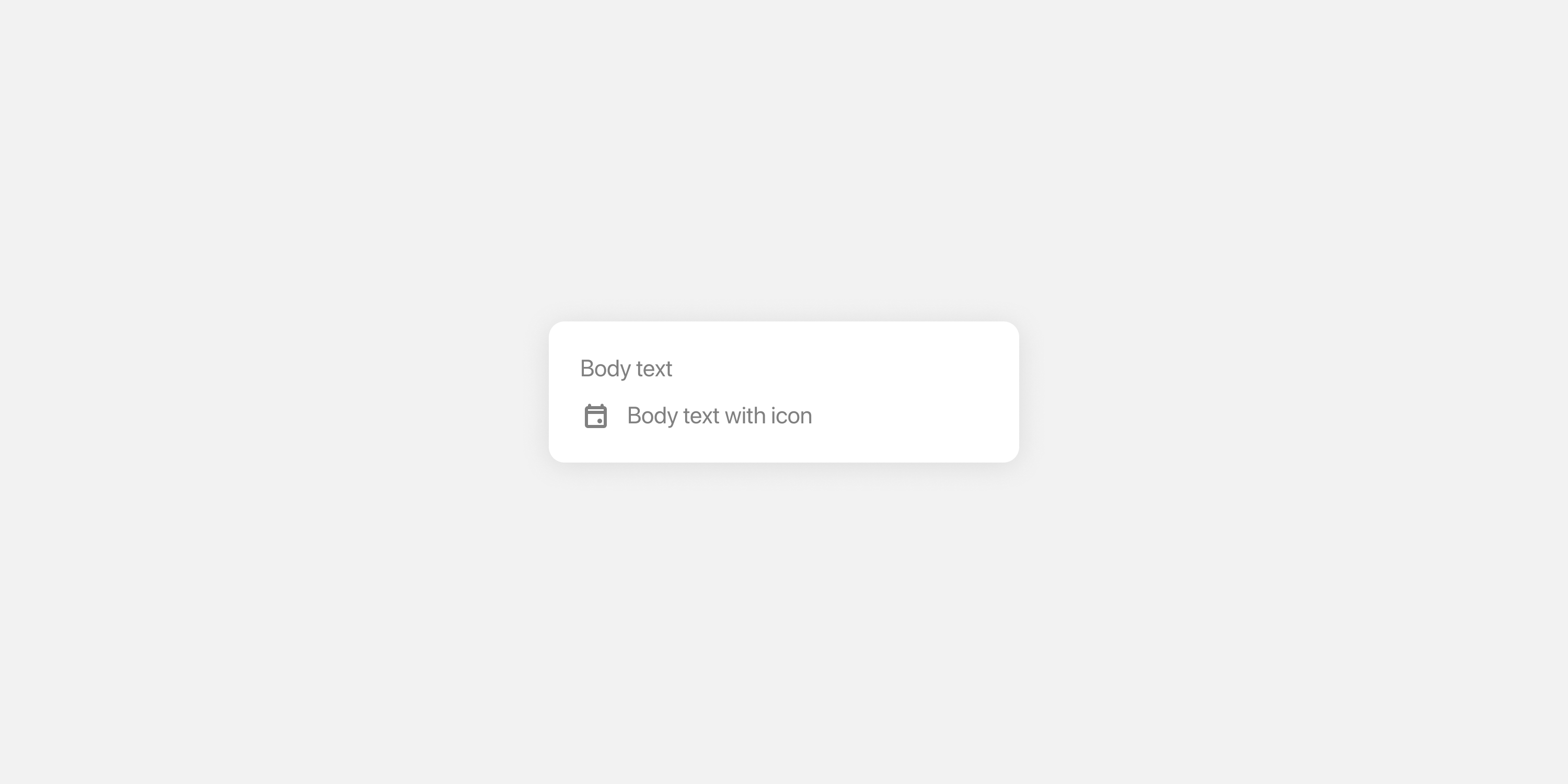
Text
Styles applied to body text - such as that inside of text blocks.
| Description | Name | Type |
|---|---|---|
| Text color for body text | feed.colors.text.body | Color |
| Typography style for body text | feed.typography.body | Typography |
Link text
| Description | Name | Type |
|---|---|---|
| Color to use for links in body text | feed.colors.text.link | Color |
Icon
| Description | Name | Type |
|---|---|---|
| Color of optional icon displayed to the left of body text | feed.colors.icon.body | Color |
Bullet point
| Description | Name | Type |
|---|---|---|
| Color for bullets displayed in body text (using Markdown) | feed.colors.icon.bullet | Color |
| Typography style for bullets | feed.typography.bullet | Typography |
Expand/collapse control
Requires SDK 25.2.0 or higher
| Description | Name | Type |
|---|---|---|
| Color for the control that expands and collapses text blocks | feed.colors.text.expandCollapse | Color |
| Typography style to apply to the control | feed.typography.expandCollapse | Typography |
| Spacing after ellipses, before the expand control label. | feed.shape.padding.expandCollapseLeft | Shape |
For the control’s typography, the font family, line height, and font size will inherit from the typography style used for body text.
Input
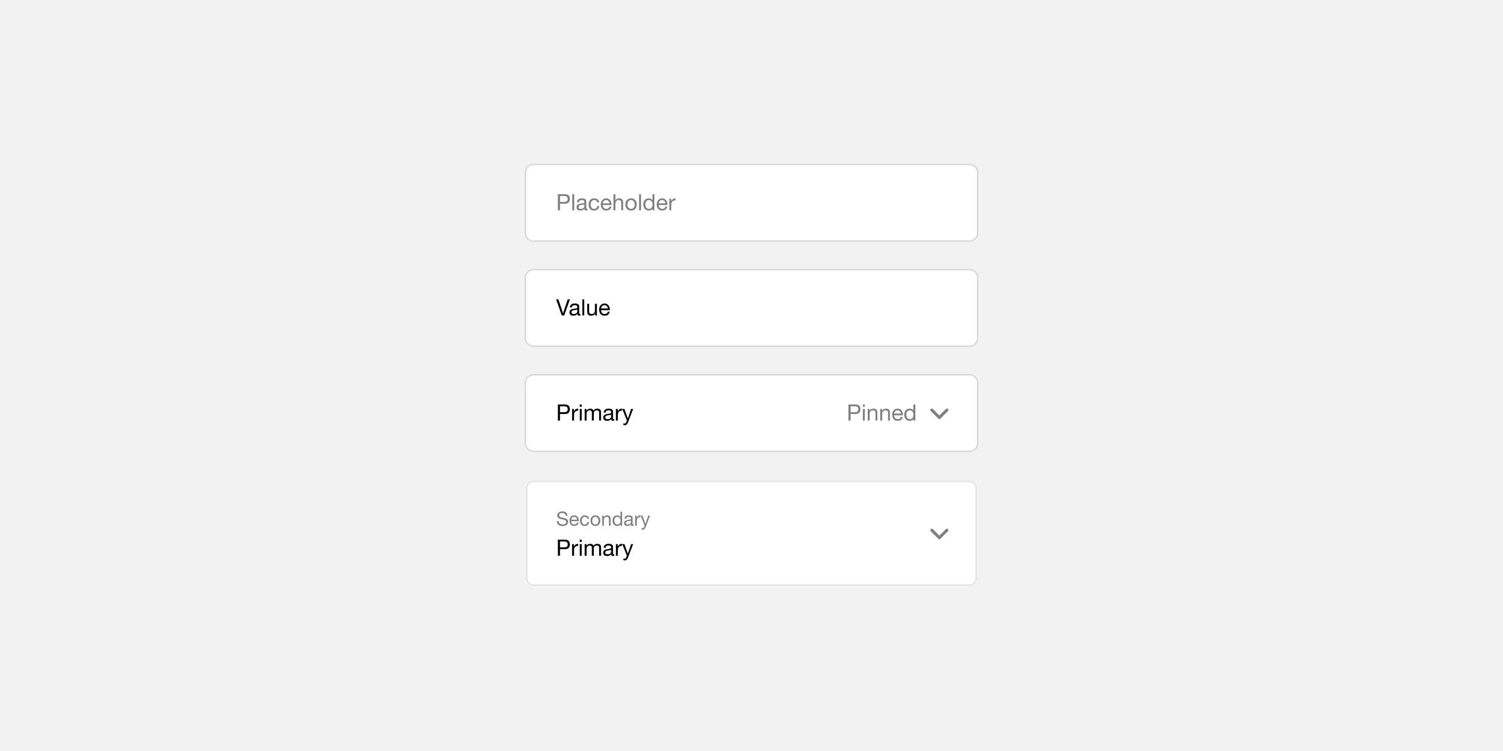
Label inline/Value stacked (Deprecated)
This combined configuration is deprecated in favour of the separate layout properties below (labelInline,
labelExternal,
valueStacked). When the new properties are not defined, Atomic will automatically apply these legacy values as fallbacks to maintain backwards compatibility.
Legacy color and text style that was used for both inline labels and stacked values. This style was applied to labels on inline date pickers and dropdowns, values on stacked date pickers and dropdowns, labels on steppers and switches, and entered values in text or number inputs.
| Description | Name | Type |
|---|---|---|
| Text color to use for primary text | workflow.colors.text.primary | Color |
| Typography style for primary text | workflow.typography.primary | Typography |
Label (inline, preview)
Requires SDK version 26.1.0 or higher.
Color and text style for labels displayed inline with their values.
| Description | Name | Type |
|---|---|---|
| Text color for inline labels | workflow.colors.text.labelInline | Color |
| Typography style for inline labels | workflow.typography.labelInline | Typography |
Label (stacked)
Color and text style for labels displayed above their values.
| Description | Name | Type |
|---|---|---|
| Text color for stacked labels | workflow.colors.text.pinned | Color |
| Typography style for stacked labels | workflow.typography.pinned | Typography |
Label (external, preview)
Requires SDK version 26.1.0 or higher.
Color and text style for labels displayed outside of input components.
| Description | Name | Type |
|---|---|---|
| Text color for external labels | workflow.colors.text.labelExternal | Color |
| Typography style for external labels | workflow.typography.labelExternal | Typography |
Value (inline)
Color and text style for values displayed inline.
| Description | Name | Type |
|---|---|---|
| Text color to use for secondary text | workflow.colors.text.secondary | Color |
| Typography style for secondary text | workflow.typography.secondary | Typography |
Value (stacked/external, preview)
Requires SDK version 26.1.0 or higher.
Color and text style for values displayed below their labels, and for values of external input fields.
| Description | Name | Type |
|---|---|---|
| Text color for stacked values | workflow.colors.text.valueStacked | Color |
| Typography style for stacked values | workflow.typography.valueStacked | Typography |
Placeholder text
Color for placeholder text in a text or number input.
| Description | Name | Type |
|---|---|---|
| Color to use for placeholder text in input fields | workflow.colors.text.hint | Color |
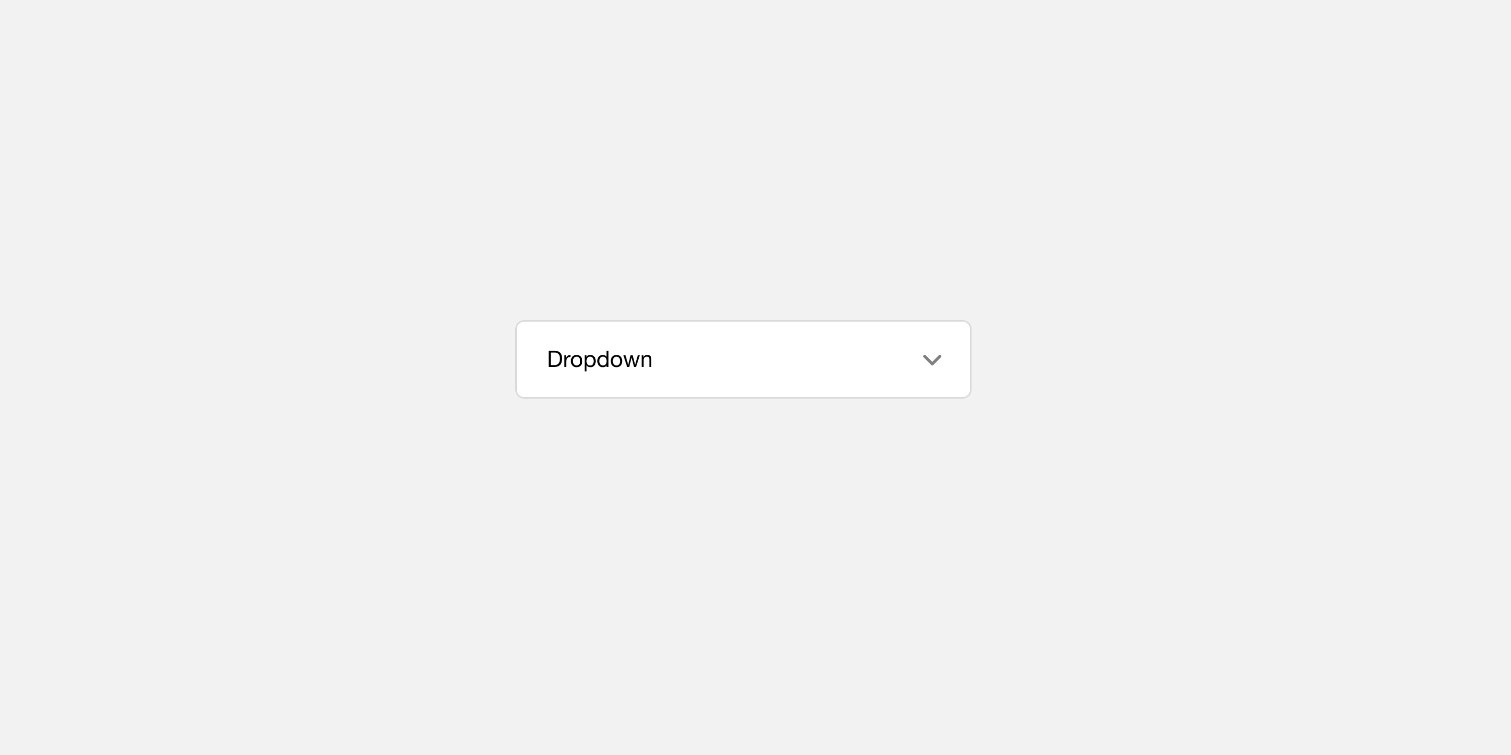
Dropdown icon
Styles applied to dropdown components (dropdowns and date pickers).
| Description | Name | Type |
|---|---|---|
| Color of the icon displayed to the right of the dropdown | workflow.colors.icon.dropdown | Color |
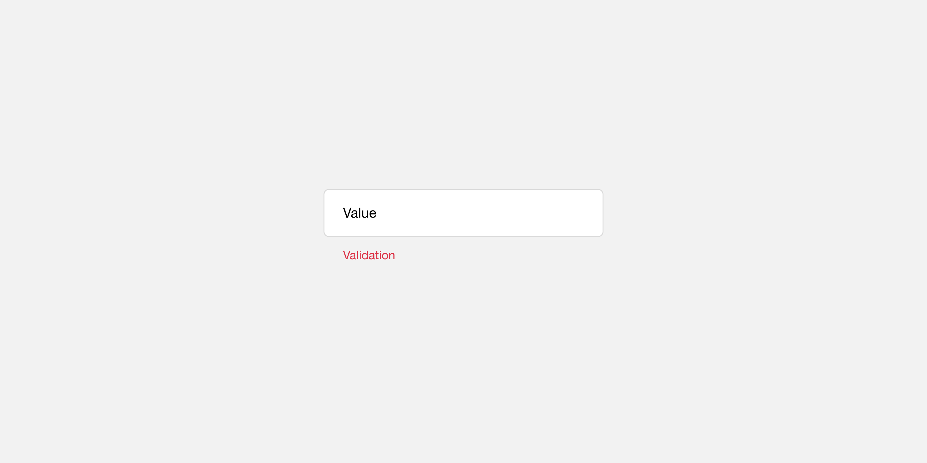
Validation text
Styles applied to validation messages on subviews.
| Description | Name | Type |
|---|---|---|
| Text color for validation messages | workflow.colors.text.error | Color |
| Typography style for validation messages | workflow.typography.error | Typography |
Stroke highlight
| Description | Name | Type |
|---|---|---|
| Color to use for the border on focused inputs | workflow.colors.border.inputActive | Color |
| Color to use for the border on non-focused inputs | workflow.colors.border.inputInactive | Color |
Border
| Description | Name | Type |
|---|---|---|
| Color to use for the border around a subview component | workflow.colors.border.component | Color |
Background
| Description | Name | Type |
|---|---|---|
| Background color of a subview component | workflow.colors.background.component | Color |
Switch
Styles applied to binary switches on subviews.
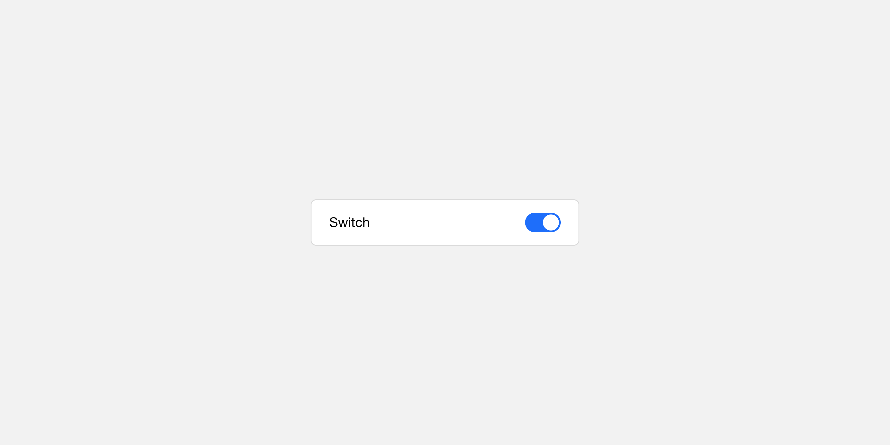
Unchecked
| Description | Name | Type |
|---|---|---|
| Color for the thumb on the switch when off | workflow.colors.icon.switchOff | Color |
| Color for the track when the switch is off | workflow.colors.background.switchOff | Color |
Checked
| Description | Name | Type |
|---|---|---|
| Color for the thumb on the switch when on | workflow.colors.icon.switchOn | Color |
| Color for the track when the switch is on | workflow.colors.background.switchOn | Color |
Stepper
Styles applied to numeric stepper components on subviews.
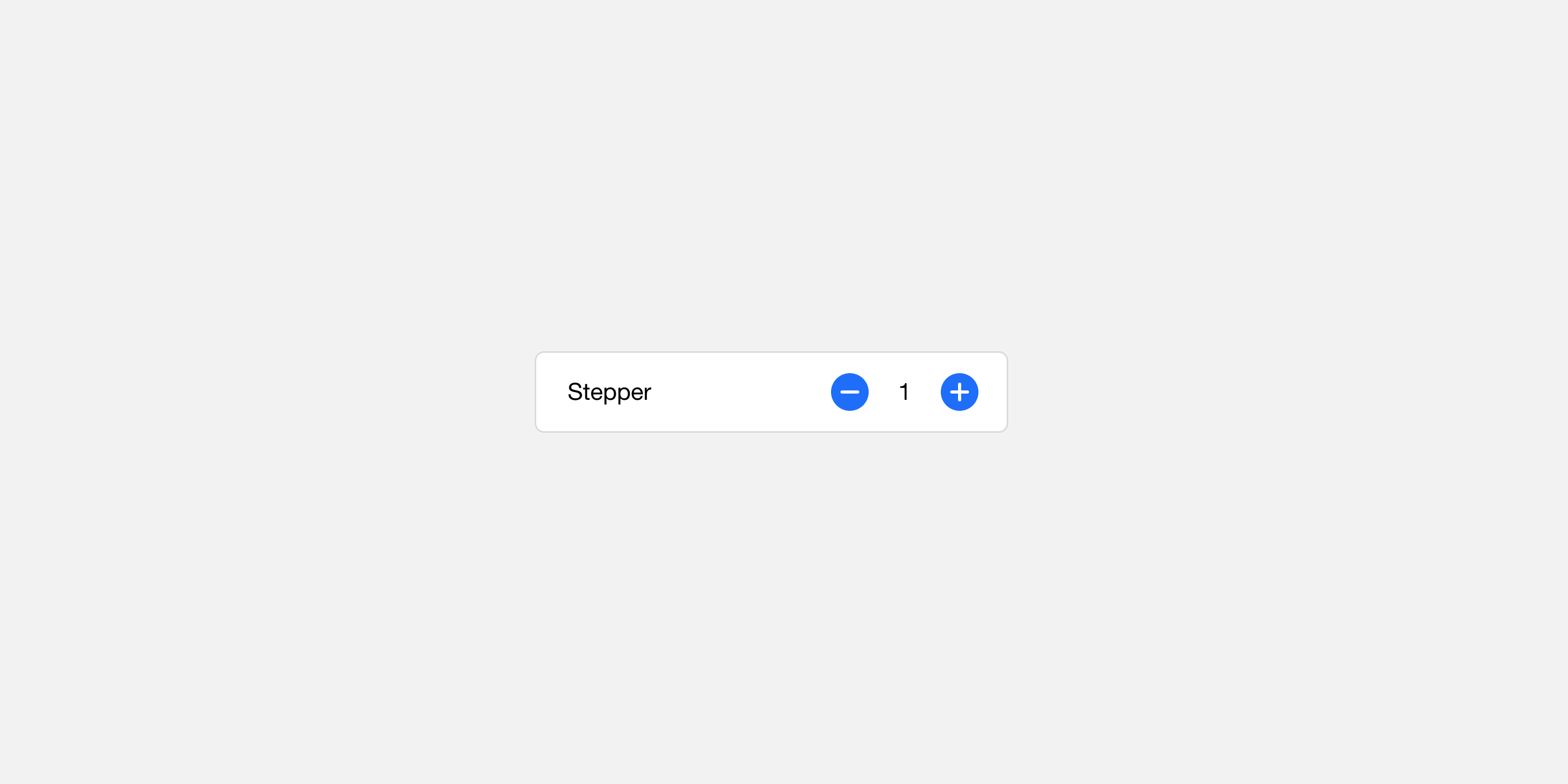
Button enabled
| Description | Name | Type |
|---|---|---|
| Color of the icon inside a stepper button | workflow.colors.icon.stepper | Color |
| Background color of the stepper buttons | workflow.colors.background.stepper | Color |
Button disabled
| Description | Name | Type |
|---|---|---|
| Color of the icon inside a stepper button when disabled | workflow.colors.icon.stepperDisabled | Color |
| Background color of stepper buttons when disabled | workflow.colors.background.stepperDisabled | Color |
Media
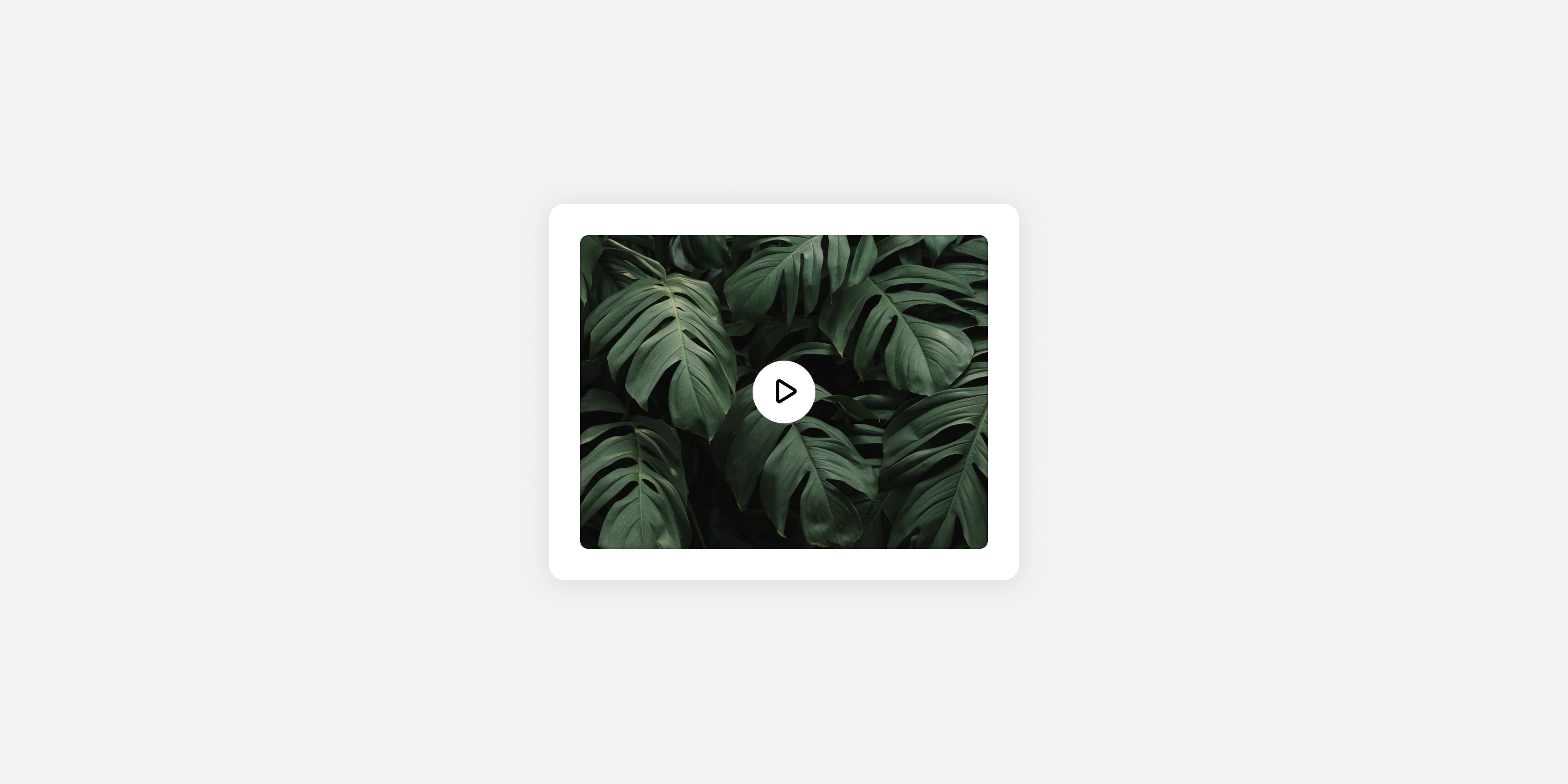
Border
| Description | Name | Type |
|---|---|---|
| Color for border around media elements | feed.colors.border.media | Color |
| Border radius for media elements | feed.shape.borderRadius.media | Shape |
Video tint
| Description | Name | Type |
|---|---|---|
| Color for overlay on videos (the play button sits on top of this overlay) | feed.colors.overlay.mediaBanner | Color |
Video play button
| Description | Name | Type |
|---|---|---|
| Icon color for play button on videos | feed.colors.icon.mediaControl | Color |
| Background color for play button on videos | feed.colors.background.mediaControl | Color |
Loading/empty state, stream
| Description | Name | Type |
|---|---|---|
| Background color for media while it is loading | feed.colors.background.media | Color |
| Color for icon indicating media type while loading | feed.colors.icon.mediaBanner | Color |
Loading/empty state, subview
| Description | Name | Type |
|---|---|---|
| Background color for media while it is loading | workflow.colors.background.media | Color |
| Color for icon indicating media type while loading | workflow.colors.icon.mediaBanner | Color |
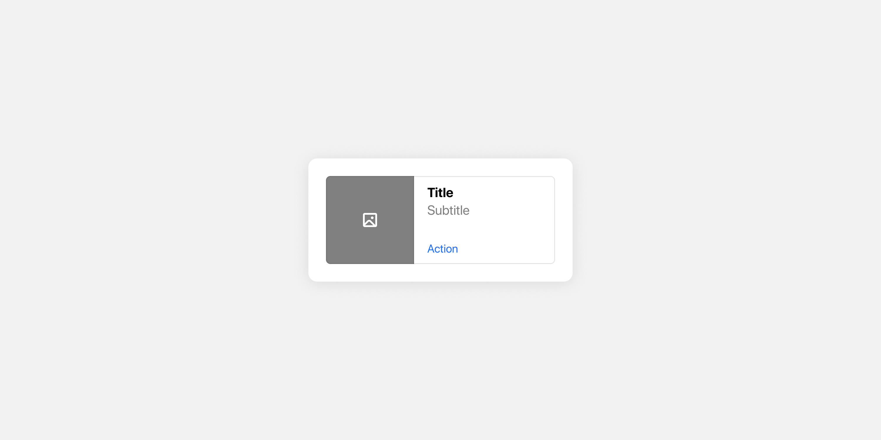
Thumb label
| Description | Name | Type |
|---|---|---|
| Color for the title on thumbnail media | feed.colors.text.mediaTitle | Color |
| Typography style for the title on thumbnail media | feed.typography.mediaTitle | Typography |
Thumb description
| Description | Name | Type |
|---|---|---|
| Color for the subtitle on thumbnail media | feed.colors.text.mediaSubtitle | Color |
| Typography style for the subtitle on thumbnail media | feed.typography.mediaSubtitle | Typography |
Thumb action
| Description | Name | Type |
|---|---|---|
Color for the action title on thumbnail media (e.g. Watch, View) | feed.colors.text.mediaAction | Color |
| Typography style for the action title on thumbnail media | feed.typography.mediaAction | Typography |
Thumb background
| Description | Name | Type |
|---|---|---|
| Background color for media using the thumbnail format | feed.colors.background.mediaThumbnail | Color |
Button
Styles applied to actions on cards (submit, dismiss, snooze, link and voting buttons).
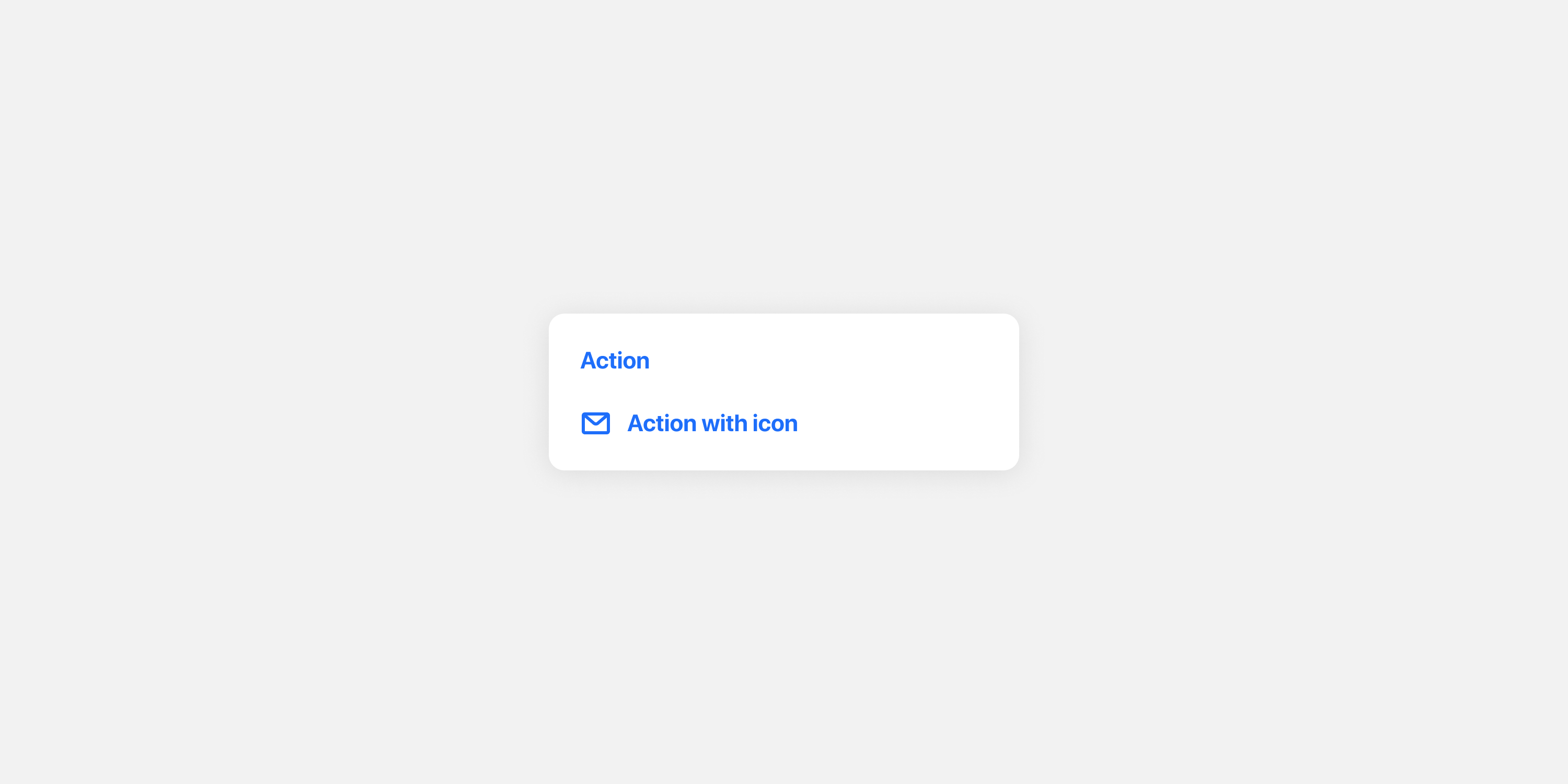
A wide variety of style attributes are available here to create a distinctive appearance for your application's action buttons. More detail about how these styles are applied can be found in the action button variants section.
Button group padding
Requires SDK 25.3.0 or higher
Introducing the concept of button groups. Buttons are now treated as being contained within a single button group, either on top-level cards or subviews. The button group itself is invisible, but it wraps all buttons so you can adjust them as a unified UI element in terms of padding and spacing.
A button group has its own padding, independent of the card’s padding. For example, you can set the card padding to 20 on all four sides, while setting the button group padding to (top: 30, left: 0, right: 0, bottom: 20). This allows you to create slightly more space between the buttons and other components on the card, making the layout more distinguishable — while still allowing buttons to span the full card width, even as other components retain the standard 20 horizontal padding.
| Description | Name | Type |
|---|---|---|
| Whether to use the same padding width on all sides | feed.shape.equalPaddings.buttonGroup | Switch |
| The width applied when using the same padding width on all sides | feed.shape.padding.buttonGroupWidth | Shape |
| The top padding when the equal padding option is disabled | feed.shape.padding.buttonGroupTop | Shape |
| The right padding when the equal padding option is disabled | feed.shape.padding.buttonGroupRight | Shape |
| The bottom padding when the equal padding option is disabled | feed.shape.padding.buttonGroupBottom | Shape |
| The left padding when the equal padding option is disabled | feed.shape.padding.buttonGroupLeft | Shape |
Horizontal rule
Requires SDK 25.3.0 or higher
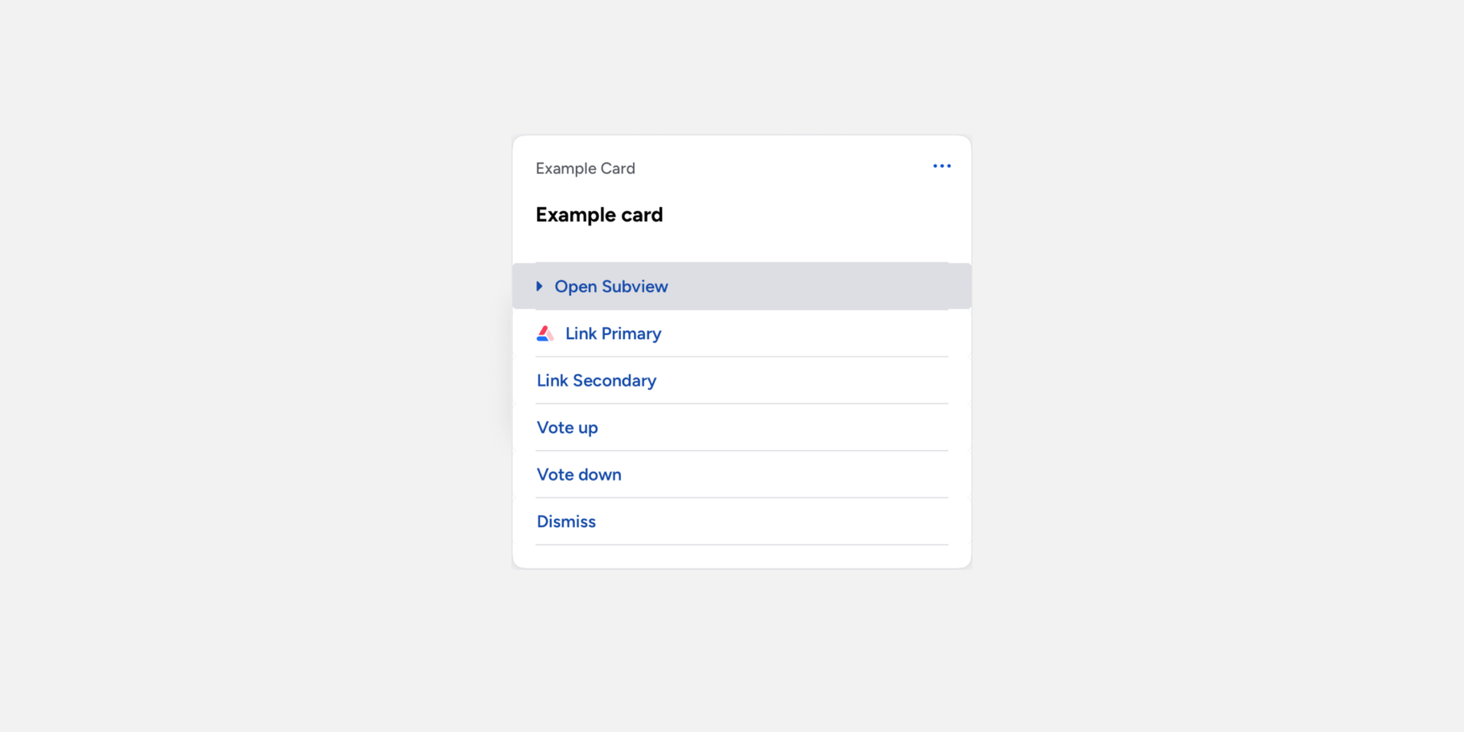
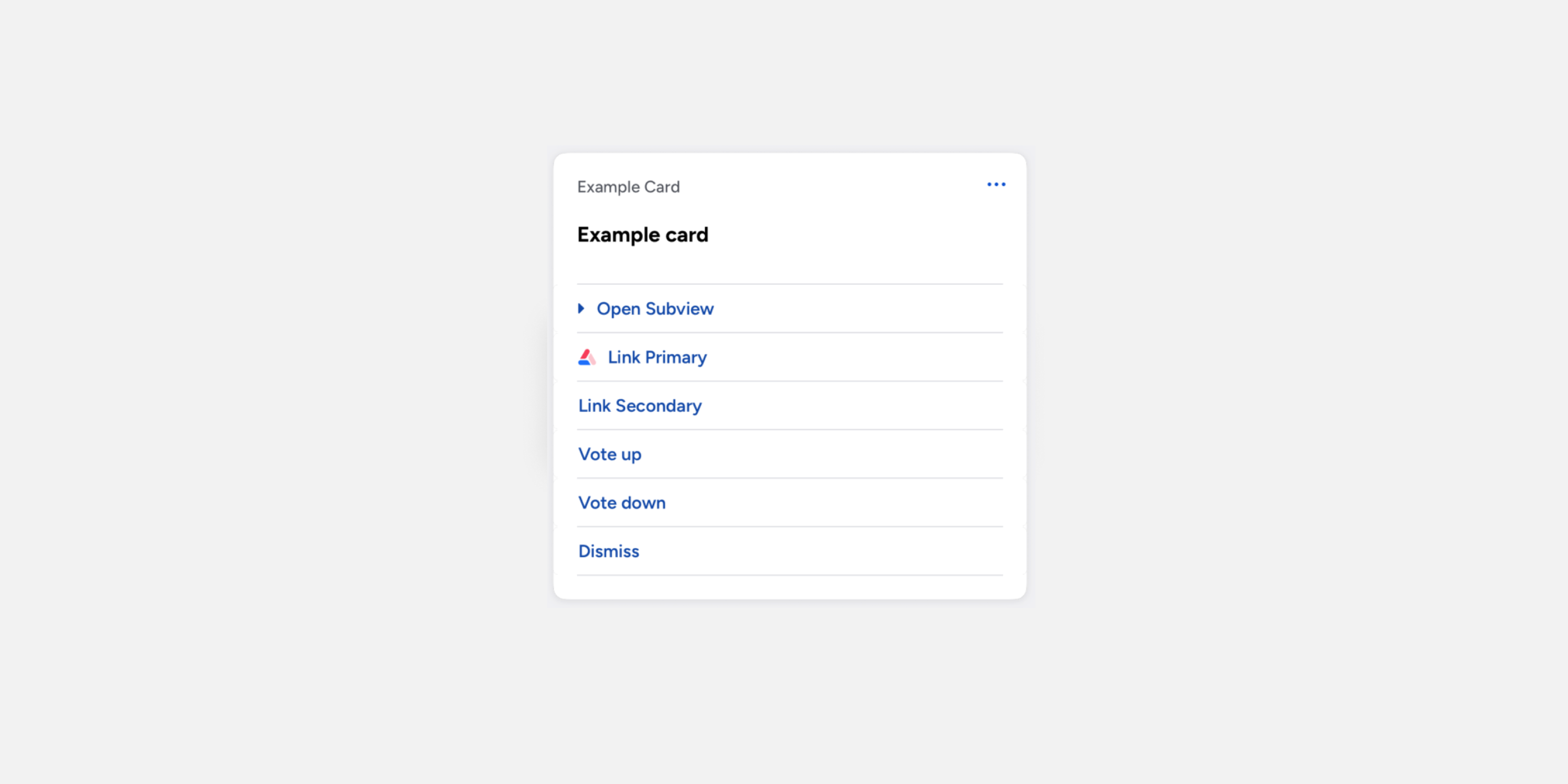
Horizontal rules are optional dividers used to separate buttons on a card. A rule does not include top or bottom spacing, and it uses its own left and right inset properties to adjust horizontal padding. You can apply three types of horizontal rules:
- Top – renders at the top edge of the button group.
- Between buttons – renders between buttons when there is more than one button on the card. The
Spacing between buttonsproperty is ignored when this rule type is enabled. - Bottom – renders at the bottom edge of the button group.
Note: The top and bottom rules are still rendered in a horizontal button layout when enabled. The rules between buttons are not rendered in horizontal layouts.
| Description | Name | Type |
|---|---|---|
| Whether the top rule is enabled | feed.horizontalRule.buttonGroupTop.enabled | Switch |
| The color of the top rule | feed.horizontalRule.buttonGroupTop | Color |
| The width (height) of the top rule | feed.horizontalRule.buttonGroupTop.width | Shape |
| The left inset of the top rule | feed.horizontalRule.buttonGroupTop.insetLeft | Shape |
| The right inset of the top rule | feed.horizontalRule.buttonGroupTop.insetRight | Shape |
| Description | Name | Type |
|---|---|---|
| Whether the middle rules are enabled | feed.horizontalRule.buttonGroupBetween.enabled | Switch |
| The color of the middle rules | feed.horizontalRule.buttonGroupBetween | Color |
| The width (height) of the middle rules | feed.horizontalRule.buttonGroupBetween.width | Shape |
| The left inset of the middle rules | feed.horizontalRule.buttonGroupBetween.insetLeft | Shape |
| The right inset of the middle rules | feed.horizontalRule.buttonGroupBetween.insetRight | Shape |
| Description | Name | Type |
|---|---|---|
| Whether the bottom rule is enabled | feed.horizontalRule.buttonGroupBottom.enabled | Switch |
| The color of the bottom rule | feed.horizontalRule.buttonGroupBottom | Color |
| The width (height) of the bottom rule | feed.horizontalRule.buttonGroupBottom.width | Shape |
| The left inset of the bottom rule | feed.horizontalRule.buttonGroupBottom.insetLeft | Shape |
| The right inset of the bottom rule | feed.horizontalRule.buttonGroupBottom.insetRight | Shape |
Subview
The secondary layout, accessed by link-buttons on the top-level.
Card
Requires SDK 25.3.0 or higher
Spacing between card elements.
Note: Buttons have a separate property for space between.
| Description | Name | Type |
|---|---|---|
| Spacing between card elements | workflow.shape.padding.elementBottom | Shape |
Headline

Typography
Styles applied to headline elements in the subview.
| Description | Name | Type |
|---|---|---|
| Text color of the headline text | feed.colors.text.headline | Color |
| Typography style to apply to headlines | feed.typography.headline | Typography |
Body
Text
| Description | Name | Type |
|---|---|---|
| Text color for body text | workflow.colors.text.body | Color |
| Typography style for body text | workflow.typography.body | Typography |
Link text
| Description | Name | Type |
|---|---|---|
| Color to use for links in body text | workflow.colors.text.link | Color |
Icon
| Description | Name | Type |
|---|---|---|
| Color of optional displayed to the left of body text | workflow.colors.icon.body | Color |
Input

Label inline/Value stacked (Deprecated)
This combined configuration is deprecated in favour of the separate layout properties below (labelInline,
labelExternal,
valueStacked). When the new properties are not defined, Atomic will automatically apply these legacy values as fallbacks to maintain backwards compatibility.
Legacy color and text style that was used for both inline labels and stacked values. This style was applied to labels on inline date pickers and dropdowns, values on stacked date pickers and dropdowns, labels on steppers and switches, and entered values in text or number inputs.
| Description | Name | Type |
|---|---|---|
| Text color to use for primary text | workflow.colors.text.primary | Color |
| Typography style for primary text | workflow.typography.primary | Typography |
Label (inline, preview)
Requires SDK version 26.1.0 or higher.
Color and text style for labels displayed inline with their values.
| Description | Name | Type |
|---|---|---|
| Text color for inline labels | workflow.colors.text.labelInline | Color |
| Typography style for inline labels | workflow.typography.labelInline | Typography |
Label (stacked)
Color and text style for labels displayed above their values.
| Description | Name | Type |
|---|---|---|
| Text color for stacked labels | workflow.colors.text.pinned | Color |
| Typography style for stacked labels | workflow.typography.pinned | Typography |
Label (external, preview)
Requires SDK version 26.1.0 or higher.
Color and text style for labels displayed outside of input components.
| Description | Name | Type |
|---|---|---|
| Text color for external labels | workflow.colors.text.labelExternal | Color |
| Typography style for external labels | workflow.typography.labelExternal | Typography |
Value (inline)
Color and text style for values displayed inline.
| Description | Name | Type |
|---|---|---|
| Text color to use for secondary text | workflow.colors.text.secondary | Color |
| Typography style for secondary text | workflow.typography.secondary | Typography |
Value (stacked/external, preview)
Requires SDK version 26.1.0 or higher.
Color and text style for values displayed below their labels, and for values of external input fields.
| Description | Name | Type |
|---|---|---|
| Text color for stacked values | workflow.colors.text.valueStacked | Color |
| Typography style for stacked values | workflow.typography.valueStacked | Typography |
Placeholder text
Color for placeholder text in a text or number input.
| Description | Name | Type |
|---|---|---|
| Color to use for placeholder text in input fields | workflow.colors.text.hint | Color |

Dropdown icon
Styles applied to dropdown components (dropdowns and date pickers).
| Description | Name | Type |
|---|---|---|
| Color of the icon displayed to the right of the dropdown | workflow.colors.icon.dropdown | Color |

Validation text
Styles applied to validation messages on subviews.
| Description | Name | Type |
|---|---|---|
| Text color for validation messages | workflow.colors.text.error | Color |
| Typography style for validation messages | workflow.typography.error | Typography |
Stroke highlight
| Description | Name | Type |
|---|---|---|
| Color to use for the border on focused inputs | workflow.colors.border.inputActive | Color |
| Color to use for the border on non-focused inputs | workflow.colors.border.inputInactive | Color |
Border
| Description | Name | Type |
|---|---|---|
| Color to use for the border around a subview component | workflow.colors.border.component | Color |
Background
| Description | Name | Type |
|---|---|---|
| Background color of a subview component | workflow.colors.background.component | Color |
Switch
Styles applied to binary switches on subviews.

Unchecked
| Description | Name | Type |
|---|---|---|
| Color for the thumb on the switch when off | workflow.colors.icon.switchOff | Color |
| Color for the track when the switch is off | workflow.colors.background.switchOff | Color |
Checked
| Description | Name | Type |
|---|---|---|
| Color for the thumb on the switch when on | workflow.colors.icon.switchOn | Color |
| Color for the track when the switch is on | workflow.colors.background.switchOn | Color |
Stepper
Styles applied to numeric stepper components on subviews.

Button enabled
| Description | Name | Type |
|---|---|---|
| Color of the icon inside a stepper button | workflow.colors.icon.stepper | Color |
| Background color of the stepper buttons | workflow.colors.background.stepper | Color |
Button disabled
| Description | Name | Type |
|---|---|---|
| Color of the icon inside a stepper button when disabled | workflow.colors.icon.stepperDisabled | Color |
| Background color of stepper buttons when disabled | workflow.colors.background.stepperDisabled | Color |
Media

Border
| Description | Name | Type |
|---|---|---|
| Color for border around media elements | feed.colors.border.media | Color |
| Border radius for media elements | feed.shape.borderRadius.media | Shape |
Video tint
| Description | Name | Type |
|---|---|---|
| Color for overlay on videos (the play button sits on top of this overlay) | feed.colors.overlay.mediaBanner | Color |
Video play button
| Description | Name | Type |
|---|---|---|
| Icon color for play button on videos | feed.colors.icon.mediaControl | Color |
| Background color for play button on videos | feed.colors.background.mediaControl | Color |
Loading/empty state, stream
| Description | Name | Type |
|---|---|---|
| Background color for media while it is loading | feed.colors.background.media | Color |
| Color for icon indicating media type while loading | feed.colors.icon.mediaBanner | Color |
Loading/empty state, subview
| Description | Name | Type |
|---|---|---|
| Background color for media while it is loading | workflow.colors.background.media | Color |
| Color for icon indicating media type while loading | workflow.colors.icon.mediaBanner | Color |

Thumb label
| Description | Name | Type |
|---|---|---|
| Color for the title on thumbnail media | feed.colors.text.mediaTitle | Color |
| Typography style for the title on thumbnail media | feed.typography.mediaTitle | Typography |
Thumb description
| Description | Name | Type |
|---|---|---|
| Color for the subtitle on thumbnail media | feed.colors.text.mediaSubtitle | Color |
| Typography style for the subtitle on thumbnail media | feed.typography.mediaSubtitle | Typography |
Thumb action
| Description | Name | Type |
|---|---|---|
Color for the action title on thumbnail media (e.g. Watch, View) | feed.colors.text.mediaAction | Color |
| Typography style for the action title on thumbnail media | feed.typography.mediaAction | Typography |
Thumb background
| Description | Name | Type |
|---|---|---|
| Background color for media using the thumbnail format | feed.colors.background.mediaThumbnail | Color |
Button
Styles applied to actions on subviews.
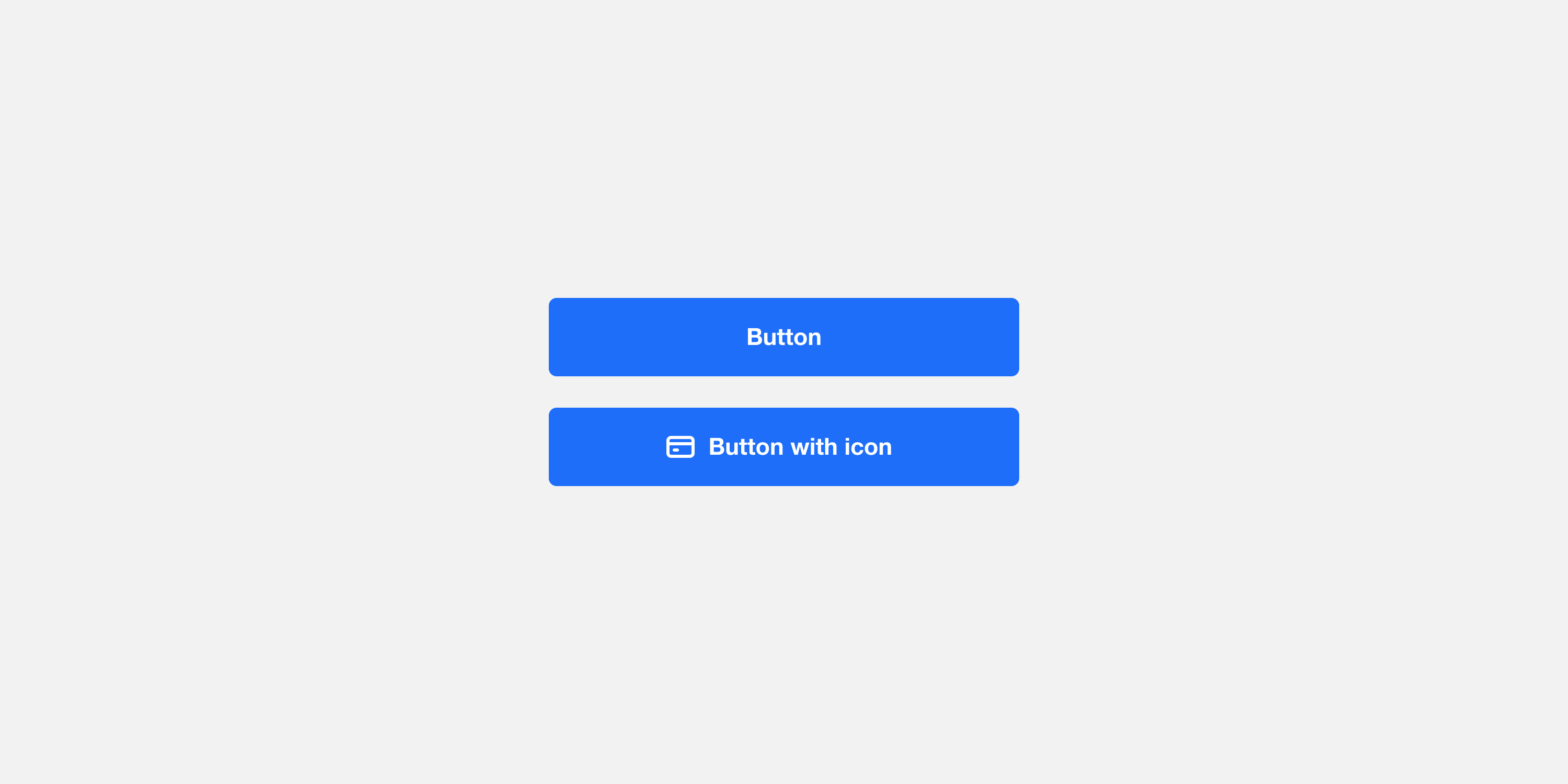
A wide variety of style attributes are available here to create a distinctive appearance for your application's action buttons. More detail about how these styles are applied can be found in the action button variants section.
Button group padding
Requires SDK 25.3.0 or higher
Introducing the concept of button groups. Buttons are now treated as being contained within a single button group, either on top-level cards or subviews. The button group itself is invisible, but it wraps all buttons so you can adjust them as a unified UI element in terms of padding and spacing.
A button group has its own padding, independent of the card’s padding. For example, you can set the card padding to 20 on all four sides, while setting the button group padding to (top: 30, left: 0, right: 0, bottom: 20). This allows you to create slightly more space between the buttons and other components on the card, making the layout more distinguishable — while still allowing buttons to span the full card width, even as other components retain the standard 20 horizontal padding.
| Description | Name | Type |
|---|---|---|
| Whether to use the same padding width on all sides | workflow.shape.equalPaddings.buttonGroup | Switch |
| The width applied when using the same padding width on all sides | workflow.shape.padding.buttonGroupWidth | Shape |
| The top padding when the equal padding option is disabled | workflow.shape.padding.buttonGroupTop | Shape |
| The right padding when the equal padding option is disabled | workflow.shape.padding.buttonGroupRight | Shape |
| The bottom padding when the equal padding option is disabled | workflow.shape.padding.buttonGroupBottom | Shape |
| The left padding when the equal padding option is disabled | workflow.shape.padding.buttonGroupLeft | Shape |

Horizontal rule
Requires SDK 25.3.0 or higher
Horizontal rules are optional dividers used to separate buttons on a card. A rule does not include top or bottom spacing, and it uses its own left and right inset properties to adjust horizontal padding. You can apply three types of horizontal rules:
- Top – renders at the top edge of the button group.
- Between buttons – renders between buttons when there is more than one button on the card. The
Spacing between buttonsproperty is ignored when this rule type is enabled. - Bottom – renders at the bottom edge of the button group.
Note: The top and bottom rules are still rendered in a horizontal button layout when enabled. The rules between buttons are not rendered in horizontal layouts.
| Description | Name | Type |
|---|---|---|
| Whether the top rule is enabled | workflow.horizontalRule.buttonGroupTop.enabled | Switch |
| The color of the top rule | workflow.horizontalRule.buttonGroupTop | Color |
| The width (height) of the top rule | workflow.horizontalRule.buttonGroupTop.width | Shape |
| The left inset of the top rule | workflow.horizontalRule.buttonGroupTop.insetLeft | Shape |
| The right inset of the top rule | workflow.horizontalRule.buttonGroupTop.insetRight | Shape |
| Description | Name | Type |
|---|---|---|
| Whether the middle rules are enabled | workflow.horizontalRule.buttonGroupBetween.enabled | Switch |
| The color of the middle rules | workflow.horizontalRule.buttonGroupBetween | Color |
| The width (height) of the middle rules | workflow.horizontalRule.buttonGroupBetween.width | Shape |
| The left inset of the middle rules | workflow.horizontalRule.buttonGroupBetween.insetLeft | Shape |
| The right inset of the middle rules | workflow.horizontalRule.buttonGroupBetween.insetRight | Shape |
| Description | Name | Type |
|---|---|---|
| Whether the bottom rule is enabled | workflow.horizontalRule.buttonGroupBottom.enabled | Switch |
| The color of the bottom rule | workflow.horizontalRule.buttonGroupBottom | Color |
| The width (height) of the bottom rule | workflow.horizontalRule.buttonGroupBottom.width | Shape |
| The left inset of the bottom rule | workflow.horizontalRule.buttonGroupBottom.insetLeft | Shape |
| The right inset of the bottom rule | workflow.horizontalRule.buttonGroupBottom.insetRight | Shape |

System
All other system elements, including states, feedback, accessibility, and footer elements.
Quick actions
Styles applied to the card completion animation and swipe actions, which appear when a card is swiped left.
Dismiss
| Description | Name | Type |
|---|---|---|
| Background color of the primary swipe action | feed.colors.background.quickActionPrimary | Color |
| Color of the icon for the primary swipe action | feed.colors.icon.quickActionPrimary | Color |
Snooze
| Description | Name | Type |
|---|---|---|
| Background color of the secondary swipe action | feed.colors.background.quickActionSecondary | Color |
| Color of the icon for the secondary swipe action | feed.colors.icon.quickActionSecondary | Color |
Card completion
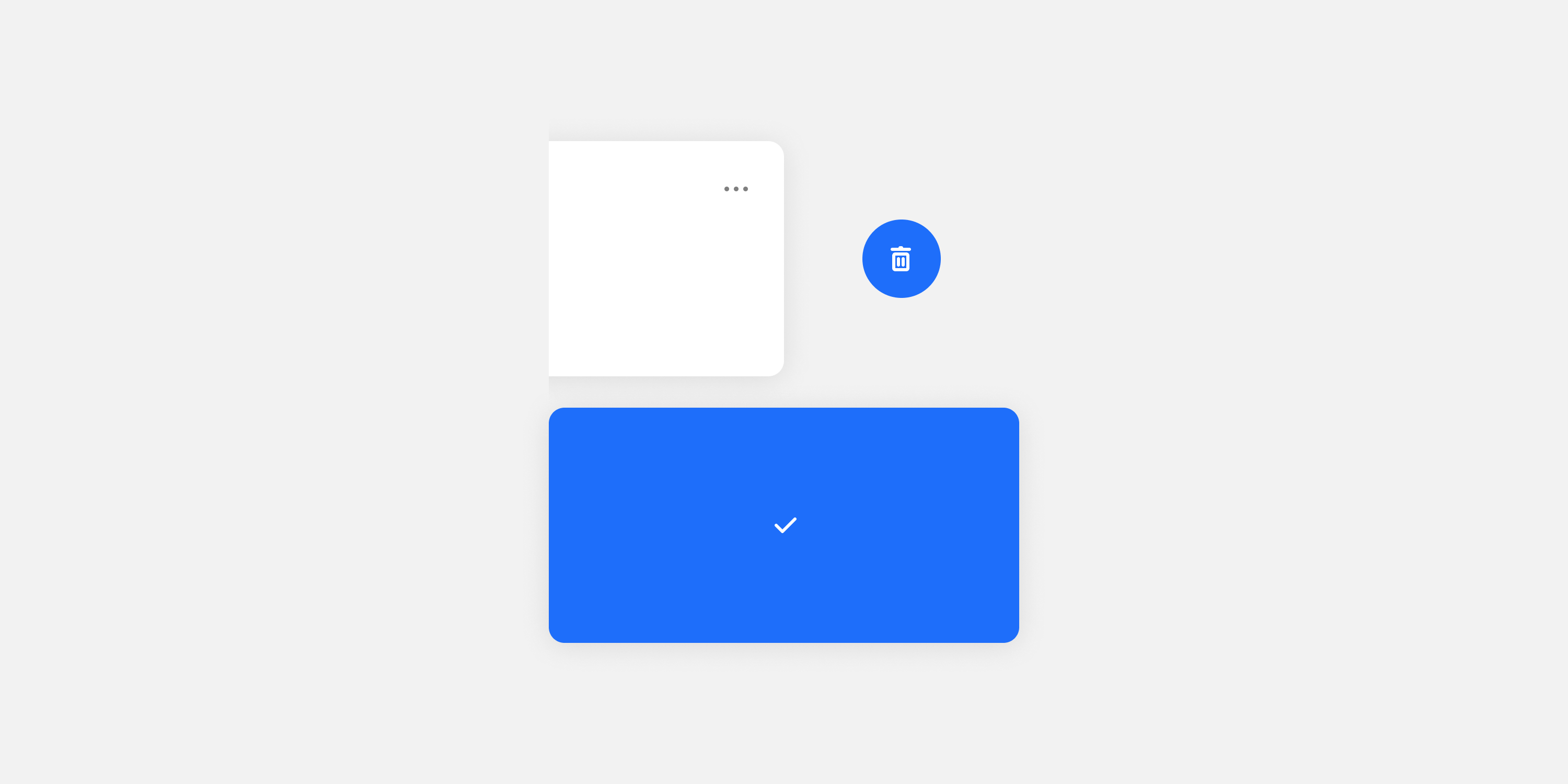
Icon
| Description | Name | Type |
|---|---|---|
| Color of the tick icon displayed in the card completion animation | feed.colors.icon.cardCompletion | Color |
Background
| Description | Name | Type |
|---|---|---|
| Background color of the card completion animation | feed.colors.background.cardCompletion | Color |
Error states
Banner text, stream
Styles applied to error banners on the card list. Error banners appear from the top of the screen when there is no internet connection on the card list.
| Description | Name | Type |
|---|---|---|
| Text color for the error state banner | feed.colors.text.banner | Color |
| Typography of the error state banner | feed.typography.banner | Color |
Banner text, subview
Styles applied to error banners on the card list. Error banners appear from the top of the screen when there is no internet connection on the card list.
| Description | Name | Type |
|---|---|---|
| Text color for the error state banner | workflow.colors.text.banner | Color |
| Typography of the error state banner | workflow.typography.banner | Color |
Banner background, stream
| Description | Name | Type |
|---|---|---|
| Background color for the error state banner | feed.colors.background.banner | Color |
Banner background, subview
| Description | Name | Type |
|---|---|---|
| Background color for the error state banner | workflow.colors.background.banner | Color |
Overlay message
Styles applied to the error overlay on the card list. The error overlay appears if the card list fails to load when there are no existing cards on screen.
| Description | Name | Type |
|---|---|---|
| Text color for the error overlay title | feed.colors.text.errorOverlayTitle | Color |
| Typography style for the error overlay title | feed.typography.errorOverlayTitle | Typography |
Overlay button label
| Description | Name | Type |
|---|---|---|
| Text color for the error overlay's action button | feed.colors.text.errorOverlayAction | Color |
| Typography style for the error overlay's action button | feed.typography.errorOverlayAction | Typography |
Loading states
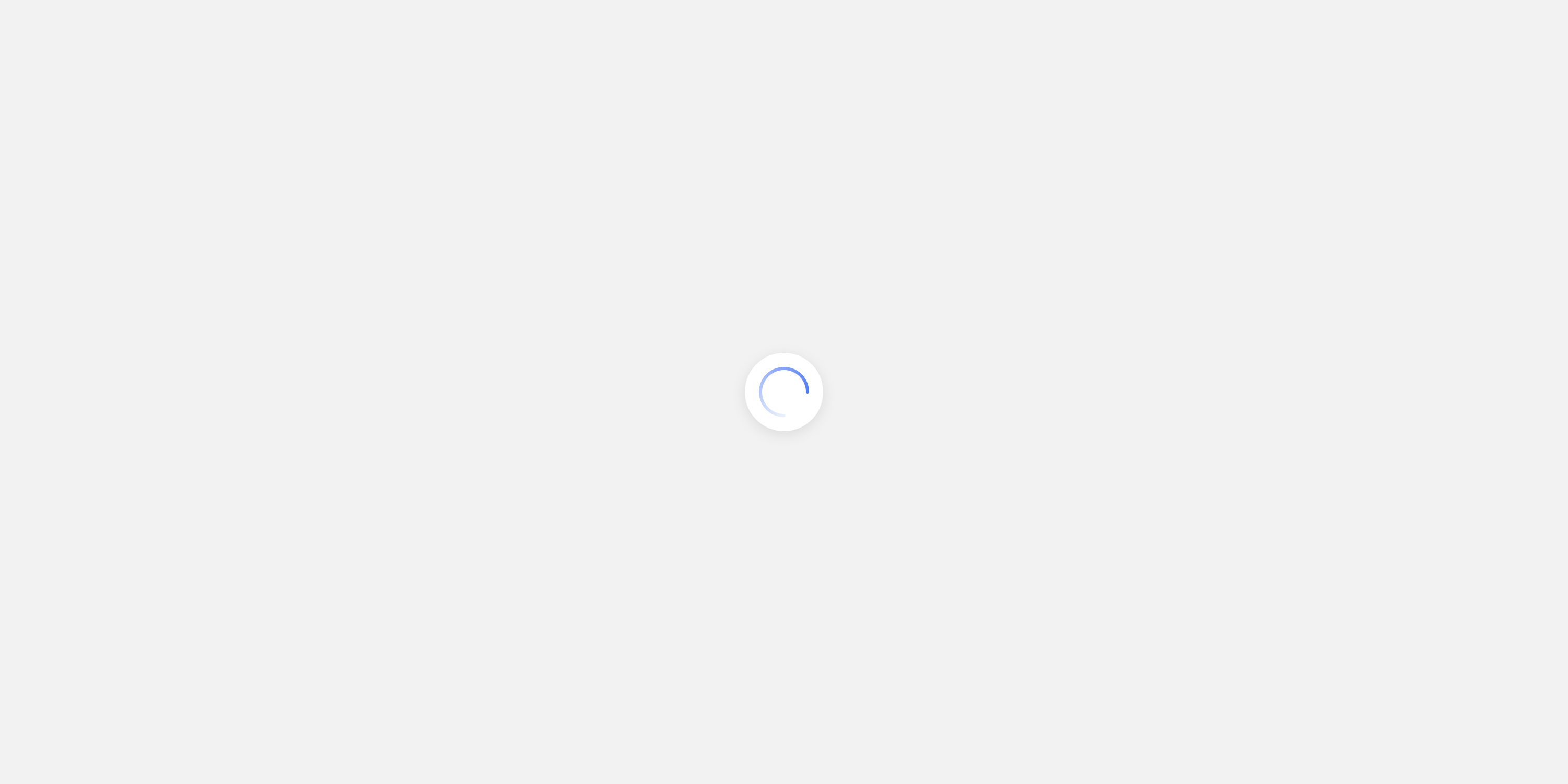
Icon
Styles applied to the loading spinner on the card list.
| Description | Name | Type |
|---|---|---|
| Color of the loading spinner icon | feed.colors.icon.loadingSpinner | Color |
Background
| Description | Name | Type |
|---|---|---|
| Background color for the loading spinner | feed.colors.background.loadingSpinner | Color |
Empty states
Icon
Styles applied to the empty list state. This state is displayed where there are no cards in the list.
| Description | Name | Type |
|---|---|---|
| Color for the icon on the empty list state | feed.colors.icon.listEmptyState | Color |
Text
| Description | Name | Type |
|---|---|---|
| Text color for the empty list state | feed.colors.text.listEmptyState | Color |
| Typography style for the empty list state | feed.typography.listEmptyState | Typography |
Toast messages
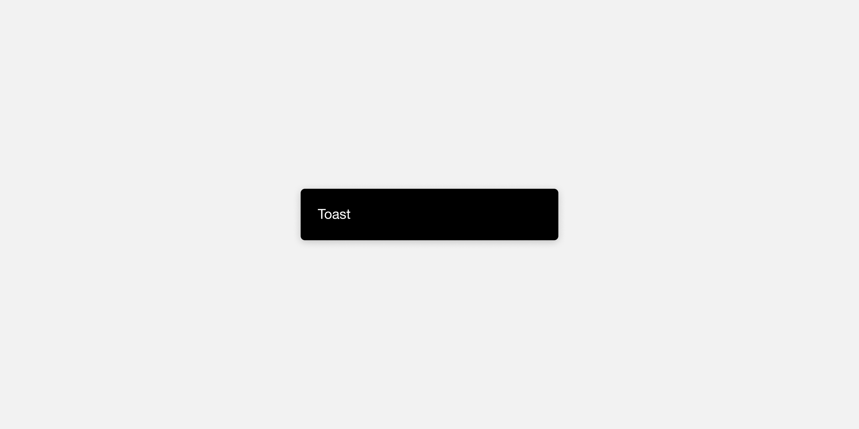
Text, stream
| Description | Name | Type |
|---|---|---|
| Text color for the toast message | feed.colors.text.toast | Color |
| Typography style for the toast message | feed.typography.toast | Typography |
Text, subview
| Description | Name | Type |
|---|---|---|
| Text color for the toast message | workflow.colors.text.toast | Color |
| Typography style for the toast message | workflow.typography.toast | Typography |
Button label, stream
| Description | Name | Type |
|---|---|---|
| Text color for the toast action text | feed.colors.text.toastAction | Color |
| Typography style for the toast action text | feed.typography.toastAction | Typography |
Button label, subview
| Description | Name | Type |
|---|---|---|
| Text color for the subview toast action text | workflow.colors.text.toastAction | Color |
| Typography style for the subview toast action text | workflow.typography.toastAction | Typography |
Background, stream
Styles applied to toast messages, such as those displayed when a card is dismissed or snoozed.
| Description | Name | Type |
|---|---|---|
| Background color of the toast message | feed.colors.background.toast | Color |
Background, subview
| Description | Name | Type |
|---|---|---|
| Background color of the subview toast message | workflow.colors.background.toast | Color |
User feedback
Unselected
Styles applied to radio groups on the card feedback screen only.
| Description | Name | Type |
|---|---|---|
| Color to use for unselected radio group items | workflow.colors.icon.selectionIndicator | Color |
Selected
| Description | Name | Type |
|---|---|---|
| Color to use for the selected radio group item | workflow.colors.icon.selectionIndicatorActive | Color |
Accessibility
Focus ring
Styles applied to SDK elements when they become focused using the keyboard (Web SDK only).
| Description | Name | Type |
|---|---|---|
| Color to use as the border of the current keyboard-focused element | feed.colors.border.focus | Color |
| Color to use as the border of the subview current keyboard-focused element | workflow.colors.border.focus | Color |
Footer
Message
Styles applied to the optional message displayed at the footer of the card list. This message can be enabled in your SDK integration, and is never displayed in single card view.
| Description | Name | Type |
|---|---|---|
| Text color for the card list footer | feed.colors.text.footerMessage | Color |
| Typography style for the card list footer | feed.typography.footerMessage | Typography |
Modal container (Beta)
Note: Modal container is a beta feature and is currently only available in SwiftUI SDK 24.3.3 or later and Web SDK 25.3.0 or later.
Background
Background color for the modal container.
| Description | Name | Type |
|---|---|---|
| Background color of the modal container's fullscreen overlay | feed.colors.background.modalContainer | Color |