Always-on cards
Sometimes you want a container to behave differently from the usual "show cards when they arrive, otherwise show nothing". Two common variations are:
- Always show something: A container should never look empty, so you keep a default card in it at all times and let more important cards stack above it.
- Show nothing until it matters: A container, especially a horizontal strip embedded inside one of your own screens, should stay completely hidden until there is a real card to show, so it never leaves an empty gap in your layout.
Both are achieved with a low-priority "placeholder" or "default" card combined with a few Workbench and SDK settings. This page covers both.
Example use-cases
- A loyalty dashboard that should always display a "Welcome back" or promotional card, even when nothing else is queued for the customer.
- A horizontal strip of offers embedded between sections of a home screen, which should collapse out of view entirely when there are no offers.
- A help or onboarding container that always presents a single evergreen tip until a more timely, higher-priority card is sent.
- A container with a fixed branded background image that you want to remain visible regardless of card volume.
How card priority makes this work
Every card is sent with a priority between 1 (highest) and 10 (lowest). Cards are ordered by priority within a container, so a card sent at priority 10 always sorts to the bottom. By reserving priority 10 for your default card and sending all other cards at a higher priority, you guarantee that:
- when there are no other cards, the default card is the only thing shown, and
- when other cards arrive, they appear above the default card automatically.
This single idea underpins both techniques below.
Technique 1: Keep a default card always visible
Use this when a container should never appear empty.
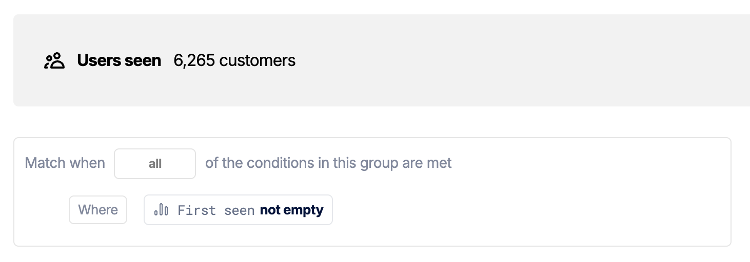
Step 1: Send the default card the first time a user is seen
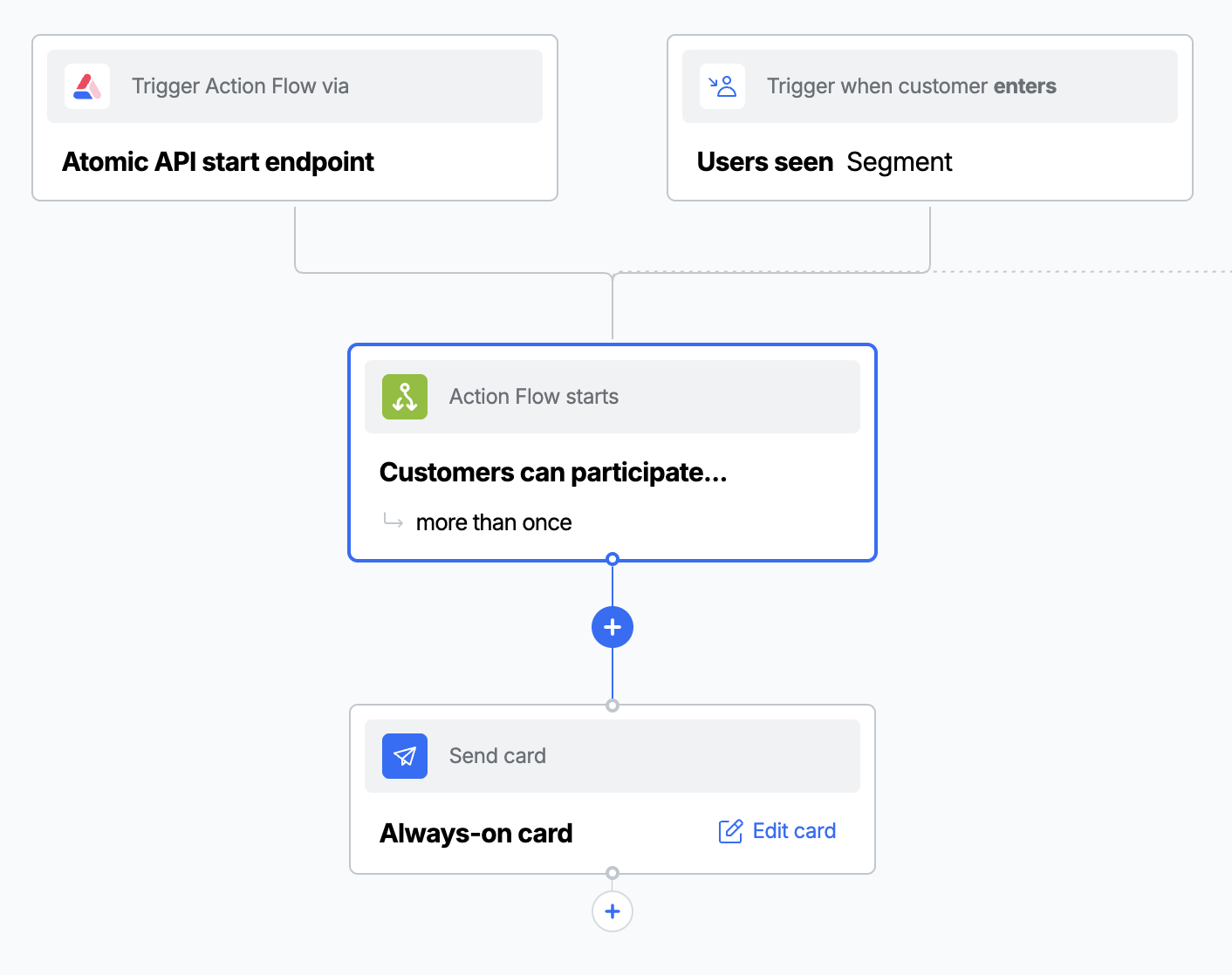
Send the default card once, as early as possible in the customer's lifecycle, so it is already in place before anything else. The simplest trigger is a "first seen" segment, exactly as described in Sending a Welcome card to new users. Create an Action Flow with a segment trigger and a single create-card step that targets the container.
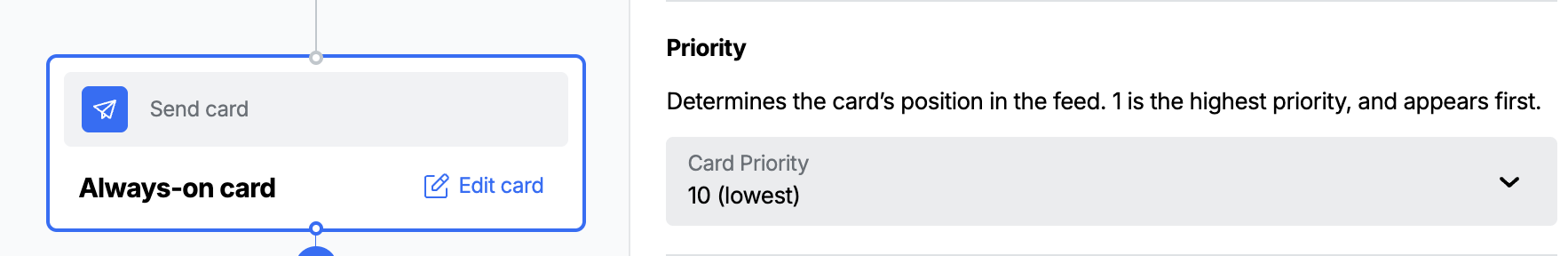
Step 2: Give the card the lowest priority
On the create-card step, set the card's priority to 10 (the lowest). This keeps the default card pinned to the bottom of the container so any other card you send appears above it.
Step 3: Remove the dismiss, snooze and voting actions
A card the customer can remove is not "always on". In the card editor, turn off the actions that would let the customer take the card out of the container:
- Disable dismiss for both the swipe gesture and the overflow (menu) option.
- Disable snooze for both the swipe gesture and the overflow option.
- Disable voting if you do not want feedback controls on the card.
See Card behaviour for where these settings live and how they interact with SDK-level configuration.
Step 4: Do not set an expiry
Leave the card's expiry empty so it remains in the container indefinitely. A card with an expiry date is removed when it expires, which would leave the container empty. See Card lifecycle for how expiry affects a card.
If your trigger could fire more than once for the same customer, you can end up with multiple default cards stacked at priority 10. To keep exactly one, cancel any existing default card before sending a new one. See Cancelling cards and Cancelling in Action Flows.
Technique 2: Hide a container until it has real content
Use this when a container, often a horizontal container embedded inside one of your own screens, should take up no space until there is a genuine card to show. There are two ways to do this, depending on how much control you need.
Option A: Collapse the container when it is empty
The horizontal container has a built-in empty-state style. Set it to shrink and the container collapses out of view whenever it has no cards, then reappears when a card arrives. This requires no placeholder card and no custom logic.
- iOS (SwiftUI)
- Android (Compose)
- Web
var config = ContainerConfiguration()
config.horizontalEmptyStyle = .shrink
HorizontalContainer(
    containerId: "<stream container id>",
    cardWidth: 350,
    configuration: config
)
StreamContainer(
    containerId = "<stream container id>",
    configuration = StreamContainerConfiguration(
        horizontalEmptyStyle = HorizontalEmptyStyle.Shrinking
    )
)
AtomicSDK.embed({
  streamContainerId: '<stream container id>',
  horizontalContainerConfig: {
    enabled: true,
    cardWidth: 350,
    emptyStyle: 'shrink'
  }
})
See each platform's SDK reference for the full set of horizontal container options.
The container only shrinks when it has zero cards. If you keep a default or placeholder card in the container (as in Technique 1), the feed is never empty, so the container never shrinks. Use Option B below when you want to keep a placeholder in place but still control when the container is shown.
Option B: Use a placeholder card and control visibility yourself
If you want full control over when the container appears (for example to wrap it in your own dialog or to keep a fixed-size placeholder so the layout never jumps) observe the card feed without rendering it, and show or hide your own container based on what is in the feed. On iOS and Android, Option A above is often all you need, but each SDK also exposes a headless observer if you want this level of control.
In a horizontal container, every card stretches to the height of the tallest card present. If you use an image as your placeholder, set its height to match the largest card you might ever send to the container, otherwise the placeholder will be shorter than the cards beside it and leave a gap. You will also need to adjust the container's theme so the image runs edge to edge: remove the card's default padding so the image fills the card with no border around it.
The shape of the pattern is:
- Send a low-priority placeholder card to the container (an empty card, or a card sized to your container's dimensions), using the same first-seen approach as Technique 1.
- Use the SDK's headless (API-driven) container to observe the feed without rendering any UI.
- Decide visibility from the feed contents. Because the placeholder is always at priority 10, the presence of any card above priority 10 means there is real content to show.
- Web
- iOS (SwiftUI)
- Android (Compose)
// Observe the feed without rendering it
const headless = AtomicSDK.observableStreamContainer({
  streamContainerId: '<stream container id>',
  cardFeedHandler: cards => {
    // The placeholder sits at priority 10; anything above it is real content
    const hasContent = cards.some(card => card.metadata.priority < 10)
    setContainerVisible(hasContent)
  }
})
headless.start()

// Later, when the screen goes away
headless.stop()
When hasContent is true, render the real container (for example inside a dialog); otherwise render nothing.
// Observe the feed without rendering it
let token = AACSession.observeStreamContainer(identifier: "<stream container id>") { cards in
    // The placeholder sits at priority 10; anything above it is real content
    let hasContent = cards?.contains { $0.priority < 10 } ?? false
    showContainer = hasContent
}

// Later, when the screen goes away
AACSession.stopObservingStreamContainer(token)
// Observe the feed without rendering it. getUpdatesForContainer returns a
// Flow<CardFeedData?>, so collect it from a coroutine scope.
AACCore.shared
    .getUpdatesForContainer(ContainerConfiguration("<stream container id>"))
    .onEach { cardFeedData ->
        // The placeholder sits at priority 10; anything above it is real content
        val hasContent = cardFeedData?.cardInstances
            ?.any { (it.metadata.priority ?: 10) < 10 } ?: false
        showContainer = hasContent
    }
    .launchIn(viewModelScope)
Checking the card count (more than one card) is the simplest test, but it assumes the placeholder is the only guaranteed card. The next best option is to give the placeholder a priority you don't use for any other cards (in this case, priority 10) and check for any cards that have a different priority. If you would rather match the placeholder explicitly, give it a custom variable (for example placeholder: true) and check that instead, or check the priority as shown in the web example. Avoid relying on card content structure (such as the number of layout nodes), as that is more fragile than priority or an explicit variable.
Keep exactly one placeholder
As with Technique 1, if the trigger that sends the placeholder can fire more than once you may accumulate duplicate placeholders. Cancel any existing placeholder before sending a new one so the container always holds exactly one. You can do this within the Action Flow itself: a first step cancels any open placeholder, and a second step creates a fresh one.
An Action Flow does not just talk to third-party systems - it can call Atomic's own API too. Using a Send a request step authenticated with a credential, an Action Flow can call the Cards API directly.
Here, the placeholder Action Flow uses this to cancel any existing placeholder before creating the next one. The same approach lets an Action Flow act on Atomic data mid-run wherever it needs to.
Choosing an approach
| You want to... | Use |
|---|---|
| Never show an empty container | Technique 1 (default card, lowest priority, no dismiss, no expiry) |
| Collapse a horizontal container when it has no cards | Technique 2, Option A (shrink empty style) |
| Keep a placeholder in place but control when the container shows | Technique 2, Option B (placeholder card plus headless observation) |
FAQs
Why priority 10 specifically? Priority 10 is the lowest priority a card can have, so it always sorts to the bottom of the container. Reserving it for your default or placeholder card guarantees every other card appears above it.
My default card disappeared. What happened? The most common causes are an expiry date on the card (remove it, see Card lifecycle) or the customer dismissing or snoozing it. Make sure dismiss and snooze are disabled for both swipe and overflow, as described in Technique 1, Step 3.
The container still shows an empty state instead of collapsing.
The shrink empty style only collapses the container when the feed has zero cards. If you are keeping a placeholder in the container, the feed is never empty - use Technique 2, Option B to control visibility yourself.
Can I use a default card and the shrink empty style together?
Not for the same goal. A default card keeps the container populated, which prevents shrink from ever triggering. Pick the technique that matches your intent: always visible (Technique 1) or hidden until real content (Technique 2).
Does the headless observation render anything? No. The API-driven container observes the feed and gives you the card data through a callback, but renders no UI. You decide what to show based on the data. See API-driven card containers.
Will the customer see the placeholder card briefly before my real card? With Option B the placeholder is never rendered, so the customer only sees your container once it contains real content. With a default card (Technique 1) the placeholder is intended to be visible, so design it to look intentional.