Presenting cards in a bottom sheet
Sometimes you might like to use Atomic containers in ways that don't fit within the native container variants that Atomic provides. Atomic containers can be used flexibly in your application in many ways - each one is a view you can embed wherever your design calls for cards. A common example is a bottom sheet: a surface that slides up from the bottom of the screen when there is a card worth showing (an offer, a required action, a timely reminder) and takes no space in your layout when there is not.
This pattern presents a horizontal stream container in a bottom sheet that:
- presents itself when the container has one or more cards,
- sizes itself to its content, so the sheet hugs a short card and never clips a tall one, and
- after the customer dismisses it, stays closed until the card count next changes.
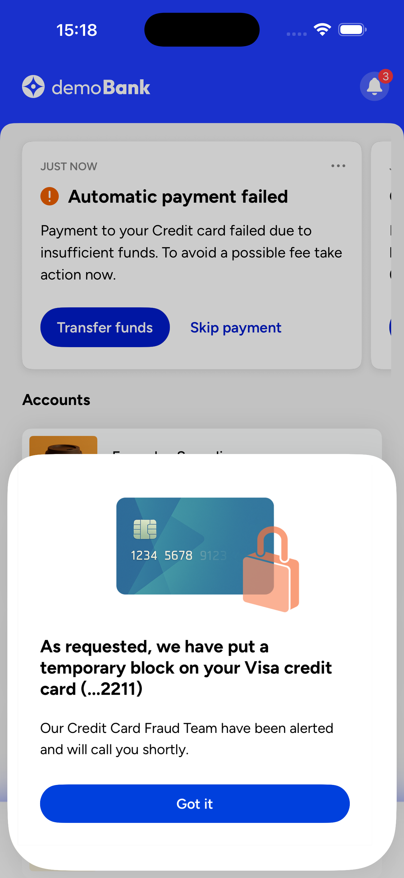
A card presented in a bottom sheet, as implemented in the Atomic Explore app.
You can try the pattern for yourself in the Atomic Explore app, available for iOS and Android.
If you want a sheet the customer opens themselves (from a button, for example), use the same recipe and drive the sheet's visibility from your button instead of the card count; Step 1 becomes unnecessary. And if you want to embed cards within a screen and hide the region when it is empty, you do not need a sheet at all: see Always-on cards.
The pattern at a glance
- Observe the container's card count.
- Present a bottom sheet when the count is greater than zero and the customer is on the screen that owns the sheet.
- Host a horizontal container inside the sheet.
- Size the sheet to the card's height.
- When the customer dismisses the sheet, keep it closed until the count next changes.
Atomic SDKs push card-count changes to your app over a WebSocket by default, so the sheet reacts in near real time.
Step 1: Observe the card count
A small shared observer object owns the subscription and exposes the count as observable state. Screens read the count; they do not subscribe themselves. Create the observer once (at app start or when the customer logs in) and stop it on logout.
- iOS (SwiftUI)
- Android (Compose)
import SwiftUI
import AtomicSwiftUISDK

@Observable
class CardCountObserver {
    var cardCount = 0

    private var token: NSObjectProtocol?

    init() {
        token = AACSession.observeCardCountForStreamContainer(
            withIdentifier: "<stream container id>",
            interval: 15
        ) { [weak self] count in
            guard let self, let count else { return }
            DispatchQueue.main.async {
                self.cardCount = Int(truncating: count)
            }
        }
    }

    func stopObserving() {
        if let token { AACSession.stopObservingCardCount(token) }
        token = nil
        cardCount = 0
    }
}
The count updates over the WebSocket immediately after the published card number changes; the interval applies only when the SDK is using HTTP (see the note below). Inject the observer into your view hierarchy with .environment(...) so any screen can read it.
The snippets on this page use the iOS 17 @Observable macro and zero-parameter onChange(of:). On iOS 16, an ObservableObject with a @Published property works the same way.
class CardCountObserver {
    private val _cardCount = MutableStateFlow(0)
    val cardCount: StateFlow<Int> = _cardCount.asStateFlow()

    private var scope: CoroutineScope? = null

    fun start() {
        if (scope != null) return
        val observerScope = CoroutineScope(SupervisorJob() + Dispatchers.Main)
        scope = observerScope
        observerScope.launch {
            AACCore.shared.getUpdatesForContainer(ContainerConfiguration("<stream container id>"))
                .map { it?.metadata?.totalCards ?: 0 }
                .collect { _cardCount.value = it }
        }
    }

    fun stopObserving() {
        scope?.cancel()
        scope = null
        _cardCount.value = 0
    }
}
getUpdatesForContainer emits an initial value when you subscribe, so the count is correct from the start; totalCards is the number of active cards in the container. Provide the observer through your dependency injection setup or a CompositionLocal so screens can read the StateFlow without threading it through parameters.
WebSockets are the default, but Atomic SDKs can be switched to HTTP (iOS, Android), and fall back to HTTP polling automatically when a WebSocket connection is unavailable. The pattern still works over HTTP - count changes just arrive at the polling interval rather than immediately: the interval you pass to the observer on iOS, and the container's cardListRefreshInterval on Android (15 seconds by default).
Step 2: Present the sheet when cards arrive
The presentation rule: show the sheet when the count is greater than zero, the customer is on the screen that owns the sheet, and no higher-priority sheet is showing.
- iOS (SwiftUI)
- Android (Compose)
struct HomeScreen: View {
    @Environment(CardCountObserver.self) private var observer
    @State private var showingSheet = false

    var body: some View {
        NavigationStack {
            // Your screen content
        }
        .sheet(isPresented: $showingSheet) {
            // Sheet content (Steps 3 and 4)
        }
        .onAppear {
            showingSheet = observer.cardCount > 0
        }
        .onChange(of: observer.cardCount) {
            showingSheet = observer.cardCount > 0
        }
    }
}
.sheet(isPresented:) supplies the slide-up transition, the dimmed backdrop and swipe-to-dismiss for free - there is no custom animation code in this pattern. Evaluate the condition in both places: .onAppear covers cards that were already present when the screen loaded, and .onChange covers cards arriving while the customer is on the screen. If the view lives inside a TabView, extend the condition so the sheet only presents on the tab that owns it.
Swiping down sets showingSheet back to false through the binding, and nothing sets it to true again until the card count changes, so the "stay closed until the count changes" behavior falls out of the binding, with no extra state.
val cardCount by observer.cardCount.collectAsStateWithLifecycle()
var sheetDismissed by remember { mutableStateOf(false) }

// Re-arm the sheet whenever the card count changes
LaunchedEffect(cardCount) { sheetDismissed = false }

if (cardCount > 0 && !sheetDismissed) {
    Dialog(
        onDismissRequest = { sheetDismissed = true },
        // Full-width dialog so the scrim and sheet span the whole screen
        properties = DialogProperties(usePlatformDefaultWidth = false),
    ) {
        Box(Modifier.fillMaxSize()) {
            // Scrim: tap anywhere outside the sheet to dismiss
            Box(
                Modifier
                    .fillMaxSize()
                    .background(Color.Black.copy(alpha = 0.32f))
                    .clickable(
                        interactionSource = remember { MutableInteractionSource() },
                        indication = null,
                    ) { sheetDismissed = true },
            )
            Surface(
                modifier = Modifier.align(Alignment.BottomCenter).fillMaxWidth(),
                shape = RoundedCornerShape(topStart = 16.dp, topEnd = 16.dp),
            ) {
                // Sheet content (Steps 3 and 4)
            }
        }
    }
}
Composition is the gate: the if renders the dialog only while the rule holds, and placing it in the screen's composable scopes the sheet to that screen. sheetDismissed is a latch: after a scrim tap or the system back gesture, the sheet stays closed until the count next changes (the LaunchedEffect re-arms it) or the screen re-enters composition (remember rather than rememberSaveable, deliberately). usePlatformDefaultWidth = false makes the dialog cover the full screen, including any bottom tab bar.
The current version of the Compose SDK's HorizontalStreamContainer expands to fill any bounded height it is offered. ModalBottomSheet measures its content against a bounded height, so the sheet settles at the wrong height and can clip the bottom of the card. The Dialog-based sheet on this page, combined with the scroll wrapper in Step 4, sizes correctly today, and a future release of the Compose SDK will improve content sizing in bounded layouts. Until then, treat this as the recommended approach.
If another sheet can appear on the same screen, i.e. a detail view the customer opened, add that to the condition so the card sheet yields to it.
Step 3: Put a horizontal container in the sheet
A horizontal container suits a sheet well: cards have a fixed width, sit side by side at a uniform height, and the container is designed to be embedded in a region of your own UI. See the SDK references for the full set of options: iOS, Android.
- iOS (SwiftUI)
- Android (Compose)
The sheet content from Step 2 is a horizontal container in a VStack:
VStack {
    HorizontalContainer(
        containerId: "<stream container id>",
        cardWidth: 350
    )
}
Inside the Surface from Step 2, add the container:
HorizontalStreamContainer(
    containerId = "<stream container id>",
    cardWidth = 350.dp,
    modifier = Modifier.fillMaxWidth(),
)
Step 4: Size the sheet to its content
A bottom sheet looks right when it hugs the card: no dead space below a short card, no clipping on a tall one. Each platform needs one technique to achieve this.
- iOS (SwiftUI)
- Android (Compose)
Package the sizing logic as a reusable ViewModifier:
struct ContentHeightSheetModifier: ViewModifier {
    @State private var detents: Set<PresentationDetent> = [.medium]
    @State private var selectedDetent: PresentationDetent = .medium

    func body(content: Content) -> some View {
        ScrollView {
            content
                .presentationDetents(detents, selection: $selectedDetent)
                .onGeometryChange(for: CGSize.self) { proxy in
                    proxy.size
                } action: { size in
                    detents.insert(.height(size.height))
                    selectedDetent = .height(size.height)
                }
                .transaction { transaction in
                    transaction.addAnimationCompletion(criteria: .removed) {
                        detents = [selectedDetent]
                    }
                }
        }
        .scrollDisabled(true)
        .frame(maxWidth: .infinity, alignment: .center)
    }
}
Apply it to the sheet content from Step 3:
VStack {
    HorizontalContainer(
        containerId: "<stream container id>",
        cardWidth: 350
    )
}
.modifier(ContentHeightSheetModifier())
Four pieces work together:
presentationDetentsstarts at.medium, a sensible resting height before the content has been measured.onGeometryChangemeasures the content and inserts a.height(...)detent, then selects it, so the sheet snaps to exactly the content's height, and re-snaps if the card changes size.- The
transactionblock prunes the detent set to just the selected height after the resize animation finishes, so no stale detents are left for the customer to drag to. - The
ScrollViewwith.scrollDisabled(true)is a measuring wrapper, not scrolling behavior; it givesonGeometryChangea stable parent to measure in.
Because it is a ViewModifier, any sheet in your app can opt in.
Wrap the container from Step 3 in a scrollable Column, replacing the bare container call as the Surface content:
Column(
    modifier = Modifier
        .fillMaxWidth()
        // Keep the bottom of the sheet content clear of the gesture-navigation
        // area: inside a dialog, navigationBarsPadding() resolves to zero.
        .padding(bottom = 32.dp)
        .verticalScroll(rememberScrollState()),
) {
    HorizontalStreamContainer(
        containerId = "<stream container id>",
        cardWidth = 350.dp,
        modifier = Modifier.fillMaxWidth(),
    )
}
A scrollable parent offers its children unbounded height, so the container reports its intrinsic card height instead of expanding to fill the screen: the sheet hugs a short card, and a card taller than the screen scrolls. The fixed bottom padding stands in for navigationBarsPadding(), which resolves to zero inside a dialog that is not edge to edge.
Behavior notes
- Dismissing the sheet does not dismiss the card. The card stays in the container's feed; the latch keeps the sheet closed until the count changes. If the customer dismisses or completes the card inside the sheet, the count drops, and at zero the presentation rule closes the sheet by itself.
- The entrance animation differs by platform. iOS's
.sheetslides up from the bottom. Android'sDialoguses the platform's default dialog transition rather than a slide; add your own enter animation if the slide matters to your design. - The sheet is one consumer of the count. The same observer can drive a badge, a tab dot, or anything else keyed to the container: one subscription, many consumers.