Integrating the SDKs
Atomic provides SDKs that provide the UI and functionality for displaying cards to customers, theming them to match your current design system. The SDKs also collect your customers' responses and provide detailed analytics.
Integrating the SDKs is the essential prerequisite to using Atomic.
Authentication using JSON Web Tokens
To ensure you can identify and target users, you’ll need to provide a JSON Web Token (JWT) to the SDK from your host app. The JWT must contain a unique ID for the user which can also be referenced by your backend systems. This JWT is verified by the Atomic API.
How authentication works
Before making a request to the Atomic Platform, the SDK asks the host app for a JWT to use for the request.
It is up to the host app to determine how often these tokens should be refreshed, cached and stored on the device.
If the JWT you supply is invalid, or fails verification, the SDK displays the appropriate error messaging.
Details on how to supply this JWT to each SDK is available in the installation guide for each SDK.
It is recommended that you only issue a JWT to your user once they have been verified as logged in by your existing authentication systems. Because of the requirement to sign tokens with a private key you must sign tokens in a secure server-side implementation.
Read more about SDK authentication
Integration decisions
There are some integration decisions you’ll need to make when installing the Atomic SDKs:
Location of cards
You need to decide where will you be surfacing Atomic cards. To render cards, you'll need to integrate the Atomic SDKs into your existing apps.
Action cards are sent to one or more streams; each container displays cards from one stream. Containers reference a theme (or two, if using dark mode).
Your app can contain multiple stream containers, rendering different streams.
While each stream container displays cards from only one stream, a stream may display its cards in multiple stream containers. This gives you the flexibility to have multiple themes to cater for different platforms (iOS, Android, web) & areas of your apps.
Learn how to integrate Atomic into your existing apps
Displaying Atomic cards
There are two main ways to display Atomic cards in your apps:
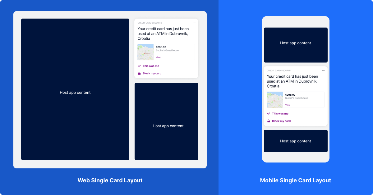
Single card view
This renders only the most recently sent card in a stream, and resizes itself to match the size of the card it is displaying.
You may choose to have two stream containers in your app - one for your card list, and one for your single card view - with only specific cards sent to the single card view.

Within a single card view, toast messages, such as those seen when submitting, dismissing or snoozing a card in a stream container, do not appear. Pull to refresh functionality is also disabled, and the single card view’s container has a transparent background.
Stream container view
A stream is simply a collection of cards. There are numerous ways stream can be displayed.
We offer stream containers and single card views in the following ways:
How are stream containers constructed?
- iOS
- A stream container is a view controller, and can be embedded as a child view controller, presented modally, displayed within a tab controller or added to a navigation controller.
- A single card view is a view, which can be embedded alongside other views in your app. It automatically resizes to fit its containing card.
- Android
- A stream container is a fragment, and can be embedded within your app.
- A single card view is also a fragment, resizing its height to fit its containing card.
- Web
- A stream container is an iframe, and can be embedded within your app. The stream container automatically fills the width it is given.
- A single card view also an iframe; its height attribute is set to fit the containing card.
Variants available in the Atomic Connect Demo App
The Atomic Connect demo app allows you to try different approaches you might choose when embedding a stream of cards:
- iOS
- Direct: The app opens directly to the stream, which is the primary focus of the app.
- Footer: The stream container is displayed as a tab within a tab controller.
- Modal: The stream container is presented modally on top of another screen.
- Content: The stream container is launched within a navigation controller, pushed onto the navigation stack when a button is pressed.
- Single Card: The app displays an Atomic stream as a single card view, surrounded by other app content.
- Android
- Footer: The stream container is displayed as a tab within a view pager.
- Single Card: The app displays an Atomic stream as a single card view, on its own tab.
- Web
- Standalone: The stream container is embedded into your app as an iframe.
- Launcher: The stream container is embedded into your app within an iframe, that is opened and closed via a button that displays in the bottom right of the page. The launcher button floats on top of other page content.
- Single Card: The app displays an Atomic stream as a single card view inside of an iframe, surrounded by other app content.
Embed methods
| Name | Description | Supported platforms |
|---|---|---|
| Single Card View | The single card view renders the first card in a chosen stream container, and resizes itself to match the size of the card it is displaying. | Android, Web, iOS |
| Direct | The app opens directly to the stream, which is the primary focus of the app. | Android, Web, iOS |
| Tabbed | The stream launches inside a tab view, when the tab is clicked. | Android, Web, iOS |
| Floating action button | The stream launches as an overlay over the root page, when the trigger is clicked. | Web |
| Modal | The stream launches inside a modal, when a trigger is clicked. A close button allows users to return to the root page. | Android, iOS |
| Subview | The stream launches inside a child view, when a trigger is clicked. A back button allows users to navigate back to the root page | iOS |
| Custom implementation | If none of the provided display modes suffice, you can also write your own code to render the stream in any position you like. On the web, this is as easy as specifying your own CSS for the embedded iframe. | Android, Web, iOS |
Loading, empty, and error states
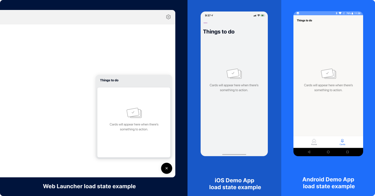
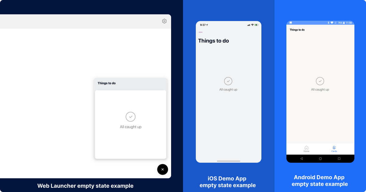
There are loading, empty, & error states that your engineers can configure when integrating the SDKs.
Loading state

Empty state

You can easily test out the customer experience — including snooze — using our Demo Apps.
Custom strings
It is possible to customize many labels, feature descriptions and toast messages. These are explained in detail in the Android SDK guide, iOS SDK guide and Web SDK guide.
Card snooze

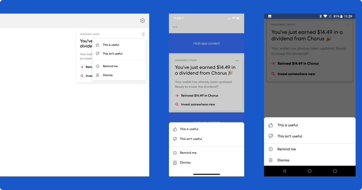
The Atomic SDKs provide the ability to snooze a card from a stream container or single card view. Snooze functionality is exposed through the card’s overflow menu as well as the quick actions menu (exposed by swiping a card to the left, on iOS and Android).
Tapping on the snooze option from either location brings up the snooze date and time selection screen. The user selects a date and time in the future to snooze the card until, with times selectable in 15 minute increments. Snoozing a card will result in the card disappearing from the user’s card list or single card view, and reappearing again at the selected date and time. A user can snooze a card more than once.
When a card comes out of a snoozed state, if the card has an associated push notification, and the user has push notifications enabled, the user will see another notification, where the title is prefixed with Snoozed:.
Runtime variables represent values in your card content that are resolved by your host app every time that card is loaded by the SDK.
Card Voting
The Atomic SDKs support card voting, which allows you to gauge user sentiment towards the cards you send. When integrating the SDKs, you can choose to enable options for users to indicate whether a card was useful to the user or not, accessible when they tap on the overflow button in the top right of a card.
If the user indicates that the card was not useful, they are presented with a secondary screen where they can choose to provide further feedback. The available reasons for why a card wasn’t useful are:
- It’s not relevant;
- I see this too often;
- Something else.
If a user selects "Something else", a free-form input is presented, where the user can provide additional feedback. The free form input is limited to 280 characters.
You can customize the titles that are displayed for these actions, as well as the title displayed on the secondary feedback screen. By default these are:
- Thumbs up - "This is useful";
- Thumbs down - "This isn’t useful";
- Secondary screen title - "Send feedback".
Read more about integrating card voting in iOS SDK, Android SDK and Web SDK.
Dark mode (optional)
The Atomic iOS, Android and Web SDKs support an optional dark mode. Light and dark themes are configured on stream containers in the Atomic Workbench. When a dark theme is provided, the SDK applies the correct theme, depending on the OS/browser version, chosen interface style on the stream container, and the appearance (light or dark) chosen by the user in their system settings.
Read more about integrating dark mode in iOS SDK, Android SDK and Web SDK.
Card content (optional)
Runtime variables
Runtime variables represent values in your card content that are resolved by your host app every time that card is loaded by the SDK.
Runtime variables are a specific type of variable used in card content. Unlike API request payload variables, they represent values that are resolved using data available to your host app every time the card is loaded by the SDK, rather than static or payload data available at the time the card was generated from an API request.
The SDK asks your host app to resolve runtime variables when a list of cards is loaded (and at least one card has a runtime variable), or when new cards become available from the polling or WebSocket endpoints (and at least one card has a runtime variable).
Read more about runtime variables in our iOS SDK, Android SDK and Web SDK.
Unread (or unseen) card count (optional)

The Atomic SDK expose an object — user metrics — that allow you to retrieve information about the number of cards in a stream container, which you can display in your app UI.
For example, you may choose to show the unread (or unseen) card count as a badge. A card is unseen as long it has not been displayed yet. Once a card instance is shown in one stream container, it will be marked as seen across all containers it is available in.
User metrics include:
- The number of cards available to the user across all stream containers;
- The number of cards that haven't been seen across all stream containers;
- The number of cards available to the user in a specific stream container (equivalent to the card count functionality in the previous section);
- The number of cards not yet seen by the user in a specific stream container.
Read more about user metrics for our iOS SDK,Android SDK and Web SDK.