Action card subviews
Action cards can contain secondary screens called subviews, that expand the surface area and interactivity of a card without adding friction or requiring customers to link away or change context.
Top-view, vs Subviews
The top-view is the top level of an Action Card displayed in stream containers, they can contain as many or few content and action elements as you need. However, it is common to keep a top-view brief and provide more details one-step away in a subview. Common scenarios include:
- Using the top-view to introduce the message and provide a call to action linking to a subview with a form to complete
- Using the top-view to deliver a video, with an option to link to the subview for a transcript
- Using the top-view to provide a content summary, and using a subview to present terms, offer details, or longer form articles
- Using a top-view to present multiple buttons/link options, having each open a different subview for simple branching
Action cards can contain form inputs on either the top-level or in subviews, but not both levels, to minimize user confusion. If you are building a form that is too complex for a single card at either level, we recommend creating a sequence of cards instead to avoid bloating a single card and impacting response rates. Form parts can be sent one after another in separate cards, and consider use condition steps and dynamic content to make even more dynamic flows. Check out the context reference to learn how outputs from each step can be reused by later steps.
Subviews vs a sequence of cards
The goal with Action cards is always to keep them as simple and brief as possible, without impacting response and conversion rates. In situations where you have many small questions or form inputs, or need to ask one thing, then conditionally route the user to a next step based on their first answer, or when a more interactive experience is required, you may prefer to design your Action Flow to send a sequence of small cards instead of bundling content or complexity into Subviews.
There is no 'right' way, and we strongly recommend you run tests with your use cases to test and learn.
Adding a subview to a card template
When adding a link button to your card template, you will see an option to have the link open an existing subview. You'll also be given the option to create a new subview while configuring the button. At any time when editing your card, you can also click the + button in the card elements menu to add a subview.
Your card can contain more than one subview.
Linking to a subview from a text element
As well as linking to a subview from a link button, you can add a subview link inline within any text element. This is a lower-profile pathway than a button, useful when you want a subview to feel like a contextual link inside the surrounding copy rather than a primary call to action.
Add a subview link
- While editing a text element, click the + icon (or type
+) to open the context picker. - Scroll to the Subviews section at the bottom of the picker. Every subview on the current card is listed there.
- Click the subview you want to link to. The picker switches to a Subview link screen.
- In the Link text field, enter the text that should appear as the link in your card. If you had text selected in the text element when you opened the picker, that selection is used as the default; otherwise the subview's title is used.
- Click Insert. The link is inserted as an orange pill in the text element.
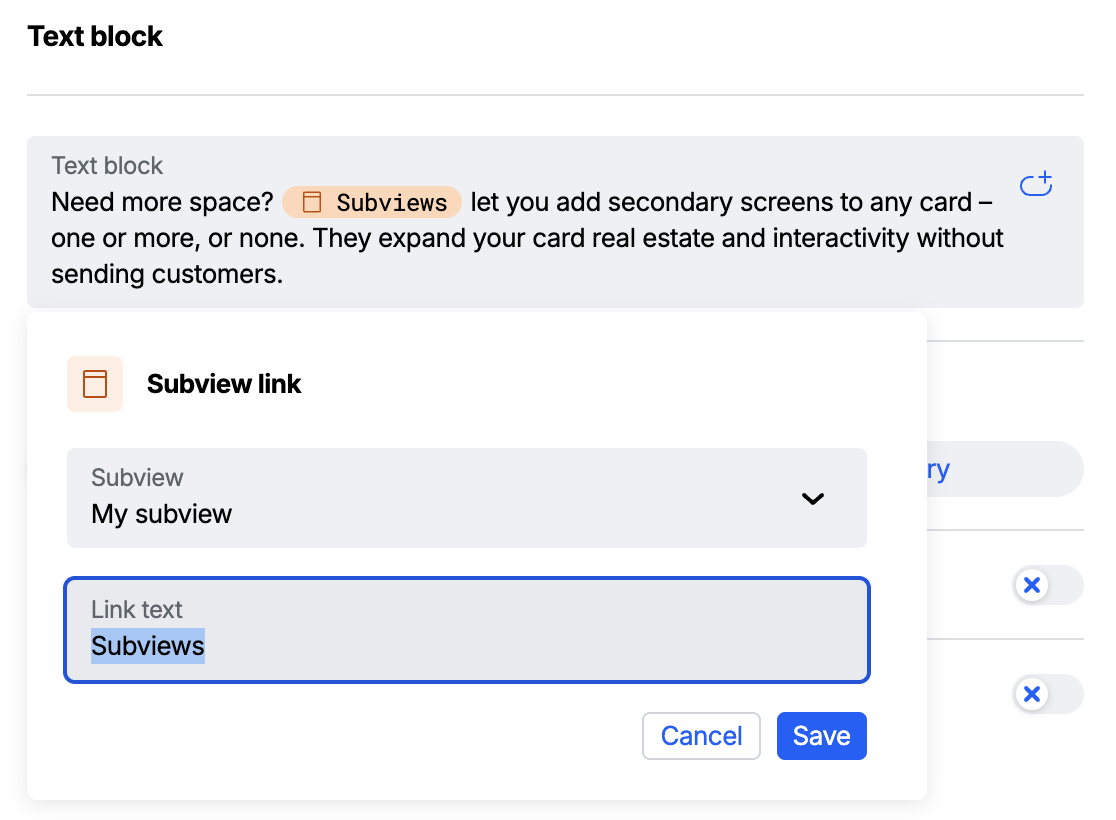
Edit a subview link
- Click an existing subview link pill in your text element. The Subview link editor opens.
- Use the Subview dropdown to change which subview the link points to.
- Edit the Link text field to change the displayed text.
- Click Save.