Card element reference
This guide is a high-level summary of which card elements are supported in the Workbench card-builder and SDKs.
Top-level is how we refer to the default view of a card - the card content a customer sees in their stream container. Subviews are the secondary layouts, which are accessed by link-buttons on the top-level view.
Some content can only be added in either top-level or subview, but most elements can be used in both.
We have indicated for each element at which level it can be used.
Every element is optional.
Text you author for card elements (headlines, labels, button text, alt text, and so on) is subject to maximum lengths in the Workbench. See Content character limits for the full list.
Text elements
Category
Title at the top of a card that identifies its category. Only available in top-level view.
Example

Properties
| Property | Detail |
|---|---|
| Header Text | The primary text to display for the category title. This is optional and can be reordered to be after the subheader if required e.g. “Overdue Tasks” |
| Subheader Text | (requires SDK 26.2.0 or higher) The secondary text to display for the category title. This is also optional and can be reordered to be before the header if required. |
| Icon | (Optional) The icon to display to the left of the text. Icons from the Free Font Awesome collection, custom SVGs and images or icons frm a publicly accessible external URL are supported. |
| Media display size | How the media will be scaled relative to the text. Can be a fixed size (fixed size), match the height of the entire text block (match text block height), or match the header text height (same as header text). |
| Media alignment | The vertical position of the media when fixed size has been chosen. This option is unavailable for the other media display sizes. |
Support
| Card editor | iOS SDK | Android SDK | Web SDK |
|---|---|---|---|
 | | | |
Banner
Media banner which displays at the top of a card. Only available in top-level view. The Images safe areas section provides a detailed description of how to optimize the aspect ratios of these images.
Properties
| Property | Detail |
|---|---|
| Source URL | The URL to the full size to display when the user taps on the image. |
| Thumbnail URL | The URL to the thumbnail image which displays inline with the card. |
| Interaction | Image-only. The behavior of the image when clicked. Either "Open full-size", "Link to URL", "Link to subview" or "Pass a JSON payload to your app". |
| Display height | The height of the image (thumbnail for videos), one of "Tall", "Medium", "Short" or "Original". |
Support
| Card editor | iOS SDK | Android SDK | Web SDK |
|---|---|---|---|
| | | |
Headline
A title intended as the main heading for a card. Available in top-level and subview.
Example

Properties
| Property | Detail |
|---|---|
| Text | The text to display in the headline. e.g. “You have 3 overdue tasks to complete” |
| Headline type | The headline style variant to be used for this text block, one of H1, H2 or H3. Will default to H1. Requires SDK version 26.2.0 or higher. Note: this does not affect the underlying HTML element used on the Web SDK. |
| Icon | (Optional) The icon to display to the left of the text. Icons from the Free Font Awesome collection and custom SVGs are supported. Where the alignment of the text is set to center or right the icon will not be displayed. |
Support
| Card editor | iOS SDK | Android SDK | Web SDK |
|---|---|---|---|
| | | |
Text
A body of text, supporting Markdown formatting and an optional icon on its left. Available in top-level and subview.
Properties
| Property | Detail |
|---|---|
| Text | The text to display. E.g. “Last task due 3rd July 2019” Supported Markdown includes: • **bold** or __bold__• *italic* or _italic_• - list item• 1. list item• [link](https://atomic.io/)• [goto subview](subview:<subviewId>) |
| Text style | The text style variant to be used for this text block, one of primary, secondary or tertiary. Will default to primary. Requires SDK version 26.2.0 or higher. |
| Icon | (Optional) The icon to display to the left of the text. Icons from the Free Font Awesome collection and custom SVGs are supported. Where the alignment of the text is set to center or right the icon will not be displayed. |
| Expand/collapse control | (Optional) Controls whether or not a text block is truncated. If enabled, you must specify the maximum number of lines to display. Optionally, you can customize the labels for the "expand" and "collapse" buttons. If left blank, the default labels are "Show more" and "Show less" respectively. Keep in mind that if your custom "expand" label is too long to fit on the last line of text, it will be truncated. Also, a minimum amount of content from the text block will remain visible on that line to indicate there's more to read. For users of assistive technology, the full content of the text block will always be presented, regardless of truncation settings. See Theme reference for related theme properties. |
Support
| Card editor | iOS SDK | Android SDK | Web SDK |
|---|---|---|---|
| | | |
List
Renders a list of items as a bulleted, numbered or comma separated list. Available in top-level and subview.
Properties
| Property | Detail |
|---|---|
| Type | The type of list to render: • number, which renders a numbered list;• bullet, which renders a bulleted list;• comma, which renders a comma separated list. |
| Source | An array of items, provided as a list variable, that will be displayed in the list. |
| Text style | The text style variant to be used for the list, one of primary, secondary or tertiary. Will default to primary. Requires SDK version 26.2.0 or higher. |
Support
| Card editor | iOS SDK | Android SDK | Web SDK |
|---|---|---|---|
| | | |
Title
The title displayed at the top of the subview. Only available subview.
Properties
| Property | Detail |
|---|---|
| Text | The title to display at the top of the subview. E.g. “Update tasks” |
Support
| Card editor | iOS SDK | Android SDK | Web SDK |
|---|---|---|---|
| | | |
Input elements
Date picker
Renders a date picker in the chosen format, allowing the user to select a day, month and year from a platform-specific picker UI. Available in top-level and subview.
Properties
| Property | Detail |
|---|---|
| Field label layout | How the label, placeholder and value are arranged (inline, stacked or external). |
| Label | The text to display on the left of the component (if Field label layout is inline), above the value (if the Field label layout is stacked) or above the input (if the Field label layout is external). |
| Placeholder | Value to display if no default date is specified, and the user has yet to select a date. |
| Default value | The default date that the picker should select. |
| Input name | The identifier for this field in the response. |
| Thumbnail URL | (Optional) URL to a thumbnail image on the left of the component. |
| Minimum value | The minimum date that this picker will allow. |
| Maximum value | The maximum date that this picker will allow. |
Support
| Card editor | iOS SDK | Android SDK | Web SDK |
|---|---|---|---|
| | | |
Dropdown
Renders a dropdown in the chosen format, allowing the user to select from a list of pre-defined values. Available in top-level and subview.
Properties
| Property | Detail |
|---|---|
| Field label layout | How the label, placeholder and value are arranged (inline, stacked or external). |
| Label | The text to display on the left of the component (if Field label layout is inline), above the value (if the Field label layout is stacked) or above the input (if the Field label layout is external). |
| Thumbnail URL | (Optional) URL to a thumbnail image on the left of the component. |
| Placeholder | Value to display when the user has yet to activate the dropdown. Once the user activates the dropdown, the default value (if specified) or the first item in the list is selected. |
| Data source | The list of items, from the event, that should be rendered in the dropdown. |
| Default value | The default value that the dropdown should select. |
| Input name | The identifier for this field in the response. |
Support
| Card editor | iOS SDK | Android SDK | Web SDK |
|---|---|---|---|
| | | |
Stepper
Allows the user to step up and down between a minimum and maximum value. The value can also be changed by selecting the current value and entering a value manually. Available in top-level and subview.
Properties
| Property | Detail |
|---|---|
| Label | The text to display on the left of the component. |
| Thumbnail URL | (Optional) URL to a thumbnail image on the left of the component. |
| Input name | The identifier for this field in the response. |
| Minimum value | The minimum value allowed by the stepper. |
| Maximum value | The maximum value allowed by the stepper. |
| Step value | The amount to increase or decrease the stepper by when the increment and decrement buttons are pressed. |
| Default value | The default value that the stepper starts at. |
Support
| Card editor | iOS SDK | Android SDK | Web SDK |
|---|---|---|---|
| | | |
Checkbox
Renders a checkbox which allows the user to provide a binary response. Can be on its own as a single checkbox, or with other checkboxes as part of a checkbox group. When used as a checkbox group you have the option to specify a minimum and/or maximum number of checkbox items that must be checked. When used as a single checkbox you can specify whether or not it is required to be checked. Available in top-level and subview.
Properties
| Property | Detail |
|---|---|
| Label | The text to display on the right of the checkbox input. |
| Value | This value is a secondary identifier that is returned on submission of the card. Single checkbox values are formatted the same way as Checkbox group items, e.g.checkbox_abcde.hasAccepted. This value is not visible on the card. |
| Field name | The identifier for this field in the response. |
| Default state | Whether the checkbox initializes as 'checked' or 'unchecked'. |
Support
| Card editor | iOS SDK | Android SDK | Web SDK |
|---|---|---|---|
| | | |
Switch
Allows a user to provide a binary response. Available in top-level and subview.
Properties
| Property | Detail |
|---|---|
| Label | The text to display on the left of the component. |
| Thumbnail URL | (Optional) URL to a thumbnail image on the left of the component. |
| Input name | The identifier for this field in the response. |
| Default on | If the switch should default to the ‘on’ state. |
Support
| Card editor | iOS SDK | Android SDK | Web SDK |
|---|---|---|---|
| | | |
Text input
Allows a user to provide a single or multi-line text response. Available in top-level and subview.
Properties
| Property | Detail |
|---|---|
| Field label layout | How the label, placeholder and value are arranged (inline, stacked or external). |
| Label (stacked & external only) | The text to display at the top of the component in stacked layout or above the component in external layout |
| Placeholder | The placeholder to display when the user has not entered any text. |
| Default value | The default value displayed in the text input. If there is no default value, the placeholder displays until the user enters text. |
| Input name | The identifier for this field in the response. |
| Thumbnail URL | (Optional) URL to a thumbnail image on the left of the component. |
| Number of Lines | The number of lines the text input can receive without scrolling: |
| - If number of lines is 0, the text field auto-grows to accommodate the text entered into it. | |
| - If number of lines is 1, the text field is restricted to a single line of text. | |
| - If number of lines is greater than 1, the text field provides enough space for the given number of lines without scrolling, auto-growing after that. |
Support
| Card editor | iOS SDK | Android SDK | Web SDK |
|---|---|---|---|
| | | |
Number input
Renders a single line input that allows only numeric values (integer or decimal). Available in top-level and subview.
Properties
| Property | Detail |
|---|---|
| Field label layout | How the label, placeholder and value are arranged (inline, stacked or external). |
| Label (stacked & external only) | The text to display at the top of the component in stacked layout or above the component in external layout |
| Placeholder | The placeholder to display when the user has not entered any numeric value. |
| Default value | The default value displayed in the number input. If there is no default value, the placeholder displays until the user enters a value. |
| Thumbnail URL | (Optional) URL to a thumbnail image on the left of the component. |
| Input name | The identifier for this field in the response. |
Support
| Card editor | iOS SDK | Android SDK | Web SDK |
|---|---|---|---|
| | | |
File upload
Renders an input that allows a user to select a file to be submitted with the card. Available in top-level and subview.
Properties
| Property | Detail |
|---|---|
| Field label layout | How the label, placeholder and value are arranged (inline, stacked or external). |
| Label (stacked & external only) | The text to display at the top of the component in stacked layout or above the component in external layout. |
| Placeholder Text | The text to display within the input before a file has been selected. |
| Field name | The identifier for this field in the response. |
| File type | The file format that the input will accept, currently only image uploads are supported. |
| File size | The file size (in MB) that the input will accept. |
| Required | Whether a user is required to supply a file to this input upon submitting the card. |
| Thumbnail placeholder | Whether or not the input should render a placeholder icon in place of the thumbnail preview before an image has been selected. |
| File destination | The target that a file selected by this input will be uploaded to upon card submission. |
Support
| Card editor | iOS SDK | Android SDK | Web SDK |
|---|---|---|---|
| | | |
Card actions
Submit button
A button that results in a card being submitted. Available in top-level and subview.
Properties
| Property | Detail |
|---|---|
| Text | The title to display on the button. E.g. “Submit”. |
| Icon | (Optional) The icon to display to the left of the text. Icons from the Free Font Awesome collection and custom SVGs are supported. |
| Post submit action > Values | When the submit button is triggered, the json payload in the values input field is sent within the card-submitted analytic event as part of the card response payload. This payload is optional, and is sent regardless of the selected post submit action. |
| Post submit action > None | No additional data is sent and no additional actions are taken when the submit button is triggered. |
| Post submit action > URL | A URL that the user is navigated to when submission completes, the URL can be specified to open either in the same window or a new window. To direct to a callable link (e.g. phone number), use the prefix tel: . e.g. tel:0123456789 |
| Post submit action > Payload | An optional JSON payload that is passed to the host app on the client side when the submit button is triggered. |
Support
| Card editor | iOS SDK | Android SDK | Web SDK |
|---|---|---|---|
| | | |
Link button
A button that triggers a subview, or launches an external URL, when tapped or clicked. Available in top-level view, and in subviews (Beta). Note: link buttons in subviews require SDK version 25.4.0 or higher.
Properties
| Property | Detail |
|---|---|
| Text | The title to display on the button. E.g. “More information”. |
| Icon | (Optional) The icon to display to the left of the text. Icons from the Free Font Awesome collection and custom SVGs are supported. |
| Subview | The subview that the user will be navigated to when pressing the link button. |
| External URL | A URL to open when the user presses the link button. The URL can be specified to open either in the same window or a new window. Any URL scheme conforming to the standard is supported, allowing for the use of links for specific app functions (deep links). Note: On iOS and Android, deeplinks open the app directly, rather than opening in the browser first. |
Support
| Card editor | iOS SDK | Android SDK | Web SDK |
|---|---|---|---|
| | | |
Dismiss button
A button that results in a card being dismissed. Only available in top-level view.
Properties
| Property | Detail |
|---|---|
| Text | The title to display on the button. E.g. “Dismiss". |
| Icon | (Optional) The icon to display to the left of the text. Icons from the Free Font Awesome collection and custom SVGs are supported. |
Support
| Card editor | iOS SDK | Android SDK | Web SDK |
|---|---|---|---|
| | | |
Snooze button
A button that results in a card being snoozed. If no snooze period is specified against the button in the card editor, the customer can determine how long the card will be snoozed for. Otherwise the card will be snoozed directly on button tap. Only available in top-level view.
Properties
| Property | Detail |
|---|---|
| Text | The title to display on the button. E.g. "Snooze". |
| Icon | (Optional) The icon to display to the left of the text. Icons from the Free Font Awesome collection and custom SVGs are supported. |
| Period | The time period the card is snoozed for. For reference see duration format. |
Support
| Card editor | iOS SDK | Android SDK | Web SDK |
|---|---|---|---|
| | | |
Vote up button
A button that results in a card being voted up, which means a corresponding analytics event is sent for that card (card-voted-up). Only available in top-level view.
Properties
| Property | Detail |
|---|---|
| Text | The title to display on the button. E.g. “Vote up". |
| Icon | (Optional) The icon to display to the left of the text. Icons from the Free Font Awesome collection and custom SVGs are supported. |
Support
| Card editor | iOS SDK | Android SDK | Web SDK |
|---|---|---|---|
| | | |
Vote down button
A button that redirects to a secondary screen to provide further feedback. Only available in top-level view.
After tapping "Submit", an analytics event containing this feedback is sent (card-voted-down).
More information about voting, such as customizing the feedback options, can be found in the Card voting guide.
Properties
| Property | Detail |
|---|---|
| Text | The title to display on the button. E.g. “Vote down". |
| Icon | (Optional) The icon to display to the left of the text. Icons from the Free Font Awesome collection and custom SVGs are supported. |
Support
| Card editor | iOS SDK | Android SDK | Web SDK |
|---|---|---|---|
| | | |
Media
For all media uploads, there is a 128 MB limit on the file size.
All media files are scanned for viruses before they can be used in card templates.
Image
An image rendered in a specified format. Tapping or clicking on the image shows a larger version, which can be zoomed or panned. Available in top-level and subview.
Supported image formats across our SDKs are outlined in the Supported media formats table.
The Images safe areas section provides a detailed description of how to optimise the aspect ratios of these images.
Properties
| Property | Detail |
|---|---|
| Format | The format to render the image in. • inline, displaying an image with additional horizontal space on each side;• text, displaying a text link to view the image;• thumbnail, displaying a thumbnail accompanied by a title and description. |
| Source URL | The URL to the full size to display when the user taps on the image. |
| Thumbnail URL | The URL to the thumbnail image to display when the format is inline or thumbnail. |
| Description | A description of the image, displayed below the title when format is thumbnail.E.g. “Atomic.io” |
| Label | The label displayed when format is thumbnail or text.E.g. “Find out more” |
| Interaction | The behavior of the image when clicked. Either "Open full-size", "Link to URL", "Link to subview" or "Pass a JSON payload to your app". |
| Display height | The height of the image, one of "Tall", "Medium", "Short" or "Original". |
Support
| Card editor | iOS SDK | Android SDK | Web SDK |
|---|---|---|---|
| | | |
Video
A video rendered in a specified format. If the video format is inline, the video plays inline. If the video format is text or thumbnail, the video plays full screen (on iOS and Android). Available in top-level and subview.
Supported video formats across our SDKs are outlined in the Supported media formats table.
On iOS devices, video audio is muted by default when the iPhone's mute switch is enabled. To ensure audio plays even when the mute button is on, see the iOS SDK guide for configuration steps.
Properties
| Property | Detail |
|---|---|
| Format | The format to render the video in. • inline, displaying a video thumbnail with additional horizontal space on each side;• text, displaying a text link to view the video;• thumbnail, displaying a video thumbnail accompanied by a title and description. |
| Source URL | The video to play when the user taps or clicks the play button. |
| Thumbnail URL | The URL to the thumbnail image to display when the format is inline or thumbnail. |
| Description | A description of the video, displayed below the title when format is thumbnail. |
| Label | The label displayed when format is thumbnail or text. |
| Display height | The height of the thumbnail image, one of "Tall", "Medium", "Short" or "Original". |
Support
| Card editor | iOS SDK | Android SDK | Web SDK |
|---|---|---|---|
| | | |
Formats
Support for various common video and image formats are outlined in the tables below.
These are not intended as exhaustive lists, but as a guide only. Depending on the browsers or operating systems you target, there may be additional media formats that you can use.
| Image format | iOS | Android | Web |
|---|---|---|---|
| JPEG | | | |
| PNG | | | |
| GIF | | ||
| Animated GIF | | ||
| SVG | |
| Video format | iOS | Android | Web |
|---|---|---|---|
| MP4 | | | |
| M4V | | ||
| MOV | | ||
| HLS | (Safari only) | ||
| MKV | | ||
| 3GP | |
Image and video dimensions
By default, images and videos are scaled to fill the width of the containing card, which is defined by the width of the SDK container. The dimensions of their initial state do not adhere to a specific aspect ratio, but have predefined heights, with image content centered within this area. This helps prevent cards from growing too tall when the SDK is wide. Depending on the variant, the following dimensions will be used.
Always use high-resolution images, especially when they will be viewed on mobile devices with high-density displays.
| Variant | Height | Width |
|---|---|---|
| Banner | 200px | Flexible |
| Inline | 200px | Flexible |
| Thumbnail | 100px | 100px |
If displaying an entire image or video without cropping is important to view the additional detail, customers can do so by tapping them to open them in a subview. Here, they are displayed in their original aspect ratio.
Images safe areas
Include plenty of space around key elements within your images, as they may be cropped at different aspect ratios depending on the device they will be viewed on.
The element displaying banner and inline images have a predefined height of 200px. Images are centred vertically and horizontally within the element.
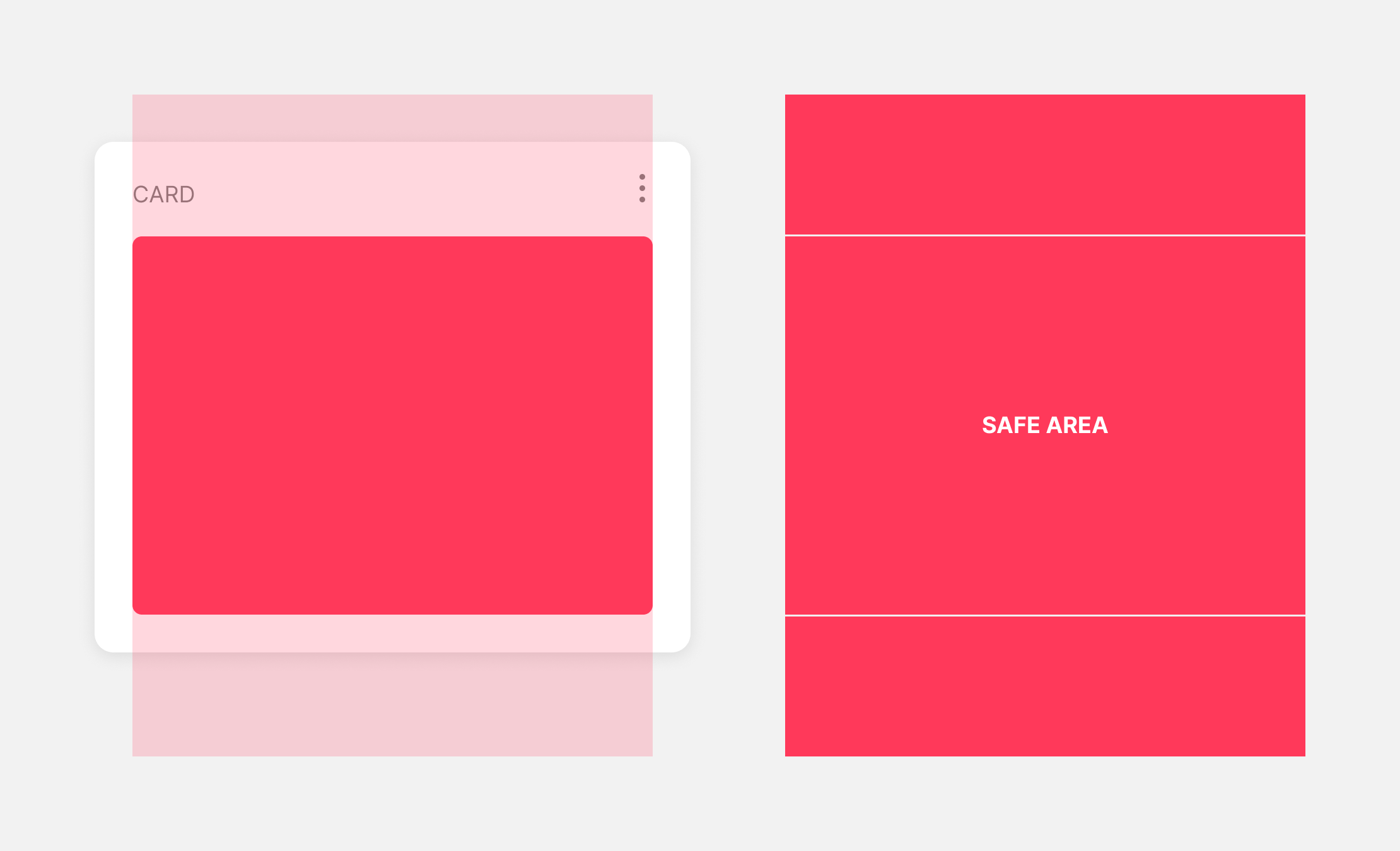
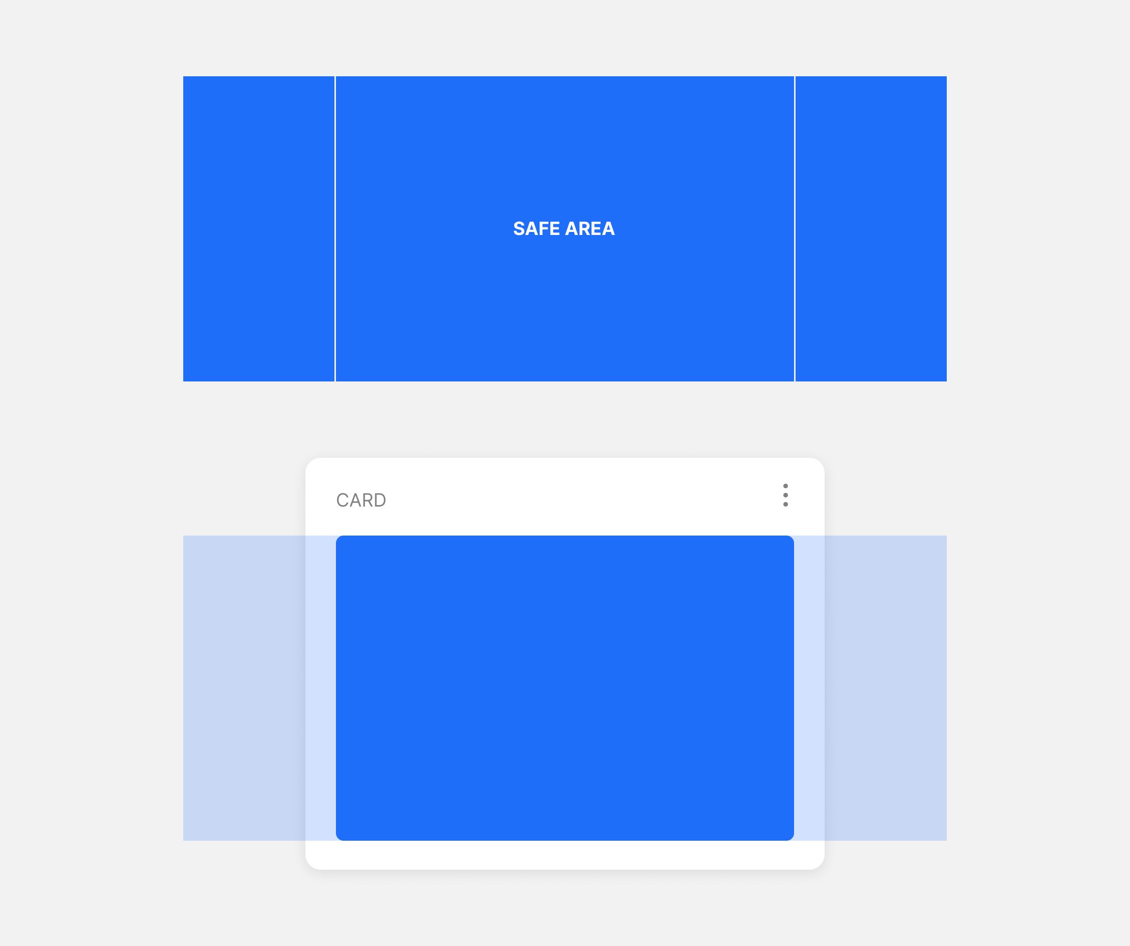
You should always test how your cards display across multiple devices and platforms – as cropping of banner and inline image elements will vary depending on the platform, device model, and if the device is rotated.
Image crops on cards displayed in the web SDK will depend on the width of the iframe, and can easily be tested via Atomic Connect.
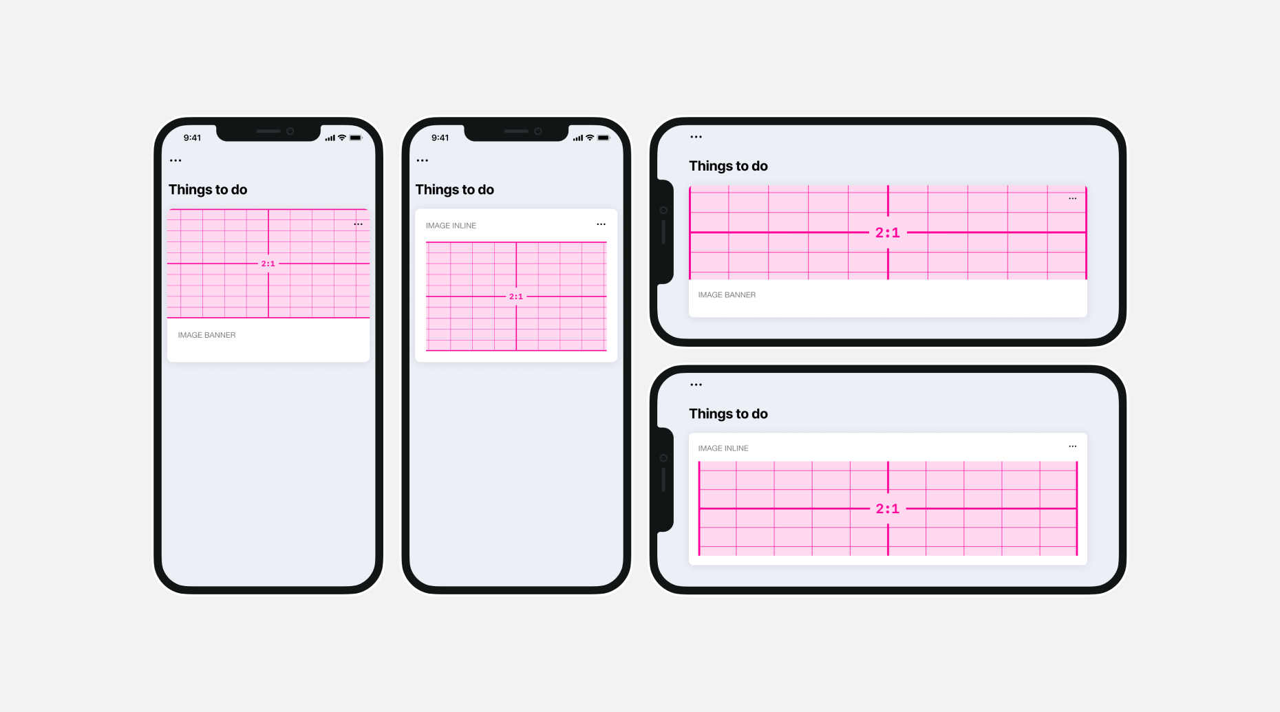
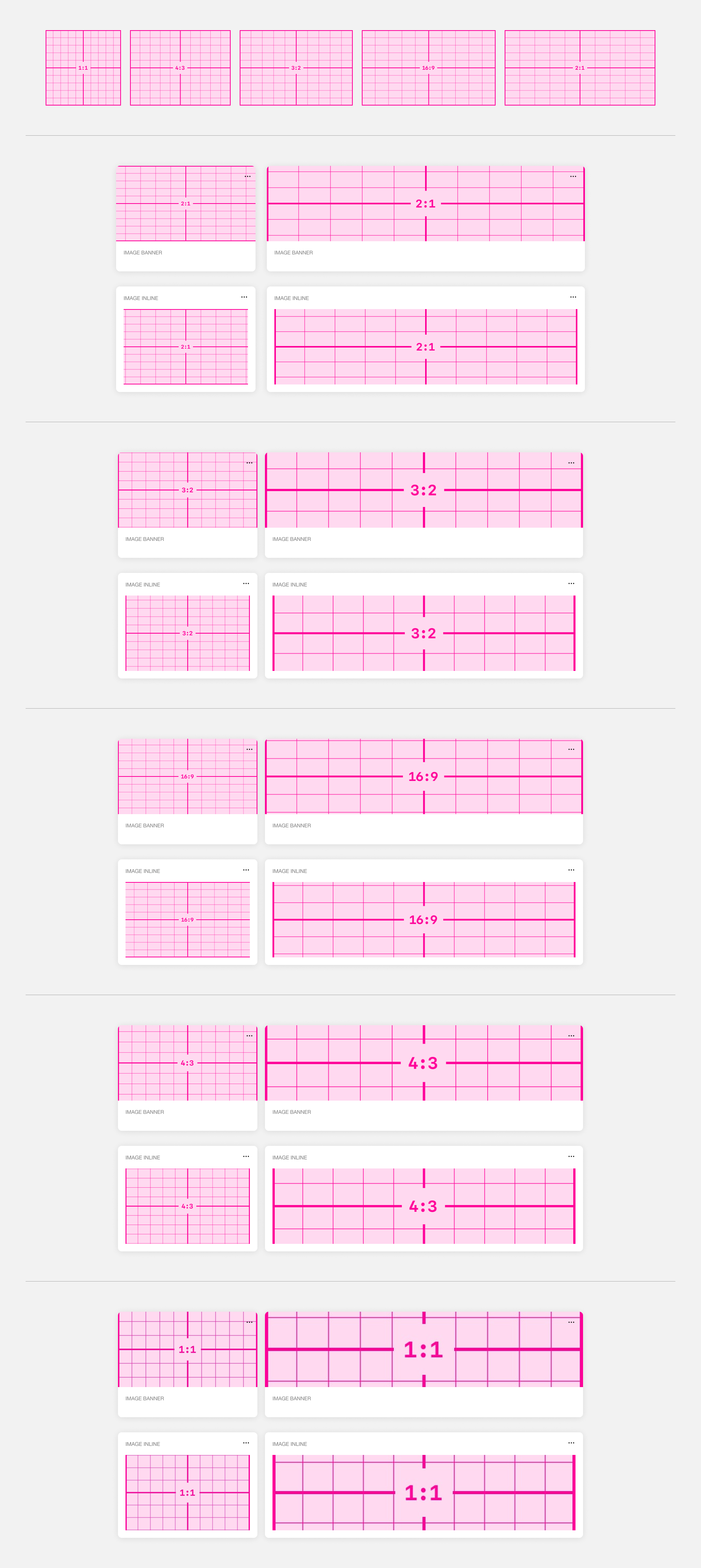
We recommend creating images with an aspect ratio of 2:1 – this works best with banner and inline image elements, across platform, device and rotation. The exception is the thumbnail element: that has an aspect ratio of 1:1.
The following is an approximate guide to the amount of cropping an image may have, based on some common aspect ratios. The crop percentages are based on our own testing across a number of devices (a mix of iOS and Android, phone and tablet). We can not guarantee exact percentages for specific devices - always perform your own testing.
| 2:1 | Mobile: Portrait | Mobile: Landscape | Tablet: Portrait | Tablet: Landscape |
|---|---|---|---|---|
| Banner | ~5% right & left | ~20% top & bottom | ~25% top & bottom | ~30% top & bottom |
| Inline | ~10% right & left | ~20% top & bottom | ~25% top & bottom | ~30% top & bottom |
| 1:1 | Mobile: Portrait | Mobile: Landscape | Tablet: Portrait | Tablet: Landscape |
|---|---|---|---|---|
| Banner | ~20% top & bottom | ~35% top & bottom | ~35% top & bottom | ~30% top & bottom |
| Inline | ~20% top & bottom | ~35% top & bottom | ~35% top & bottom | ~30% top & bottom |
| 4:3 | Mobile: Portrait | Mobile: Landscape | Tablet: Portrait | Tablet: Landscape |
|---|---|---|---|---|
| Banner | ~15% top & bottom | ~30% top & bottom | ~35% top & bottom | ~45% top & bottom |
| Inline | ~10% top & bottom | ~30% top & bottom | ~35% top & bottom | ~45% top & bottom |
| 3:2 | Mobile: Portrait | Mobile: Landscape | Tablet: Portrait | Tablet: Landscape |
|---|---|---|---|---|
| Banner | ~10% top & bottom | ~30% top & bottom | ~30% top & bottom | ~35% top & bottom |
| Inline | ~5% top & bottom | ~30% top & bottom | ~30% top & bottom | ~35% top & bottom |
| 16:9 | Mobile: Portrait | Mobile: Landscape | Tablet: Portrait | Tablet: Landscape |
|---|---|---|---|---|
| Banner | ~5% top and bottom | ~25% top & bottom | ~30% top & bottom | ~35% top & bottom |
| Inline | ~5% left & right | ~25% top & bottom | ~30% top & bottom | ~35% top & bottom |
Custom icons
Custom icons allow you to upload your own SVG files to use instead of Font Awesome icons.
There are some limitations to which SVG properties are supported in custom icons.
Fully Supported properties
The following properties are supported by all SDK platforms:
- rect
- circle
- svg
- g
- ellipse
- line
- polygon
- polyline
- path
- text
- defs
- pattern
- clipPath
- mask
- linearGradient
- stop
Supported properties with Issues
The following properties have issues on at least one platform:
- text
- text is rendered in Android but fonts are shown very pixelated.
Not Supported
The following properties result in a non-rendered image on at least one platform:
- a
- animate
- animateMotion
- animateTransform
- feBlend
- feColorMatrix
- feComponentTransfer
- feFuncB
- feFuncG
- feFuncR
- feGaussianBlur
- feOffset
- filter
- foreignObject
- image
- radialGradient
- set
- textPath
- tspan
Nested SVG are not supported by iOS
The following SVG won't work:
<svg width="258" height="383" xmlns="http://www.w3.org/2000/svg">
  <!-- First line -->
  <svg x="0" y="0" width="258" height="172" viewBox="0 0 300 200" xmlns="http://www.w3.org/2000/svg">
    <line x1="0" y1="0" x2="300" y2="200" style="stroke:red;stroke-width:2" />
  </svg>
  <!-- Second line -->
  <svg x="0" y="177" width="258" height="43" viewBox="0 0 300 50" xmlns="http://www.w3.org/2000/svg">
    <line x1="0" y1="10" x2="250" y2="10" style="stroke:red;stroke-width:12" />
  </svg>
  <!-- Third line -->
  <svg x="0" y="225" width="258" height="158" viewBox="0 0 300 210" xmlns="http://www.w3.org/2000/svg">
    <line x1="0" y1="0" x2="0" y2="200" style="stroke:red;stroke-width:14" />
  </svg>
</svg>
But this will:
<svg width="258" height="383" xmlns="http://www.w3.org/2000/svg">
  <!-- First line -->
  <g transform="translate(0, 0)">
    <line x1="0" y1="0" x2="300" y2="200" style="stroke:red;stroke-width:2" />
  </g>

  <!-- Second line -->
  <g transform="translate(0, 177)">
    <line x1="0" y1="10" x2="250" y2="10" style="stroke:red;stroke-width:12" />
  </g>

  <!-- Third line -->
  <g transform="translate(0, 225)">
    <line x1="0" y1="0" x2="0" y2="200" style="stroke:red;stroke-width:14" />
  </g>
</svg>