Insights
You can access the insights dashboard by selecting 'Insights' in the left hand sidebar.
Access to the Insights dashboard requires view permission on the Insights resource. To save, refresh, or delete saved reports, you need edit permission. See Permissions for details on configuring roles.
Insights provides an easy way to see how your cards are performing. We have developed a simple set of calculated metrics to help you understand how long it takes for customers to interact, to understand the action funnel, and to see whether customer behavior and outcomes differ by device platform.
The insights data is updated from a queue of events, during periods of high activity the insights dashboard may be delayed as this queue is worked through.
Watch the video below to learn the basics about using the Insights dashboard, note that video may not include the latest features or tiles:
Filters
There are a number of ways to filter the insights dashboard:
- Date: The time period in which to display insights for, displayed in your chosen time zone.
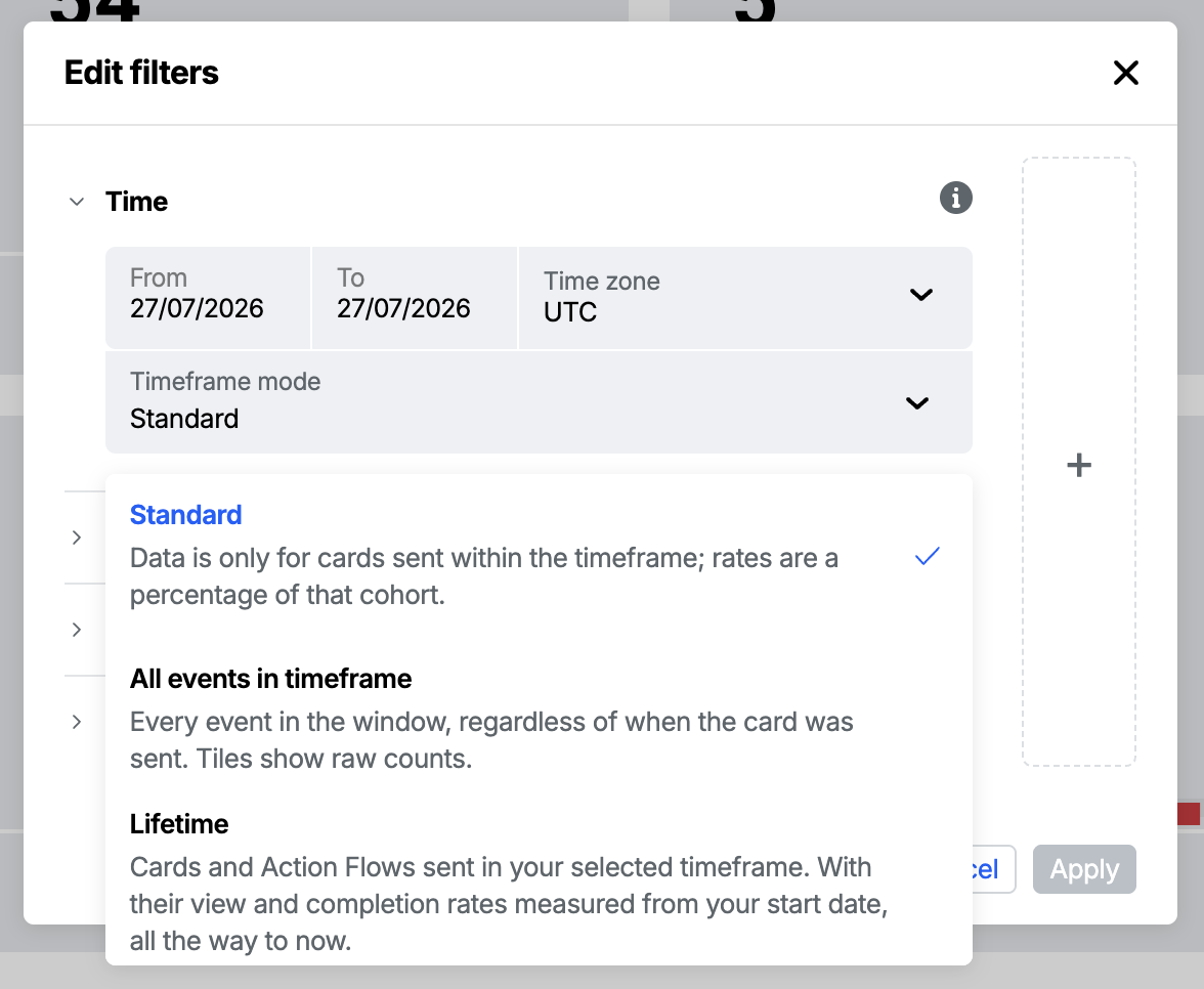
- Timeframe mode: a dropdown in the Time section that changes which events are counted and how the percentage tiles are calculated. It has three options - Standard (the default), All events in timeframe, and Lifetime - see "How the timeframe is counted" below.
- Action Flows: select one or more Action Flows.
- Cards: select one or more cards within an Action Flow.
- Folders: select one or more folders to scope your insights to Action Flow instances that were within those folders at the time they were started.
- Triggers: select one or more of the triggers that started an Action Flow to see data scoped to cards that were send by those triggers. By default the available options are 'api', 'CSV upload' & 'Segment on Action Flow publish' - to see triggers specific to an Action Flow (such as segment enter/exit, webhooks, scheduled timers), select one or more Action Flows in your filters.
- Customer ID: enter a customer ID (aka Atomic ID) to filter on. This allows you to see a timeline of events for a single customer.
- Stream: select one or more of your streams.
- Platform: select a platform (Web, iOS, or Android).
- Test/Live mode: select a mode (live, all, or test) to include or remove test events from your insights.
How the timeframe is counted
The Timeframe mode dropdown in the Time section of the filters controls how your date range is applied. There are three modes.
Standard (the default) counts events for cards that were sent within your selected date range. This is what makes the funnel meaningful: you see how many cards went out in that window, then drill into their efficiency through the percentage tiles (the share of those cards that were viewed, actioned, completed, and so on). Because every percentage is measured against the cards sent in the same window, a card sent before the window but actioned during it is deliberately excluded, this keeps figures like "completed" from ever exceeding "sent".
All events in timeframe inverts "standard". Every matching event that occurred within the timeframe is counted, regardless of when its card was sent, and the percentage tiles become raw counts (because there is no fixed "sent" denominator). Use this when you care about activity that happened during a period rather than the performance of cards sent during it - for example, measuring engagement during a campaign week when many of the cards were sent earlier.
Lifetime keeps the same "cards sent in the window" cohort as "standard", but measures their outcomes all the way up to now instead of stopping at the end of the window. The percentage tiles stay as percentages, but they now show the complete, mature rates for that cohort - for example, the true final completion rate for the cards you sent in March, measured through to today rather than cut off at the end of March. Cards sent and Action Flows started still only count what was sent in the selected window.
Lifetime mode is in beta and may be subject to change. Please contact us to provide feedback.
- Lifetime figures keep changing over time. Because outcomes are measured up to now, the same date range can show higher view or completion rates when you look at it again later, as more customers interact with those cards.
- A saved report freezes the figures at the moment it was generated, so it will not move even though the live dashboard will.
- Lifetime looks at data from the start of your window right up to now, so a distant start date scans more history and can take longer to load.
Comparing filter sets
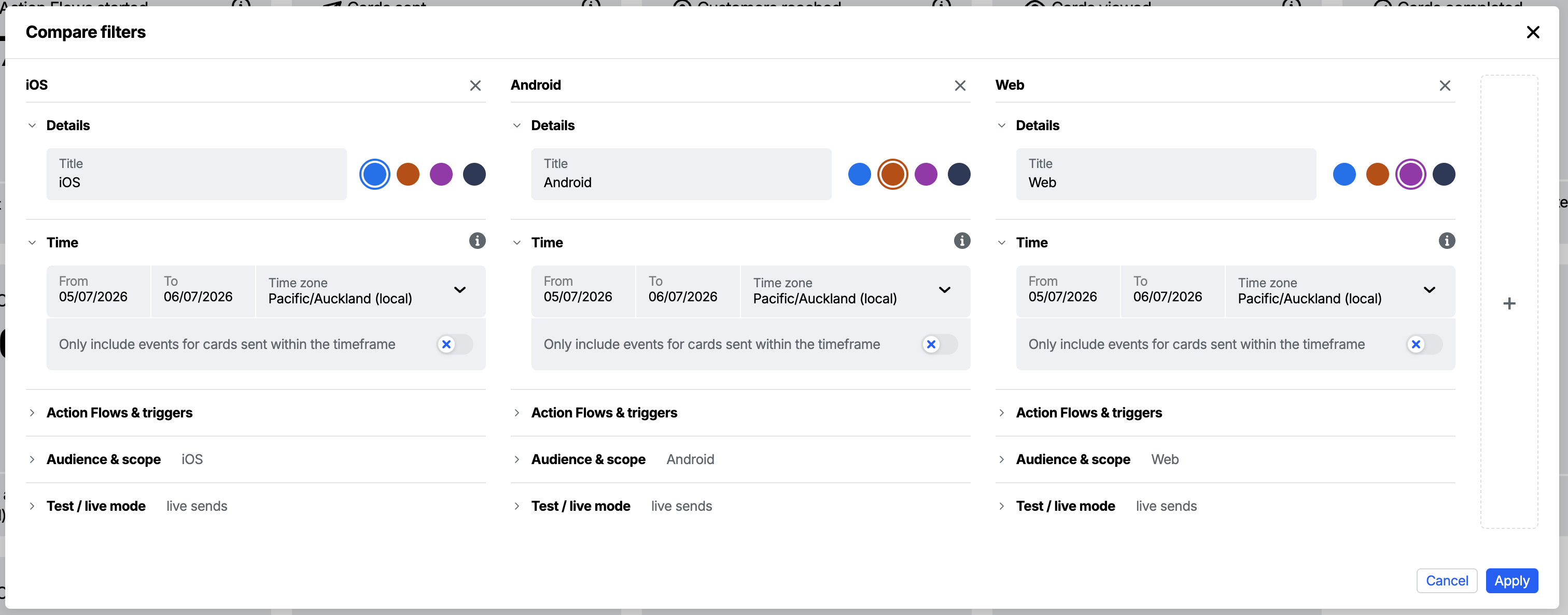
Instead of looking at one set of filters at a time, you can build several filter sets and compare them on the dashboard at once. Each tile then shows every set side by side, so you can read the difference between them at a glance, for example this week against last week, or one platform against another.
Example use-cases
- Compare the current period with the period before it - the day, week, or same dates last month - to see whether performance is trending up or down.
- Break a metric down by platform, with a set each for iOS, Android, and Web.
- Compare two Action Flows, audiences, streams, or triggers against each other.
Creating a comparison
- Open the filters by clicking the filter bar at the top of the dashboard.
- Click the + on the right of the modal to add a filter set. You can start from a quick preset:
- Day before, Week before, or Last month - adds a set for the period before the one to its left. Day and week cover the period immediately before the start date; "Last month" keeps the same dates shifted back a calendar month. Adding the same preset again steps further back in time.
- Split by platform - turns your current filters into one set each for iOS, Android, and Web.
- Empty filter set - adds a blank set for you to configure from scratch.
- Edit each set's filters as you would normally. In the Details section you can give each set a Title and pick a color, which is used to identify the set across the dashboard.
- Remove a set with the ✕ next to its name.
- Click Apply to update the dashboard.
Reading a comparison
Once applied, the filter bar shows a colored pill for each set, and every tile shows one colored bar per set:
- Count tiles (such as Cards sent) show each set's total.
- Percentage tiles (such as Cards viewed) show the percentage with the underlying count beneath it.
- Card feedback shows the positive and negative counts split out for each set.
- Average tiles (such as Average cards in stream) show each set's average.
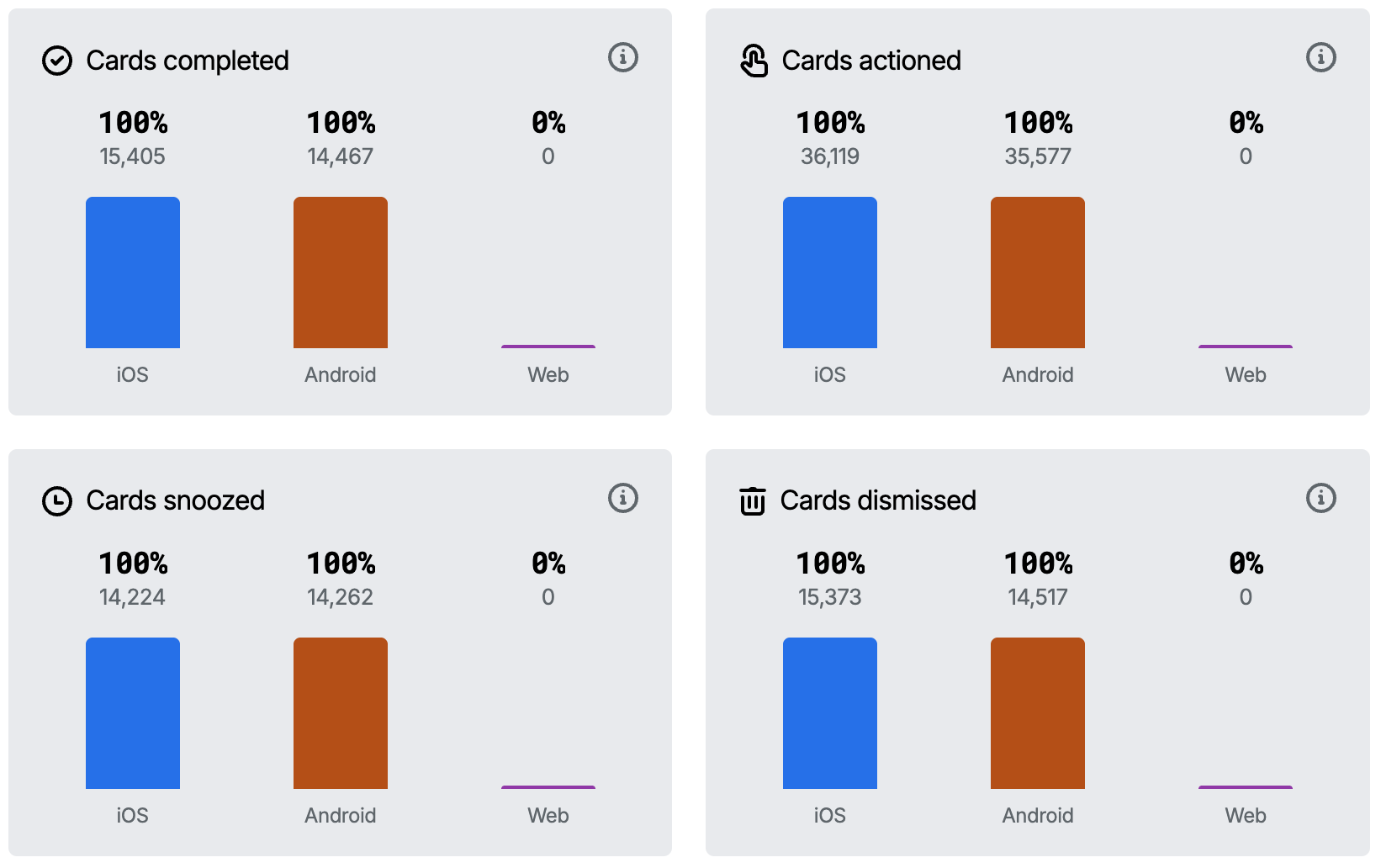
- You can compare up to four filter sets at a time.
- While comparing, clicking a tile opens the sidebar with the metric's description, but the detailed breakdown (charts and tables) is only available when viewing a single filter set.
- Comparison only changes how the dashboard is displayed; it does not change the underlying data or query results.
You can download a comparison with the Summary button and save it as a report - see Dashboard controls and Saved reports.
Metrics
The dashboard is made up of tiles, each showing one metric over the selected timeframe along with a chart of how it trended. You can drag tiles to reorder them - your preferred order is saved for next time.
Volume metrics
These tiles describe the volume of activity in the timeframe, rather than how effective it was.
- Cards sent: the number of card sends, unique by invocation and customer.
- Customers reached: the count of unique customers who viewed a card.
- Action Flows started: the number of Action Flows started, unique by invocation and customer.
- Push notifications: the number of push notifications sent, unique by card and customer (including push notifications sent from an Action Flow send-notification step).
- Card feedback: the sum of upvotes and downvotes, unique by card.
- Cards with videos played: the number of cards where a video was played at least once. The detail also shows how many videos were watched to completion.
- Average cards in stream: the average number of cards a stream held, sampled once each time the stream was loaded for a customer. A stream is only sampled if at least one card in it was shown, so empty streams are excluded and cannot bring down the average. The sidebar breaks this down by stream, showing the smallest and largest number of cards seen, along with how many times each stream was shown.
Average cards in stream is in beta and may be subject to change. Please contact us to provide feedback.
::info When this tile is shown
Average cards in stream is hidden for timeframes that begin before this metric started being collected. If the tile disappears when you widen the date range, this is why.
It is also hidden when you filter by Action Flows, Cards, Triggers or Folders. The metric counts every card in each stream, regardless of which Action Flow or card it came from. Showing it with a filter that selects only some cards could therefore be misleading: a value of 5 under an Action Flow filter might look like "5 cards from this Action Flow", when it actually means "5 cards in the stream", including cards from elsewhere.
The Stream, Platform, Customer ID and Test/Live filters still apply because they narrow which stream views are counted without changing what the metric itself counts.
When comparing filter sets, the tile is shown only if every set meets these conditions.
:::
Engagement metrics
These tiles show what share of your cards reached each stage of the funnel, so you can see how effective your cards were rather than just how many went out. The first step is measured against cards sent; the deeper steps are measured against cards viewed.
In All events in timeframe mode these tiles stop being engagement (efficiency) metrics and become volume metrics. With no fixed "sent" denominator, each tile shows the raw number of events that occurred in the timeframe rather than a percentage - so "Cards completed" becomes a count of completions, "Cards actioned" a count of actioned cards, and so on. Read them as activity during the period, not as a conversion rate.
In Lifetime mode tile values stay as percentages, but are measured against the same cohort of sent cards all the way up to now - so they show the final conversion rates for the cards sent in the window, rather than only what had happened by the end of it.
The same applies to the lifecycle metrics below. See How the timeframe is counted.
- Cards viewed: the percentage of cards sent in the timeframe that were viewed at least once.
- Cards completed: the percentage of viewed cards that were completed.
- Cards actioned: the percentage of viewed cards that were actively engaged with. A card counts as actioned (once, no matter how many times the customer interacts) when any of the following analytics events occur on it:
card-completed- the customer submitted or completed the cardcard-dismissed- the customer dismissed the cardcard-snoozed- the customer snoozed the cardsnooze-options-displayed- the customer opened the snooze optionscard-voted-up- the customer gave positive feedbackcard-voted-down- the customer gave negative feedbackcard-subview-displayed- the customer opened a subview within the carduser-redirected- the customer followed a link or button that redirected themvideo-played- the customer played a video in the card
- Cards snoozed: the percentage of viewed cards that were snoozed at least once.
- Cards dismissed: the percentage of viewed cards that were dismissed.
- Cards with links clicked: the percentage of viewed cards where a link was clicked at least once.
Lifecycle metrics
- Cards expired: the percentage of cards that expired before being completed. After expiry, cards are no longer visible to customers.
- Cards cancelled: the percentage of cards that were cancelled, whether by the card or Action Flow cancellation tools or via the API.
Dashboard controls
The page header has a few controls for working with the live dashboard:
- Refresh: re-runs the dashboard against the latest data. Insights are updated from a queue of events, so during busy periods recent activity can take a little while to appear - use Refresh to pull the newest figures.
- Summary: downloads a CSV summary of the current dashboard view, using whatever filters you have applied. This is a quick export of the tiles you are looking at; for richer or scheduled exports see Downloading analytics. When comparing filter sets, the CSV includes every set in one file, with a Filter set column identifying which set each row belongs to.
- Save: saves the current filters as a report. See Saved reports.
Sidebar
Each tile can be clicked to open a sidebar with the detail behind the number. The sidebar contents vary by tile, but generally let you see exactly which Action Flows, cards, and customers make up the metric, for example, clicking the Cards sent tile lists the Action Flows and cards sent in the selected timeframe.
Depending on the tile, the sidebar can include:
- The Action Flows and cards relevant to the metric
- A list of customer IDs, which you can use with the Customer ID filter to drill into a single customer's timeline
- Card feedback (the individual upvotes, downvotes, and custom responses)
- Snooze periods customers chose
- Which links were clicked
- Which videos were played
- The streams a metric covers, with the average, smallest and largest number of cards each stream held
When a tile chart is shown, you can click one of its bars in the sidebar to narrow the detail to just that bar's period of time.
While comparing filter sets, the sidebar still opens with the metric's description, but the detailed breakdown below it is only shown when viewing a single filter set.
Saved reports
You can save your insights filters as reports in order to make it simple to share or return to a specific search. Note that reports are a snapshot in time of the data when the report was generated - if you think new data may have come in since the report was generated you can refresh the report using the "refresh report" button in the page header.
A comparison can be saved as a report too. When you reopen it, the saved sets are shown together as a read-only comparison.
Saving, refreshing, and deleting reports requires edit permission on the Insights resource. Workbench members with only view permission can still open and browse reports their team has saved, but the Save, Refresh report, and Delete report buttons will not be shown.
If your access is scoped to specific Action Flow folders, you will only see saved reports whose filters are entirely within your accessible folders.
Folder-scoped access
When the environment is in secure folder mode, the Insights dashboard automatically scopes data to the folders your groups have access to. The Folders filter is pre-populated with those folders and can be narrowed but not cleared. Members whose role grants Workbench folder: Admin see data across all folders. See Workbench permissions - secure folder mode and per-folder access for the full model.
Downloading analytics
The insights dashboard is Atomic's opinionated approach to what is useful to see and know about your card sends. If you would like to develop your own dashboard, analytics data can easily be downloaded from the Analytics Exporter or Debugger tools in the Atomic Workbench, or via API or batch extraction. A full reference of Atomic Analytics Events events is detailed in our API docs.