Overflow menu
The overflow menu is the button in the top-right corner of a card. It gives customers the card's secondary actions: vote up (This is useful), vote down (This isn’t useful), snooze (Remind me) and Dismiss.
This page describes how the menu, and the snooze and feedback screens it opens, look and behave in each SDK and container type. To turn these actions on or off for a card, see Secondary card actions.
Menu display
How the overflow menu opens when a customer taps or clicks the menu button (excluding the × used to dismiss). Behaviour and display are hard-coded and can’t be customised.
| Container | Android 26.2.0+ | iOS 26.2.0+ | Web 26.2.0+ |
|---|---|---|---|
| Multi-card vertical | Opens a dropdown from the menu button¹ | Triggers a bottom sheet | Opens a dropdown from the menu button² |
| Multi-card horizontal | Triggers a bottom sheet | Triggers a bottom sheet | Opens a dropdown from the menu button² |
| Single card | Triggers a bottom sheet | Triggers a bottom sheet | Opens a dropdown from the menu button² |
| Modal | Triggers a bottom sheet | Triggers a bottom sheet | Opens a dropdown from the menu button² |
| Launcher (web only) | N/A | N/A | Opens a dropdown from the menu button, inside the launcher panel² |
¹ Opens above the button if there’s no room below.
² Web 26.2.0 always opens below, with an internal scroll if there isn’t enough space to display the entire menu. From 26.3.0, it opens above if there’s enough space.
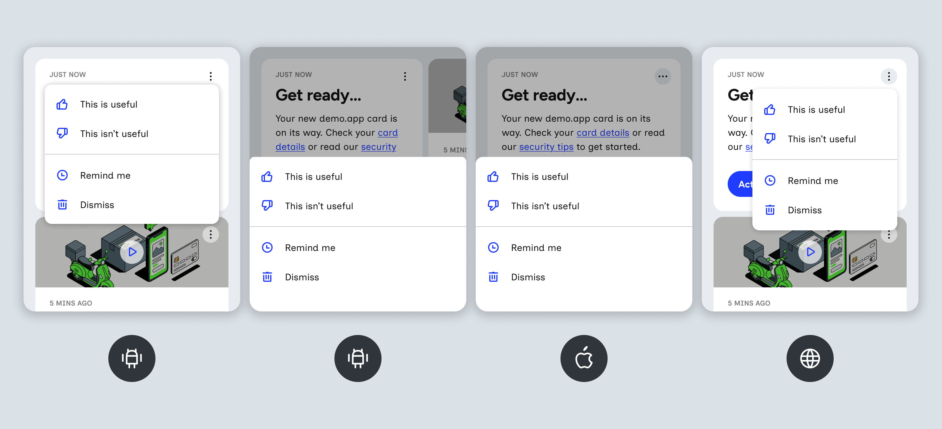
From left to right:
- Android – dropdown, in the vertical container only.
- Android – bottom sheet, in every other container: horizontal, single card and modal.
- iOS – bottom sheet, in all containers.
- Web – dropdown, in all containers.
Menu styling
Styling, position and shape of the menu button, the menu and its content. See Containers for more on customising the content.
| Setting | Android 26.2.0+ | iOS 26.2.0+ | Web 26.2.0+ |
|---|---|---|---|
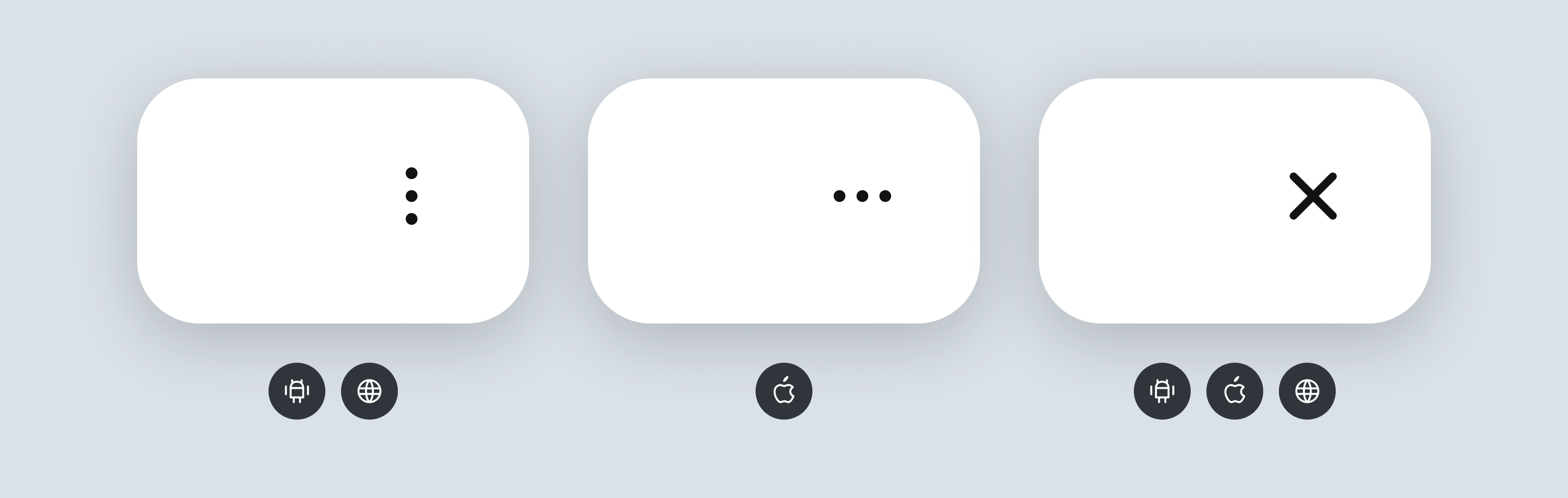
| Menu button icon | Fixed kebab menu – three vertical dots (follows native Android convention) | Fixed meatball menu – three horizontal dots (follows native iOS convention) | Same as Android |
| Menu button colour | Themeable icon and background colour (includes default and active states) | Same as Android | Themeable icon and background colour (includes default, hover and active states, plus keyboard focus border) |
| Menu button size & shape | Fixed: 30dp circle | Fixed: 30pt circle | Fixed: 30px circle |
| Menu button position | Themeable menu button padding | Same as Android² | Same as Android |
| Menu background | Themeable menu background colour | Same as Android | Same as Android |
| Menu item text & icons | Themeable text colour, typography and icon colour, for default and active states, plus an active row background. Icons are hard-coded and can’t be removed or swapped out. | Same as Android | Themeable text colour, typography and icon colour, for default, hover and active states, plus hover/active row background. Icons are hard-coded and can’t be removed or swapped out. |
| Menu item spacing | Fixed | Same as Android | Same as Android |
| Divider | Themeable divider colour. Shows between the vote items and Remind me/Dismiss. | Same as Android | Same as Android |
| Menu dropdown corner radius | Themeable border radius | N/A | Same as Android |
| Menu dropdown width | Fixed – set by the SDK | N/A | Fixed – set by the SDK¹ |
| Menu dropdown shadow | Fixed (follows native Android convention) | N/A | Fixed |
| Bottom sheet top corners | Fixed | Themeable border radius, applied to the top corners | N/A |
| Bottom sheet drag handle & cancel row | None. Menu can be closed by tapping the mask or swiping the sheet down. | None. Menu can be closed by tapping the mask. | N/A |
| Menu mask (scrim) behind open menu | No mask on vertical container. All other containers have a fixed scrim colour. | Themeable colour and opacity | No mask behind the dropdown |
¹ Web 26.2.0 has a fixed width of 300px. From 26.3.0, it’s 75% of the card width, with a minimum of 240px and a maximum of 420px.
² iOS – the position also depends on whether the card’s first element fills the whole row: an inline image does, a text block doesn’t.
Snooze screen
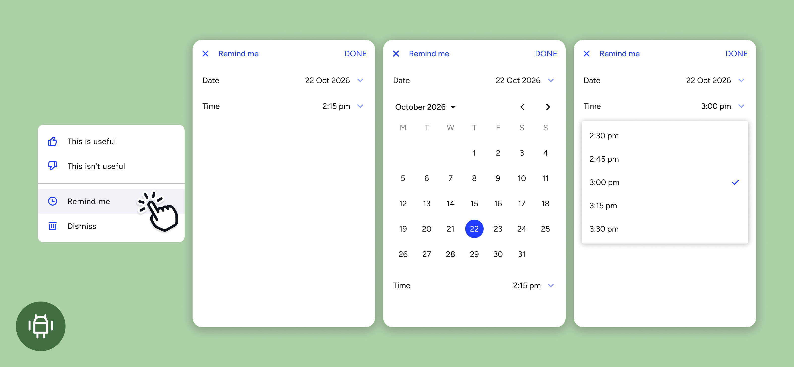
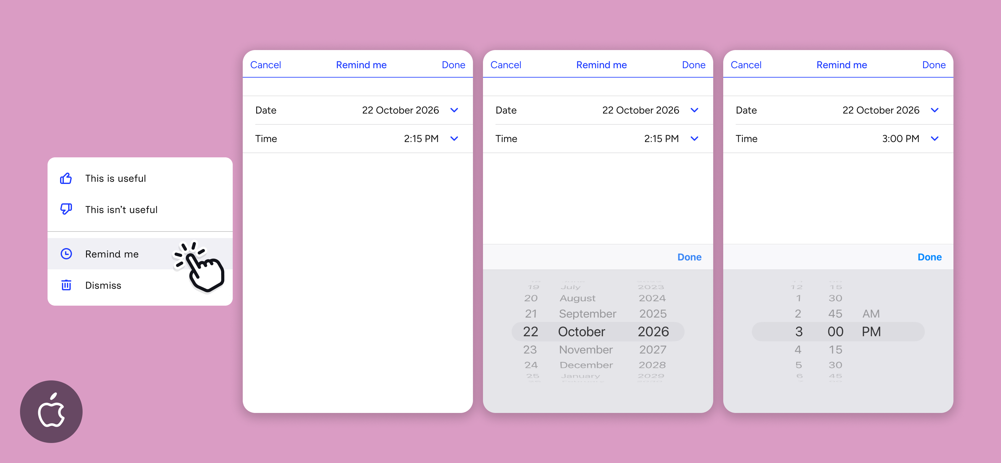
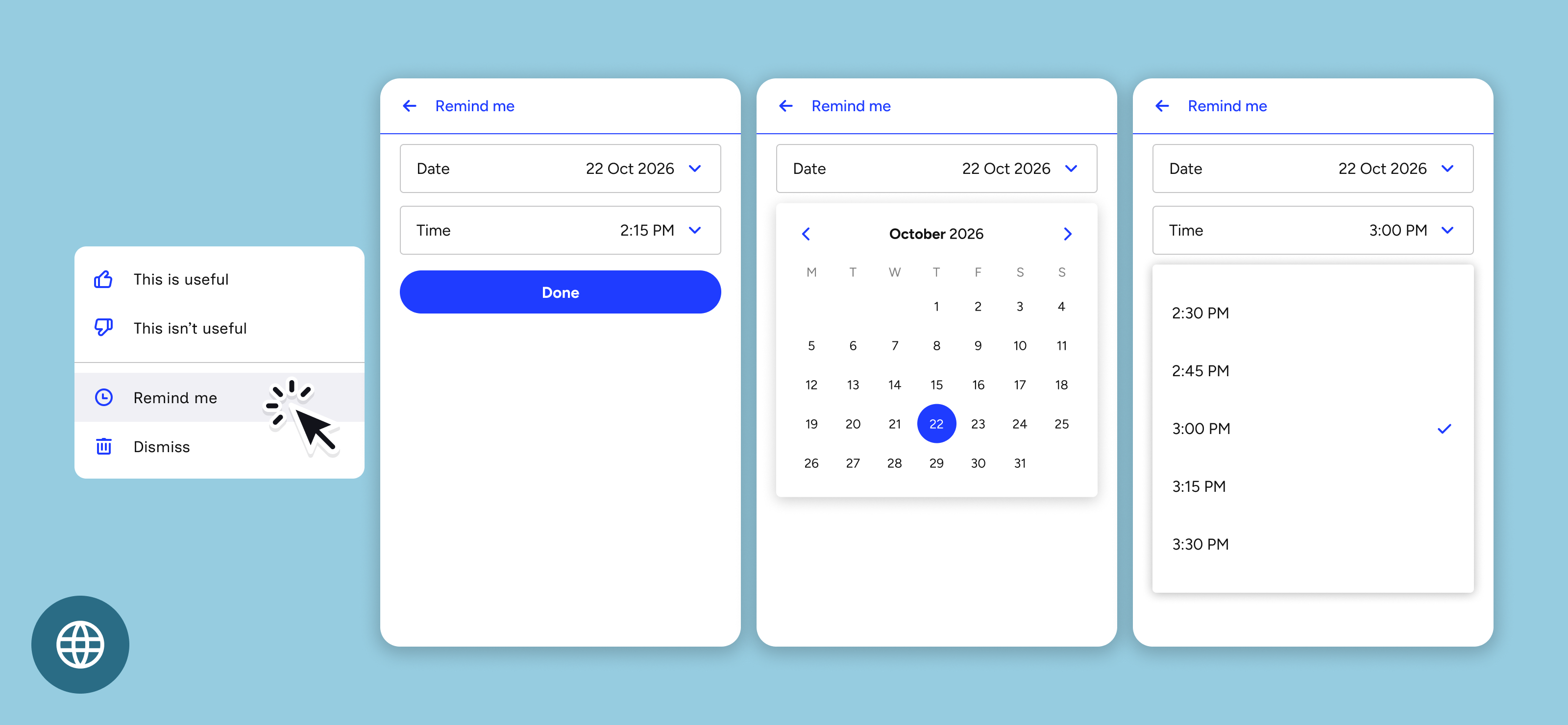
Behaviour and display of the snooze screen when a customer selects Remind me from the overflow menu. Placement and layout are hard-coded and can’t be customised. The screen’s header, inputs and buttons follow the subview theme.
| Container | Android 26.2.0+ | iOS 26.2.0+³ | Web 26.2.0+ |
|---|---|---|---|
| Multi-card vertical | Opens full screen | Opens full screen | Opens full screen – filling the container¹ |
| Multi-card horizontal | Opens full screen | Opens full screen | Opens a modal over the page² |
| Single card | Opens full screen | Opens full screen | Opens a modal over the page² |
| Modal | Opens full screen | Opens full screen | Card-width panel, centred over the mask |
| Launcher (web only) | N/A | N/A | Fills the launcher panel |
¹ Web – if the container is set to autosize, the screen sizes to the natural height of its contents.
² Web 26.2.0 opens the screen in an iframe, which sits in the normal page flow after the container and can be positioned with CSS. 26.3.0 opens a modal, centred and up to 480px wide by default. Its placement, size, corner rounding and shadow can be changed with style overrides.
³ iOS – how the screen opens depends on how the app hosts the container. If the container is inside the app’s NavigationStack, the screen slides in from the right and the app’s tab bar stays visible. Otherwise it opens full screen from the bottom. Apps can force full screen for the vertical container with navigationMode: .forceModal. Horizontal and single card containers always open full screen. The modal container opens the screen inside its own full-screen window, so it always looks full screen.
Feedback screen
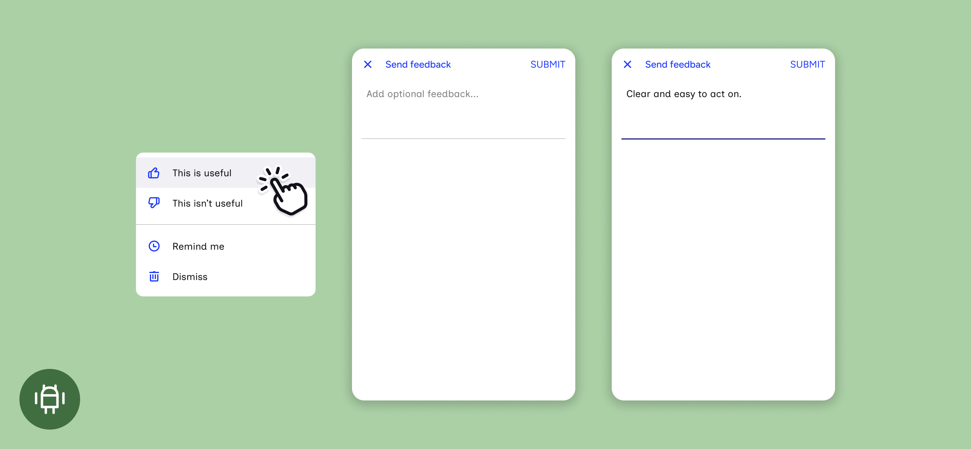
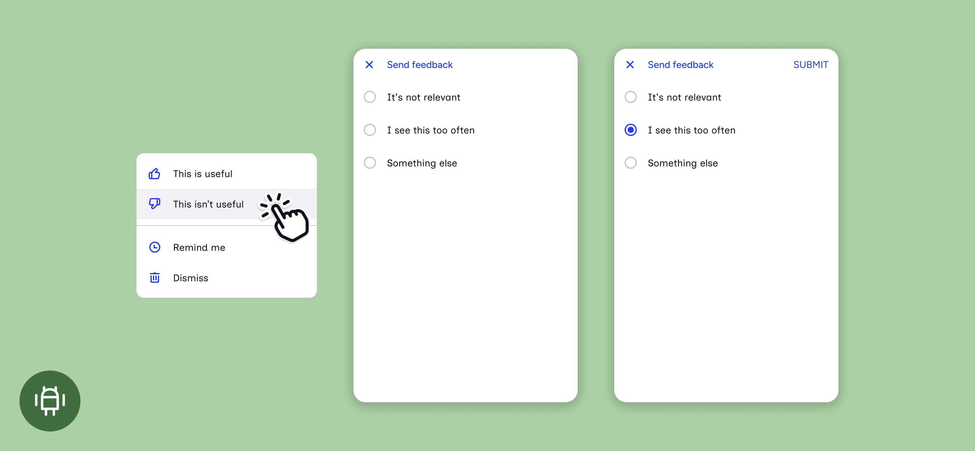
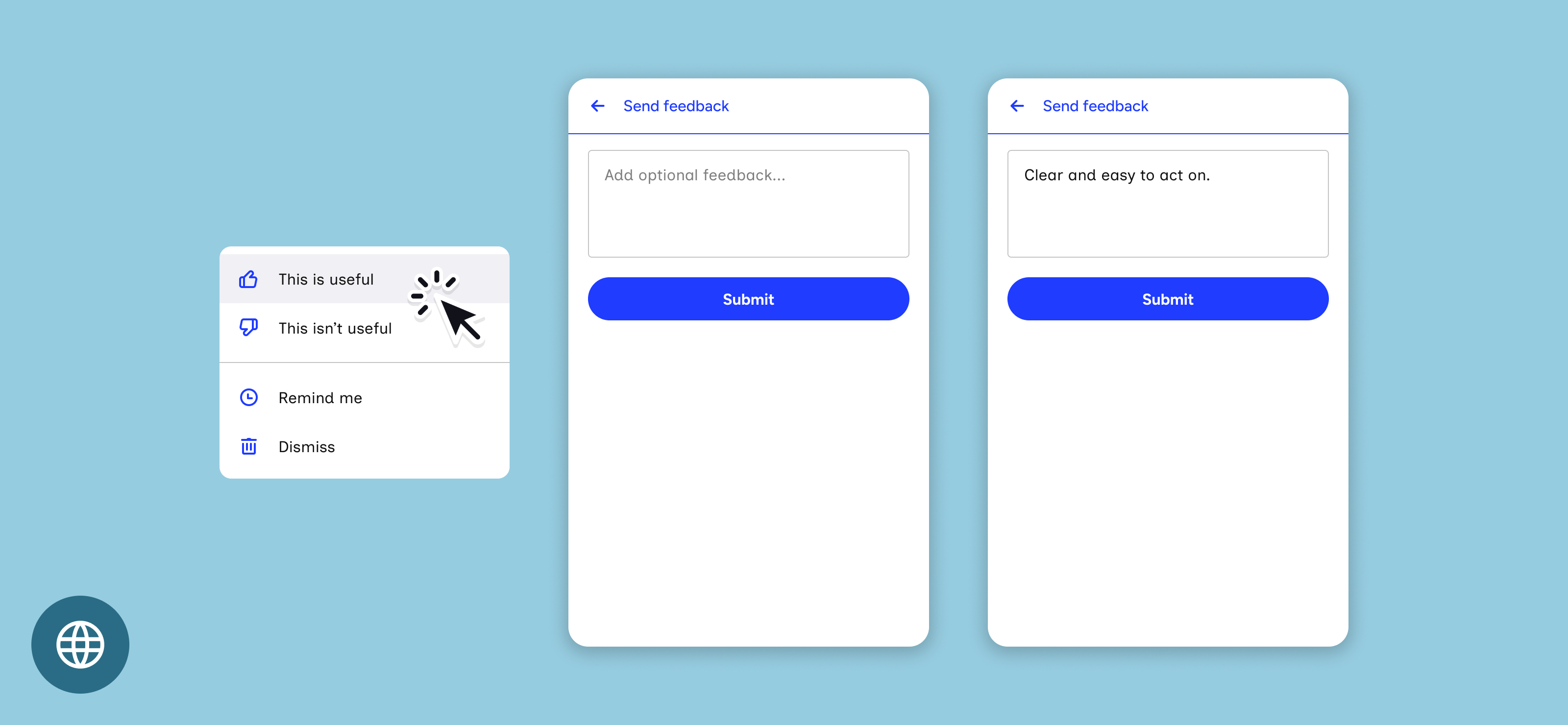
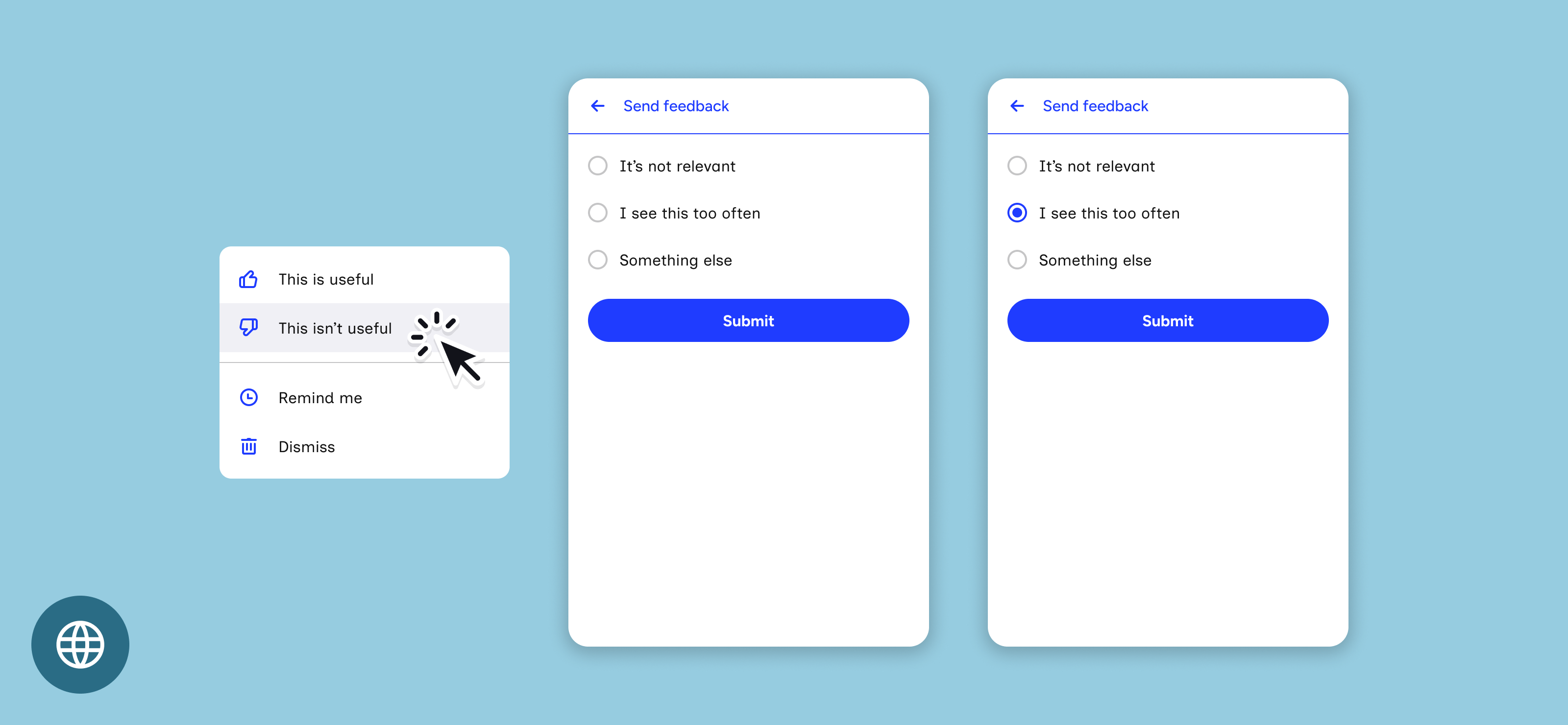
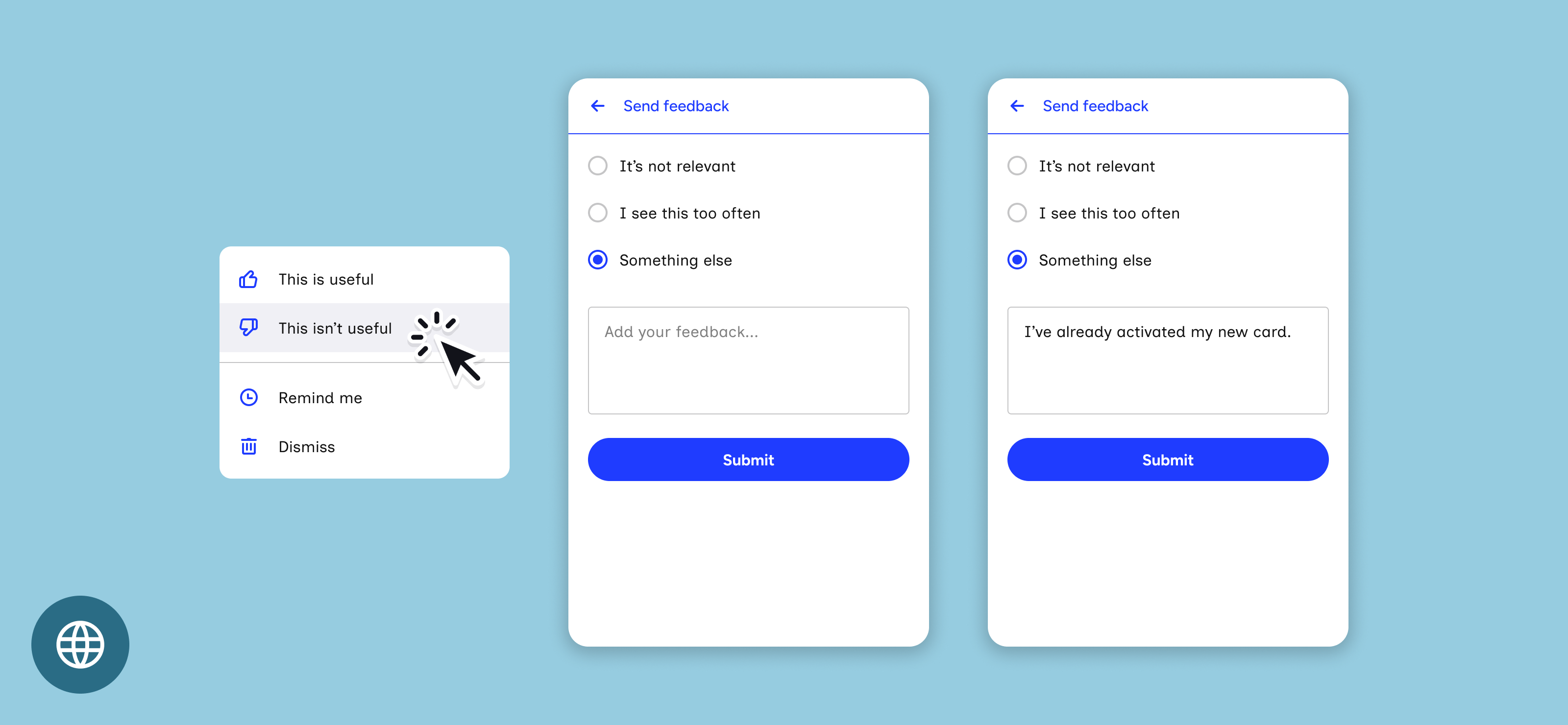
Behaviour and display of the vote up and vote down screens when a customer selects This is useful or This isn’t useful from the overflow menu. Placement and layout are hard-coded and can’t be customised. The screen’s header, inputs and buttons follow the subview theme.
| Container | Android 26.2.0+ | iOS 26.2.0+³ | Web 26.2.0+ |
|---|---|---|---|
| Multi-card vertical | Opens full screen | Opens full screen | Opens full screen – filling the container¹ |
| Multi-card horizontal | Opens full screen | Opens full screen | Opens a modal over the page² |
| Single card | Opens full screen | Opens full screen | Opens a modal over the page² |
| Modal | Opens full screen | Opens full screen | Card-width panel, centred over the mask |
| Launcher (web only) | N/A | N/A | Fills the launcher panel |
¹ Web – if the container is set to autosize, the screen sizes to the natural height of its contents.
² Web 26.2.0 opens the screen in an iframe, which sits in the normal page flow after the container and can be positioned with CSS. 26.3.0 opens a modal, centred and up to 480px wide by default. Its placement, size, corner rounding and shadow can be changed with style overrides.
³ iOS – how the screen opens depends on how the app hosts the container. If the container is inside the app’s NavigationStack, the screen slides in from the right and the app’s tab bar stays visible. Otherwise it opens full screen from the bottom. Apps can force full screen for the vertical container with navigationMode: .forceModal. Horizontal and single card containers always open full screen. The modal container opens the screen inside its own full-screen window, so it always looks full screen.
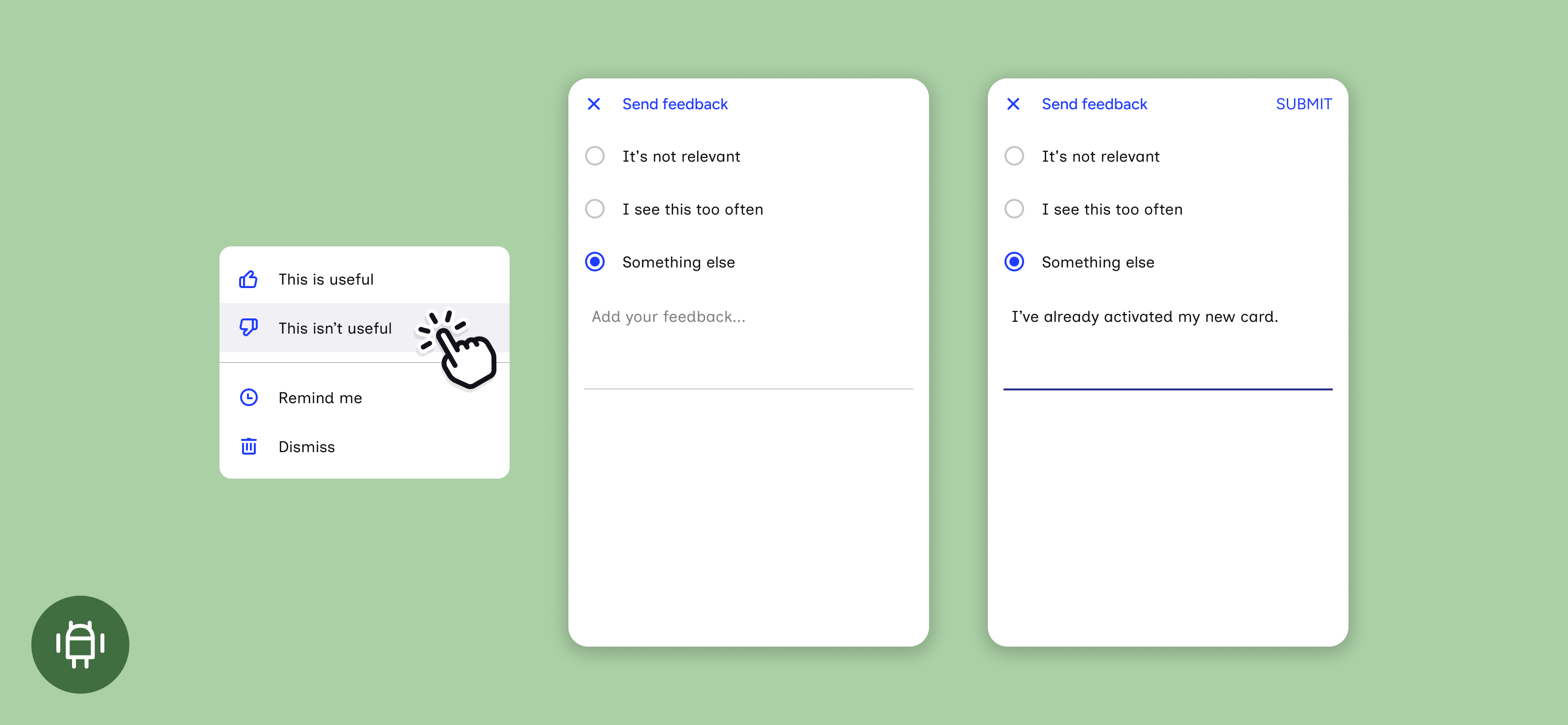
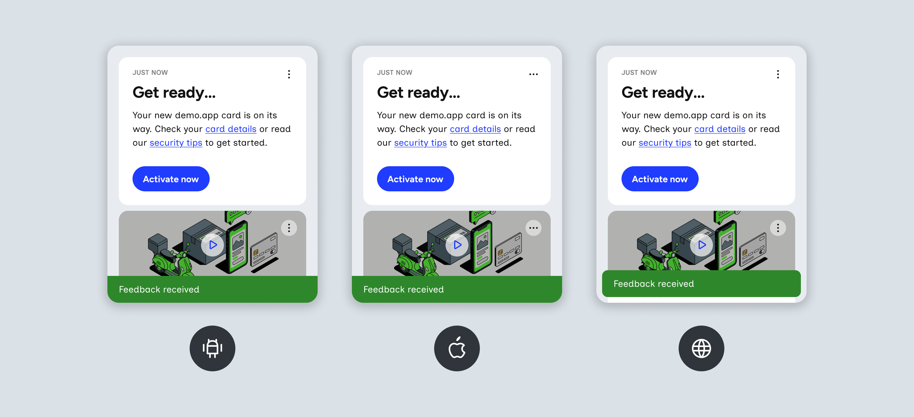
Android
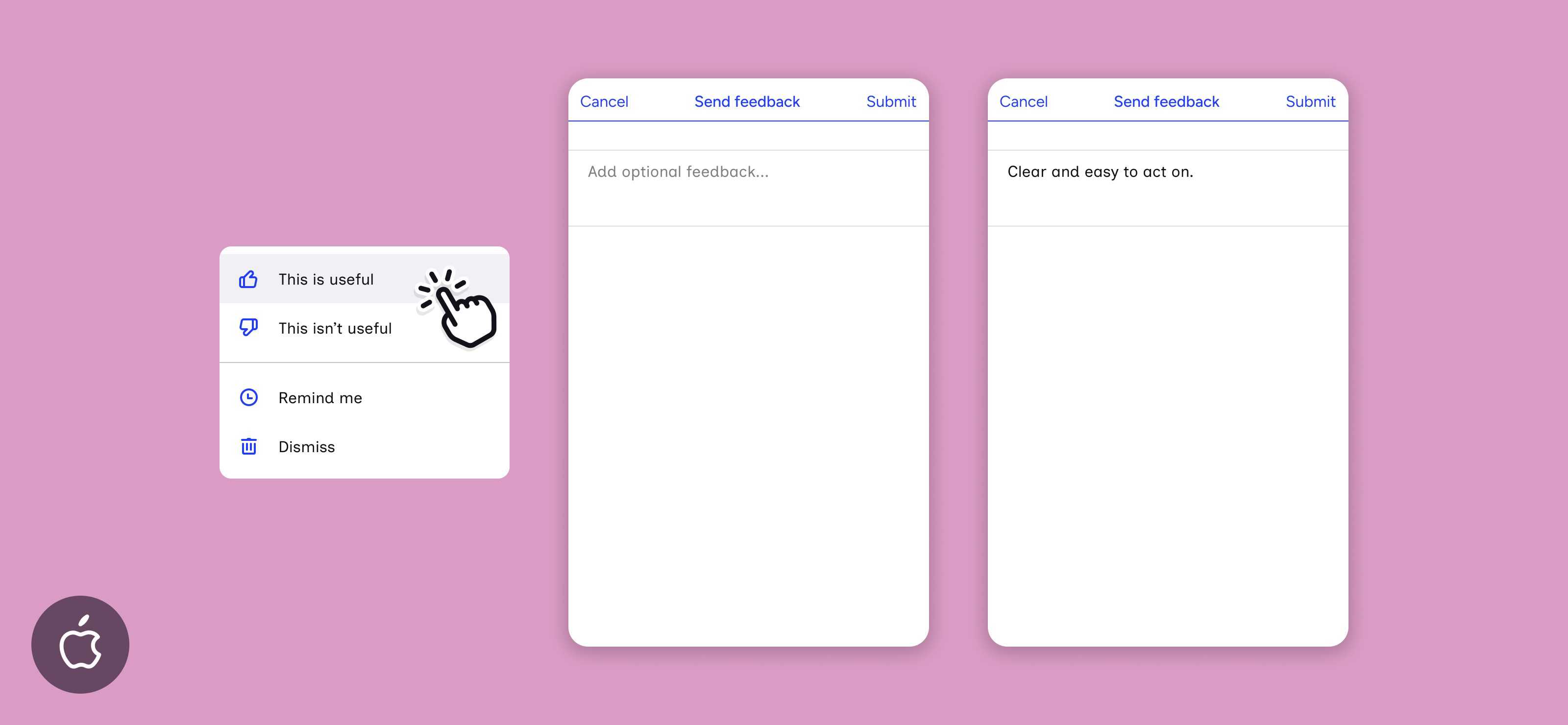
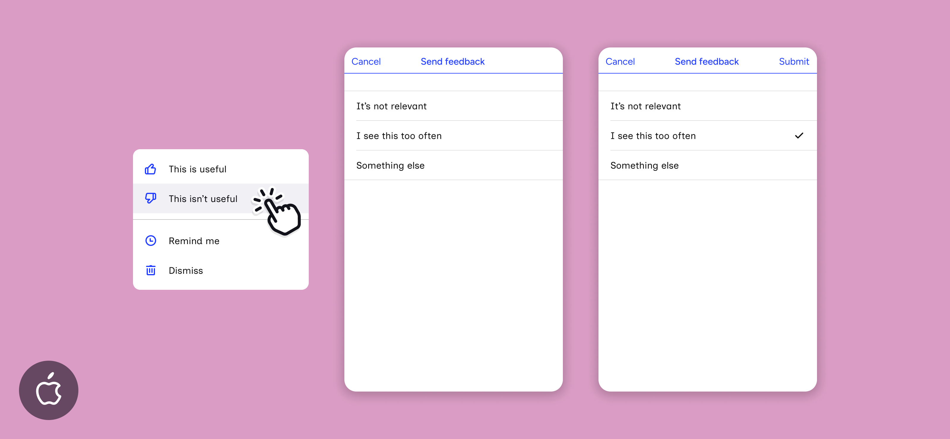
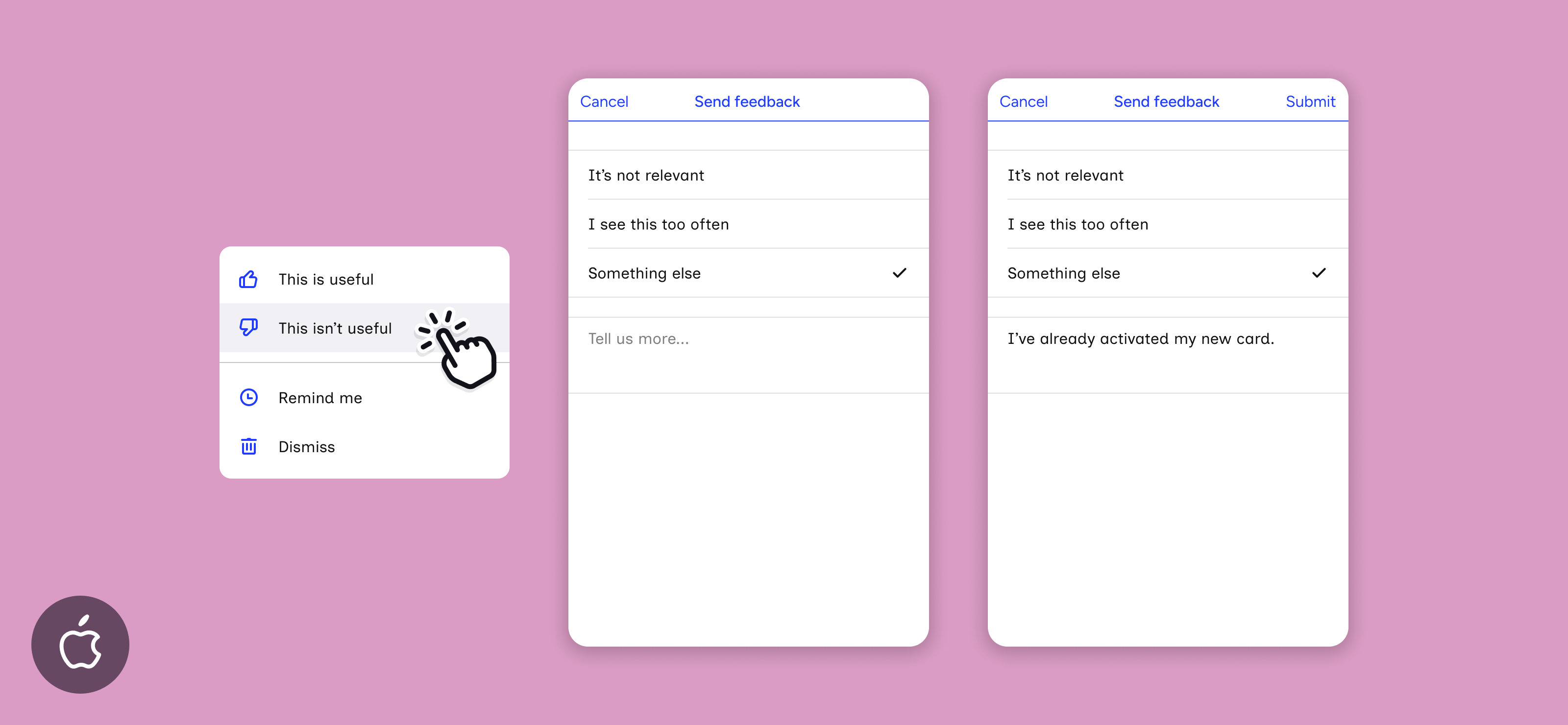
iOS
Web
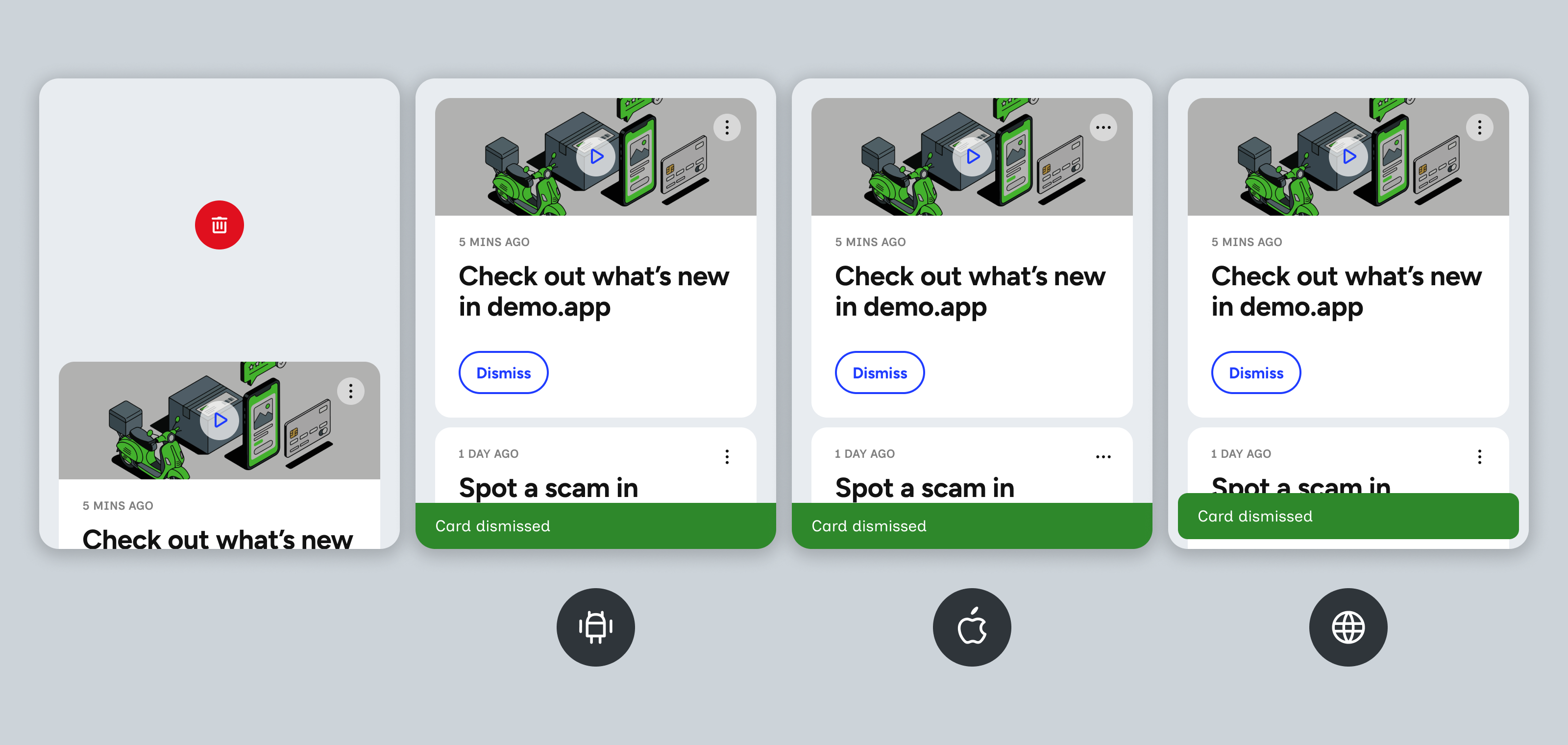
Toast
Dismiss
Dismissing a card doesn’t open a screen. The card leaves the stream and the Card dismissed toast shows.
Containers
General behaviour, display and customisation across containers, and where each can be configured.
| Behaviour | Android 26.2.0+ | iOS 26.2.0+ | Web 26.2.0+ |
|---|---|---|---|
| Menu action availability | Each action (including feedback) is enabled or disabled at the environment level, then enabled options are available per card template. | Same as Android | Same as Android |
| Menu labels | The default menu item labels (This is useful, This isn’t useful, Remind me, Dismiss) can be changed in the SDK configuration. | Same as Android⁴ | Same as Android |
| Menu item order | Menu item order, and the divider between voting and other actions, are hard-coded. | Same as Android | Same as Android |
| Dismiss-only state | When Dismiss is the only action enabled, the menu dots (kebab and meatball) become an × that dismisses the card. | Same as Android | Same as Android |
| No actions enabled | When all four actions are turned off for a card, there’s no menu button. | Same as Android | Same as Android |
| Snooze picker & period | Displays a date and time picker. Times are hard-coded to 15-minute increments. A preset period is only available on a Snooze button. Date and time formats depend on the platform³. | Same as Android⁵ | Same as Android. Single card and horizontal containers show the title with an × on the right. Vertical, modal and launcher containers show a back arrow on the left. The button below the fields always reads Done. |
| Snooze repetition | Customers can snooze a card more than once. | Same as Android | Same as Android |
| Vote up feedback | Only opens a screen when feedback is enabled. Optional text, up to 280 characters. | Same as Android | Same as Android |
| Vote down feedback | Always opens a screen, displaying It’s not relevant, I see this too often and Something else. Turning off text feedback hides the Something else option. | Same as Android | Same as Android |
| Feedback placeholder label | The feedback placeholder label can be customised per card, in the Workbench card editor. | Same as Android | Same as Android |
| Feedback cancel & submit button | Displays an x on the left and a Submit button on the right of the header. Vote up always displays Submit. Vote down shows Submit once a reason is chosen. For Something else, the customer must also enter text. | Displays a Cancel button on the left and a Submit button on the right of the header. Vote up always displays Submit. Vote down shows Submit once a reason is chosen. For Something else, the customer must also enter text. | Single card and horizontal containers display an × on the right of the header and a Submit button below the options. Vertical, modal and launcher containers display a back arrow on the left of the header. |
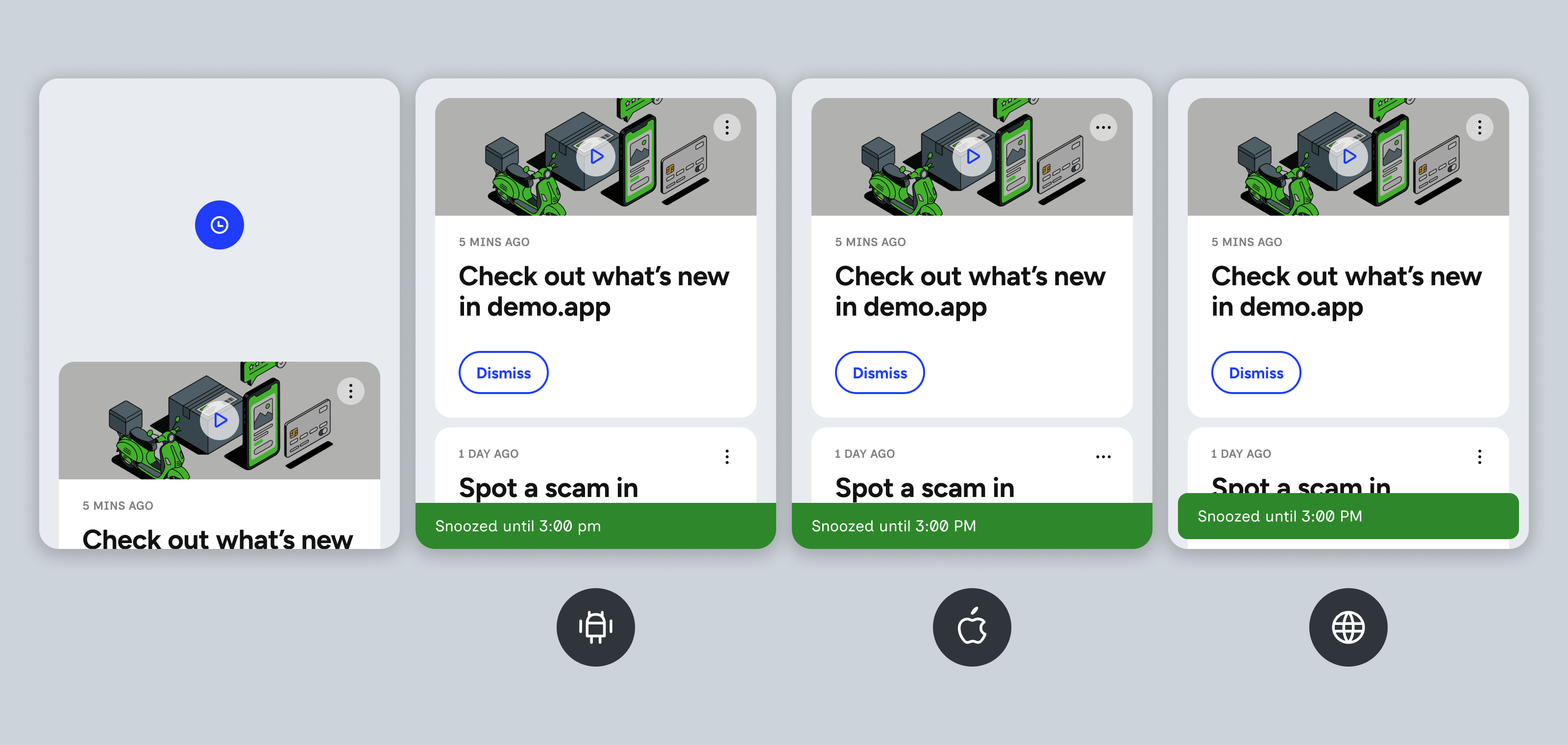
| Toast | Full-width bar at the bottom of the screen, in every container: Snoozed until 3:00 pm or Feedback received. The time is always lowercase – 3:00 pm – and another day adds the date³. | Full-width bar at the bottom of the screen. The time follows the phone’s region – 3:00 pm (AU, UK) or 3:00 PM (NZ, US) – and another day adds the date³. Tapping the toast dismisses it⁶. | Box with rounded corners at the bottom of the feed¹, with the same text. In single card and modal it sits at the bottom centre of the window². Clicking the toast dismisses it. The time is always shown as 3:00 PM. |
¹ Other web containers can use custom toast placement instead. See custom toast message positioning.
² From Web 26.3.0, the toast’s position, width bounds and text alignment can be changed with style overrides.
³ Date and time formats depend on the platform. Android uses the phone’s region for the first day of the calendar week (Monday in New Zealand, Australia and the UK; Sunday in the US) and always writes times in lowercase (‘2:15 pm’). iOS uses a date wheel, so there’s no first day of the week, and uses the phone’s region for the time format (‘2:15 pm’ in Australia and the UK, ‘2:15 PM’ in the US and New Zealand). The iOS Date row uses the region’s long date format (‘29 October 2026’ in New Zealand, ‘October 29, 2026’ in the US). The wheel follows the phone’s 12 or 24-hour setting, but the Time row always shows 12-hour time, so with 24-hour time on, the two show different formats. Web always starts the calendar on Monday and writes times in capitals (‘2:15 PM’). The screens on this page show a New Zealand region.
⁴ iOS – the feedback screen title (Send feedback) can also be changed. The snooze screen title uses the Remind me label. The screen buttons (Cancel, Submit, Done) and the three vote down reasons are fixed.
⁵ iOS – the snooze screen header shows Cancel and Done (not Submit). Times after the card’s expiry can’t be picked, and the default time is the first 15-minute slot at least 5 minutes from now. The wheel panel that opens from the Date and Time rows doesn’t follow the subview theme – its Done button and background use fixed iOS system colours.
⁶ iOS – apps can change the toast text in the SDK configuration (toastCardSnoozeMessage, toastCardFeedbackMessage) or turn toasts off. A custom snooze message replaces the whole text, including the time. When the snooze is on another day, the day always comes before the month (‘30 Oct 2026, 3:00 pm’), even in the US.